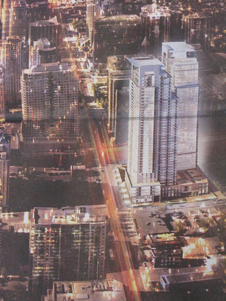
Toronto Hullmark Centre | 167.94m | 45s | Tridel | Kirkor

Those renderings look surprisingly attainable, although the precast 'frame' above the vidscreens threatens to be a pre-castishly oppressive element that dominates the street-level view. There aren't many intersections in the city that would be altered so substantially by one project as Yonge & Sheppard will be by this one.
 
There's a Sheppard subway station public art piece located about where the future square for Hullmark will be going- the one with the fake fire pit in front of an ATM. I don't see it in the rendering, so just wondering what's going to be the fate of it.
 
(Preliminary)
hullmark_centre-800w.jpg


(Current)
hullmark_night_wlogo_1000.jpg


I like the ground level experience here, but the further above that this project rises, the duller it gets. It's certainly no Time Warner Centre (and no, I know that no-one is claiming that anyway), and it's not terrible or anything, but given the size of the lot, its prominent position at the meeting of a subway line and a Transfer City line, and the scads of money that will be spent here, let's get something memorable! More than this anyway...

Tridelwebmaster: you might not want to answer this question because of the somewhat negative comment I am making here, but did this project go before a Design Review Panel?

42
 
Sure ... lets put adds / LCDs on the 40th floor while we're at it ....
 
interchange42 said:
...its prominent position at the meeting of a subway line and a Transfer City line...

Either that's a fantastic typo, or a really excellent joke I haven't been in on. Kudos either way.
 
I believe that either Scarberiankhatru or Hipster Duck came up with Transfer City. Whoever originated it, it's gold!

42
 
I think it was EnviroTO!

edit - and since I've used it about 8000 times, I probably owe substantial royalties to whoever coined it.
 
thanks TWM ... the rendering is looking good

while I find the height + density exciting at this location, I'm happy I did not buy a unit in the abutting Radiance@MintoGardens, I really liked this one unit facing west with wide expansive windows in a 20' wide living/dining room (but would a bummer now looking right into Hullmark Centre)
 
Day + Night

courtesy of Tridel.com

building_day_352.jpg
building_night_352.jpg
 
Hullmark
building_night_352.jpg

from Tridel.com

Gibson Square
IMG_1215.jpg

image courtesy of Wyliepoon


I know they are not the exact same and there are many differences, but I think in essence these are very similar looking buildings. Maybe it's just me. There is also a billboard and rendering of Gibson Square on the east side of Yonge just north of the 401, near the Menkes Savvy/Cosmo sites, pretty close to the Hullmark site.
 
Neither of these projects are exactly graceful, but despite my earlier criticism, I'd say Hullmark is much more attractive than Gibson.

However, Tridelwebmaster, can you please tell us whether the massive Hullmark project was submitted voluntarily to a Design Review Panel, and if not, why not?

42
 
Gibson Square is also replacing a rose garden and will not have street retail on Yonge, while Hullmark is replacing a large parking lot with retail, some offices, and a mini-plaza.

Tridel - 1, Menkes - 0
 

Back
Top