This image says it better. Yes to opening up the street level.

You are using an out of date browser. It may not display this or other websites correctly.
You should upgrade or use an alternative browser.
You should upgrade or use an alternative browser.
Toronto Hudson's Bay Centre Renovations | 32.87m | 6s | Brookfield | Adamson
- Thread starter allabootmatt
- Start date
Tuscani01
Senior Member
Is this a real proposal, or just someone's project?
Folio
New Member
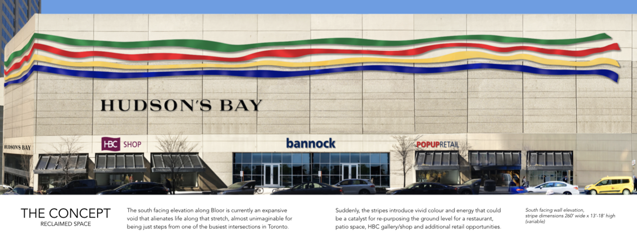
It is my unsolicited proposal. HBC is in the midst of a corporate battle for ownership of the company, https://www.theglobeandmail.com/business/article-catalyst-makes-rival-bid-for-hbc/
I will admit that it is a bit like "putting lipstick on a pig" , but short of ripping off the entire frontage and creating a new entry altogether (difficult given the split level construction of the store, subway entrance and pedestrian concourse below) this is an affordable way to revive the facade.
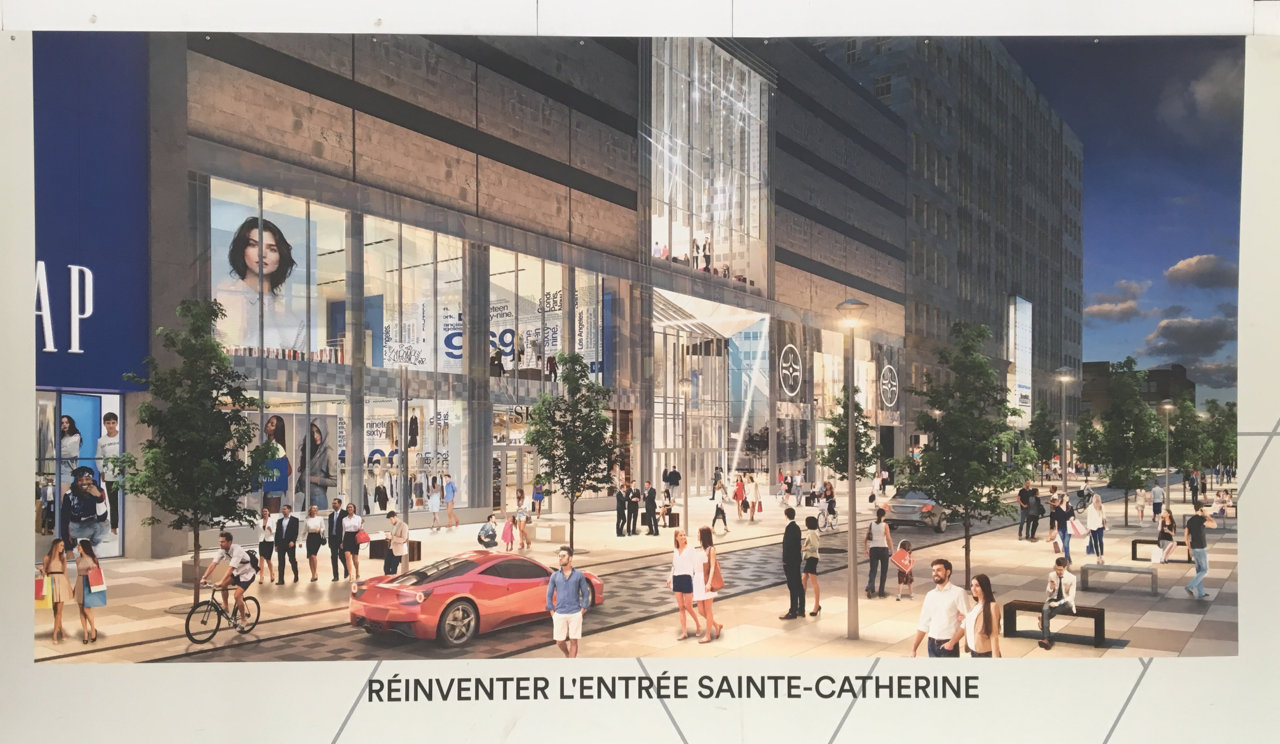
Consider the facelift being given to the former Eaton Centre on rue Ste. Catherine in Montreal, below:
Of course, in light of the massive developments at One Bloor East and West, the temptation would be to replace the store altogether with a multi-use tower. The real estate is just too valuable for the existing building to remain as it is.
maestro
Senior Member
The value is in the retail. It would require a complete reconstruction so why not throw up a residential tower too. Inserting a residential tower to command top value could prove difficult.
AlvinofDiaspar
Moderator
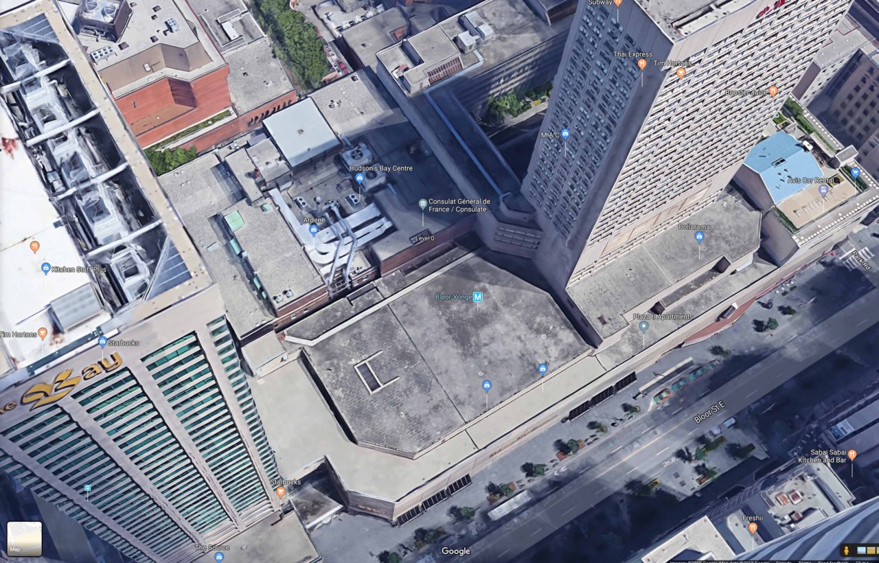
Yeah, whatever space there is left for a tower will have to contend with the fact that it will be sitting right atop the Y+B subway station.
AoD
AoD
zang
Senior Member
Really; the entire facade need not be replaced; vertical windows could be put into every other column of panels, creating glass up the entirety of the building, and the diagonal sw corner (that faces the intersection) could be made full glass, bringing interior light and destroying the bunker look of the building. Re-build the entrances (including the condo) to fit flush (no ugly mid-70s pigeon-crap awnings) into the vertical glass panels, and rework the weird double entrance at that s/w side so that all concourse/bay traffic is funnelled through the corner-facing entrance. Perhaps a small street level café where the south-facing doors are there.
The above would give street-side interest and give a more traditionally spaced department-store window display look to it—something that could be turned into the modern equivalent of the wonderful Queen St. displays at Xmas time (and give Holt Renfrew a run for their money in the street display category). It wouldn't be as expensive as a full facadoplasty, and finally gives HBC a good reason to get rid of the weird, confusing entrance layout, including the barely-used mid-Bloor entrance that comes across as a massive waste of space.
The above would give street-side interest and give a more traditionally spaced department-store window display look to it—something that could be turned into the modern equivalent of the wonderful Queen St. displays at Xmas time (and give Holt Renfrew a run for their money in the street display category). It wouldn't be as expensive as a full facadoplasty, and finally gives HBC a good reason to get rid of the weird, confusing entrance layout, including the barely-used mid-Bloor entrance that comes across as a massive waste of space.
Last edited:
maestro
Senior Member
Lipstick on a pig. The Bay needed to be gutted 20 years. It's also a rental tower above a hotel.
I was thinking minimal distances could be an issue with a large infill tower. The Bell Building takes up a lot of space on the block behind the Bay Store.
I was thinking minimal distances could be an issue with a large infill tower. The Bell Building takes up a lot of space on the block behind the Bay Store.
Last edited:
Folio
New Member
There is sufficient space for another tower—biggest challenge is the subway station below, I think.
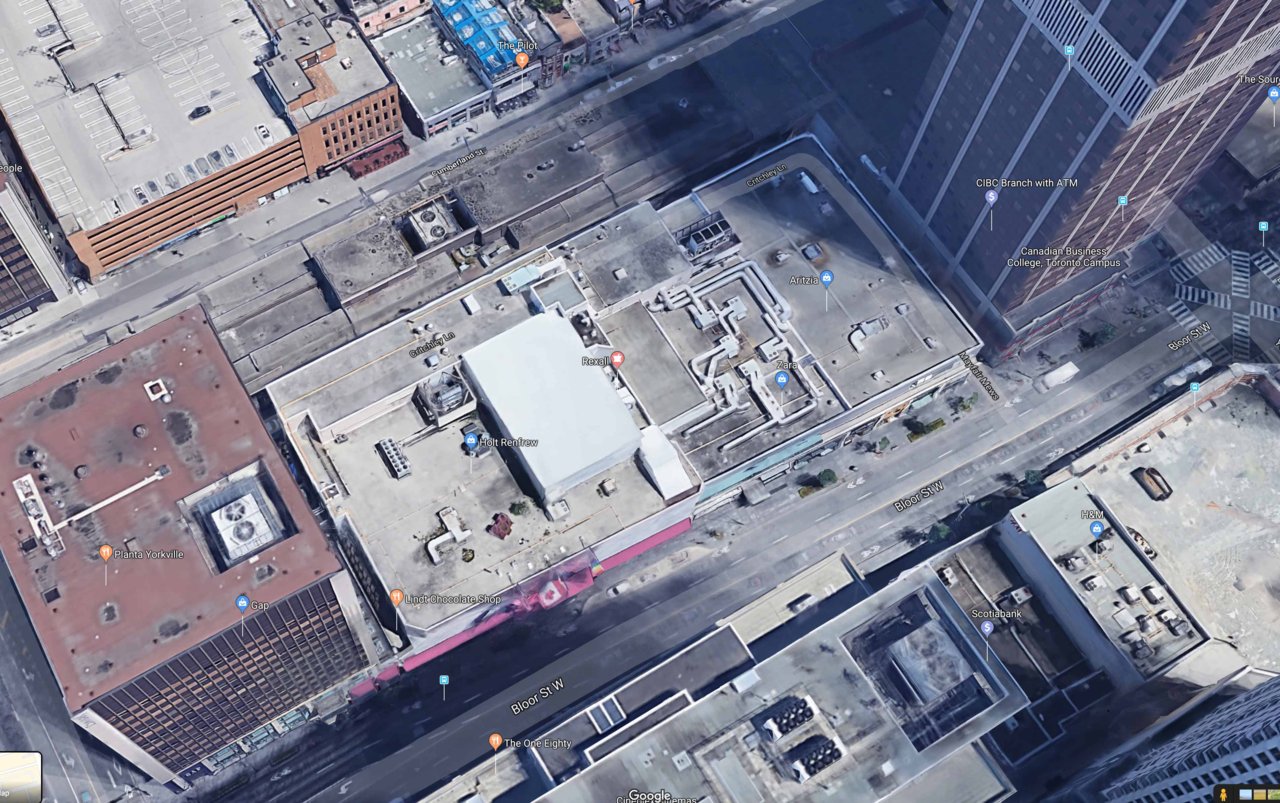
I suspect that the Holt Renfrew building west of Yonge (currently getting a facelift) will eventually be replaced with a denser development as well.


I suspect that the Holt Renfrew building west of Yonge (currently getting a facelift) will eventually be replaced with a denser development as well.
awaterwell
New Member
As someone who actually likes the look of this store (albeit as a tourist), I think this is a good way to make it more visually interesting and street-facing while maintaining the monumental wall.
3Dementia
Senior Member
"Tear down the wall" ... the lipstick won't stick long enough. There's likely no business case for a facade makeover but the only thing that will save this precast beast is glass/transparency. Windows looking in at busy HBC shoppers in-store and HBC yummy wares displays - would be a mega advertisement. How to pay for it? LOL- signage would help a bit... blank canvas at Yonge/Bloor. (maybe some politically correct HBC historical images + First Nations art to mitigate.
ahmedyusali
Member
it is better opaque wall to replace glass walls similar the podium of one bloor east so the area will be more attractive..
junctionist
Senior Member
Everyone always seemed to hate this looming wall over Bloor Street without windows on the upper floor. That's why it always puzzled me that no one questioned the plans to do it again on Harbour Street that resulted in the construction of the Harbour Plaza Residences podium.
ProjectEnd
Superstar
There was plenty of discussion about how that was a bad idea. It's completely untrue that it was 'unquestioned'.
zang
Senior Member
There was plenty of discussion about how that was a bad idea. It's completely untrue that it was 'unquestioned'.
On top of which, HBC has great swaths of flat, unremarkable concrete at street level, making it even less inviting.
Johnny Au
Senior Member
HBC could have adorned it with a mural of the history of HBC, especially given that it is the oldest surviving business in North America.On top of which, HBC has great swaths of flat, unremarkable concrete at street level, making it even less inviting.