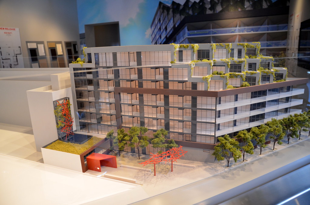
Toronto Howard Park Residences | 24.99m | 8s | Triumph | RAW Design

It is just a rendering ... likely the real-life built product will be a building with terraces (without the greenery)

Otherwise known as "the cheapening."

It looks like they may have placed the bushes on the top portion intentionally so that each unit has two windows facing into the same terrace instead of awkward all-glass windows facing your neighbours as they sun tan. If this is the case, these gardens my have a separate entrance for maintenance. But whether some builder will want to sacrifice precious square footage to create privacy or an aesthetic feature remains to be seen.

It's a shame too if this gets pushed aside, since the garden features of this building are really what make it unique.
 
It is just a rendering ... likely the real-life built product will be a building with terraces (without the greenery)

If that is true, then u'd have a second terrace for each unit that looks into their neighbours. I also realize the same problem with the lower triangle balconies. They could maybe solve this by dividing the units awkwardly creating triangular rooms. It is impossible to put a divider in that balcony as it is really small already.

I appreciate new modern buildings with interesting shapes like this, but this is not an efficient use of space.
 
Not convinced by the accusation that space is being used inefficiently here - the shape of the lot dictates that something be triangular here, and the balconies seem to be the most obvious spot. There are a number of assumptions being made here before we get a look at the floorplans - I am looking forward to their release!

42
 
There is something wrong with the Canadian development business model if only large scale projects are viable. In Berlin, where labour costs are high, land values modest, and construction standards put ours to shame, gorgeous 15 to 50 unit residential infill projects in areas very similar to this are the norm.

I suspect it may be a matter of "form follows finance", where credit might only be made available for larger scale projects. Many people would prefer a smaller building with fewer neighbours. Such a financing situation which would be unacceptable if true, because smaller infill can make a city a lot more interesting architecturally and also more vibrant with a greater variety of housing and commercial space. Small infill projects help fill in the gaps in low-rise neighbourhoods without necessitating buildings that are too tall to fit in or the destruction of heritage buildings.

In terms of this building, the Howard Park frontage is really long and looks like it may end up feeling monotonous in spite of the variation between the sections with and without balconies. The greenery is there to distract from the sea of grey and black and the tiring repetition of design elements like the angled balconies. Some colourful accents wouldn't have been expensive and would go a long way towards accentuating the design elements and introducing transitions between them. I'm surprised and disappointed about the lack of Dundas West frontage and thus potential flatiron, but if a smaller project could be built there, it would be a positive development.
 
From http://twitter.com/Urbanation

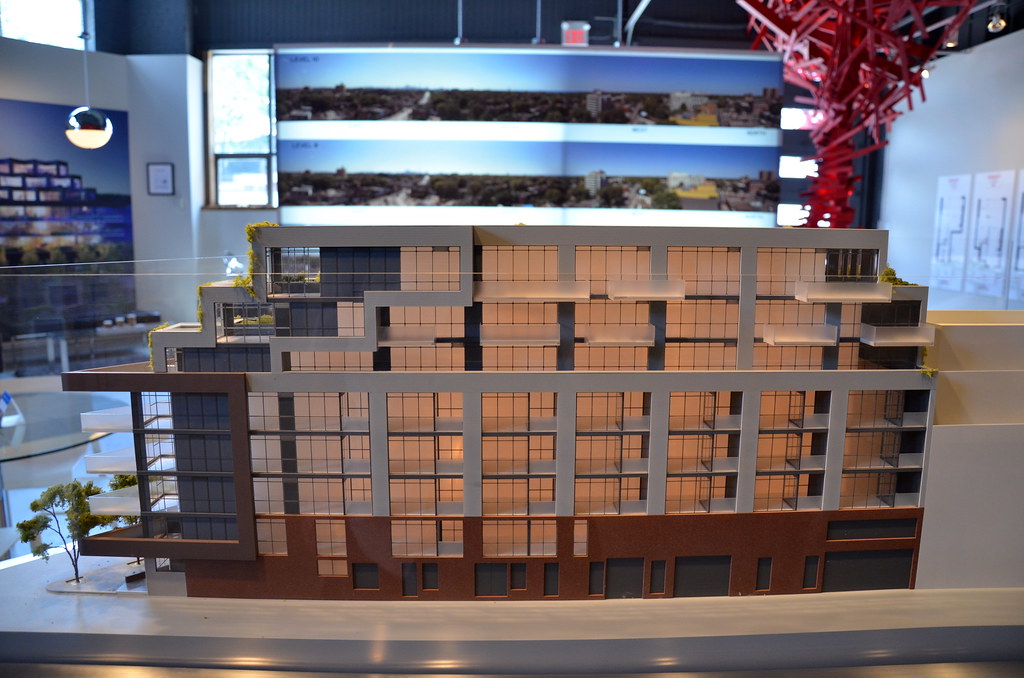
Howard Park's scale model:
howard.png

howard1.png
 
http://www.insidetoronto.com/news/local/article/1253951--residents-say-development-is-too-big

Residents say development is too big

ERIN HATFIELD|Nov 30, 2011 - 12:08 PM


A proposed development on Howard Park Avenue in Roncesvalles Village is just too big, neighbours say.
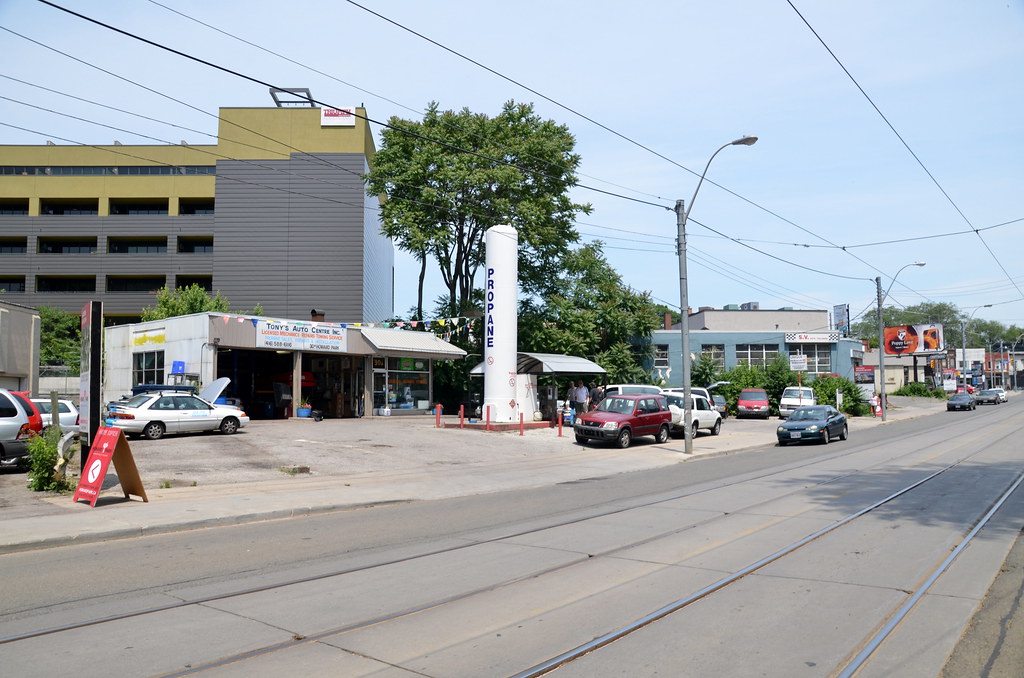
A collection of properties, mainly auto shops along Howard Park between Roncesvalles Avenue and Dundas St. W., is the site of a proposed 10-story development.

Many in attendance also expressed concern over the building being entirely residential and asked consideration be given to having retail on the ground floor.

The development would consist of two buildings, one with 104 units including 14 townhouses and a mix of bachelor, one- and two-bedroom condos on the upper floors and a second building with 96 units, including five two-storey townhomes.

"This is a large unusual site and a site we think is appropriate for more height," said Roland Rom Colthoff, an architect with RAW Design.

In this area, the city has, through its Avenues and Mid-rise Buildings Guidelines, stated a building in this area should be no taller than six storeys.
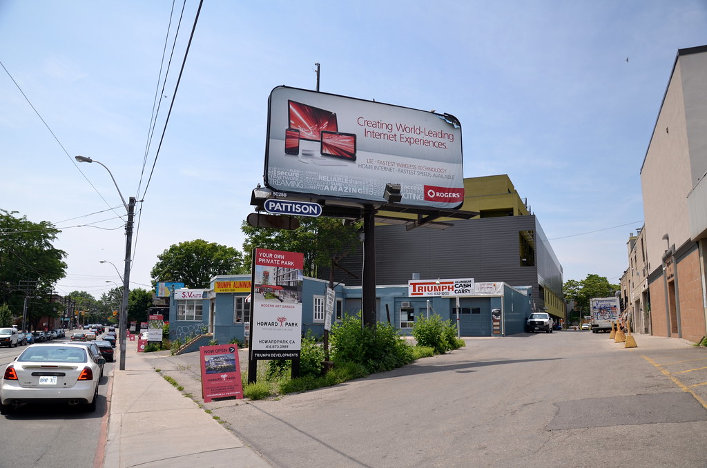
 
This project looks great, but there's a huge mechanical garage on the corner. Does the developr own that as well/ will it change?
 
Went to sales centre. They confirmed the change in height of building from 10 floors to 8 floors. Many of the top floor plans (larger units) are being modified to accommodate the reduction in # of units. Also talk of changing to Geothermal.
 
Was driving by the area and dropped in (street signage actually works, who would have thought) ... the prices seemed 'reasonable' for the sqft and usage of space. The sales rep talked a lot about Geothermal. Relatively close to the TTC Dundas West Station as well as the GO (much quicker route directly to Union). From the sales board in looked 80-90% sold ... handful of North facing units available ... looked like the ones with the triangle terraces have all been sold
 
Stop into the sales office on Sat and the model of phase 2 is missing.

Building is 50% sold and hope to start construction late fall, with a 2014 completion date.

First phase is at the east end next to the first building and the lane-way.

Photos to follow.
 
June 16
The site
7401383750_d15795a9a1_b.jpg


7401374654_72c472c3d2_b.jpg


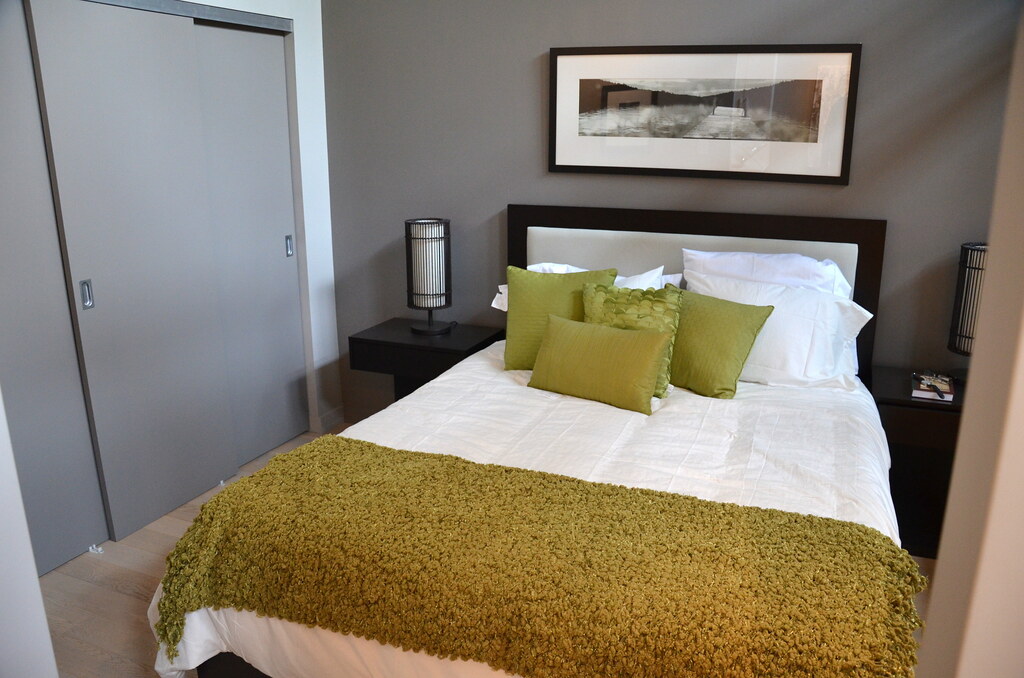
Smaller than what I have now.
7401363670_2f0d97e22d_b.jpg


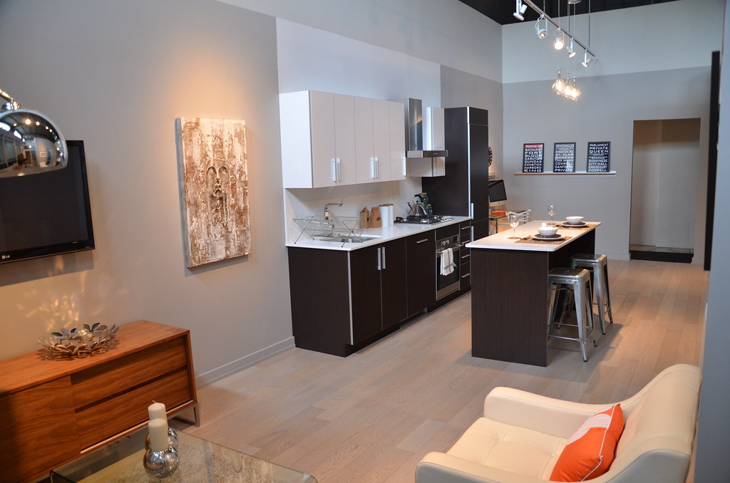
Like the layout for the 610 sq ft unit
7401359548_a2887668f3_b.jpg


The lane-way view
7401365626_c00a0cb5cf_b.jpg


7401352980_3e283b3036_b.jpg
 
…but is still relegated to small: the model is two floors shorter than the rendering was.

42
 

Back
Top