Toronto Hospital For Sick Children: Patient Support Centre | 99.06m | 22s | Sick Kids | B+H

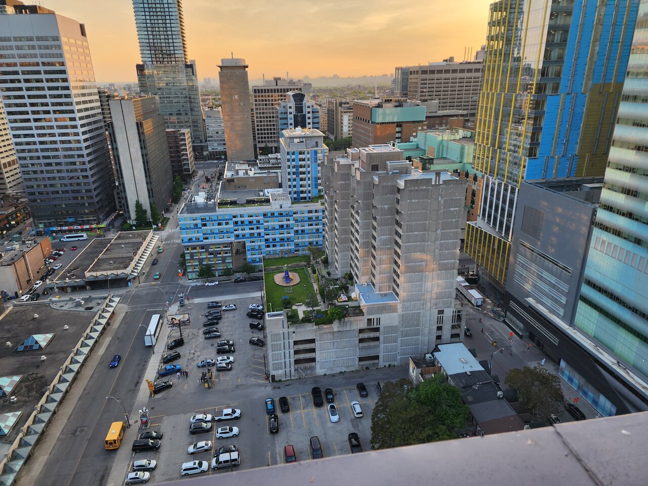
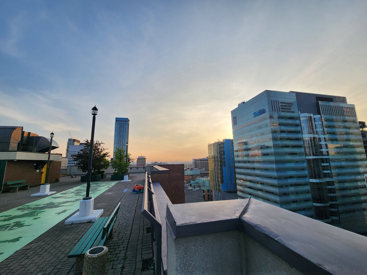
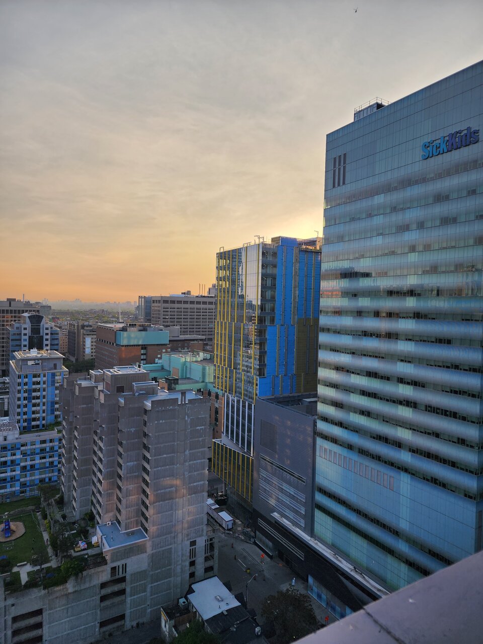
Saturday evening rooftop views.

20230527_200053.jpg
20230527_195813.jpg
20230527_200030.jpg
 
No big updates w/the building at substantial completion, nonetheless, a visual record of the finishing efforts as the streetscape begins go in, etc.

Photos taken July 19th, 2023:

DSC02213.jpg


DSC02214.jpg


DSC02215.jpg


And one from the south-west, at a distance, for good measure:
DSC02224.jpg
 
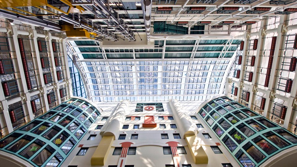
Sick Kids' new buildings are getting a lot of well-deserved attention. The architecture is wonderful. But the 1990s expansion designed by Eberhard Zeidler doesn't seem to get much attention anymore. That's too bad because the quality of its architecture is stunning:

Eyuqho1WgAAEVLx

Source

It's arguably the most impressive atrium in the city. The glass-faced stairs and elevators, the vintage aviation-style corridor lighting, the massive clock, the tasteful use of colour, and the many differentiated facades rising above a piazza-like space make for a wonderful architectural experience.

Zeidler apparently had a lot of creative freedom and a healthy budget. The end result continues to shine to this day. I hope Sick Kids plans to keep maintaining it in great condition for generations.
 
Last edited:

Back
Top