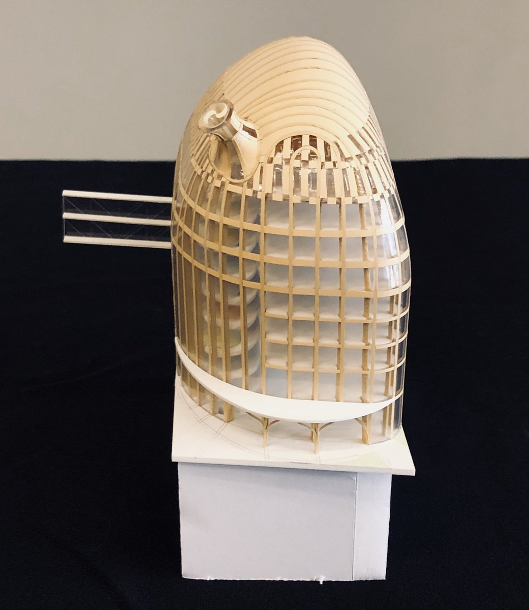
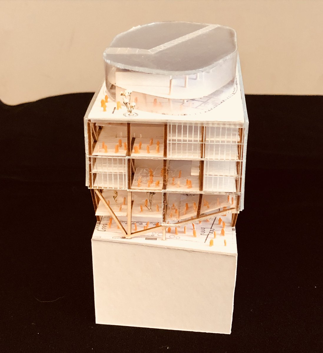
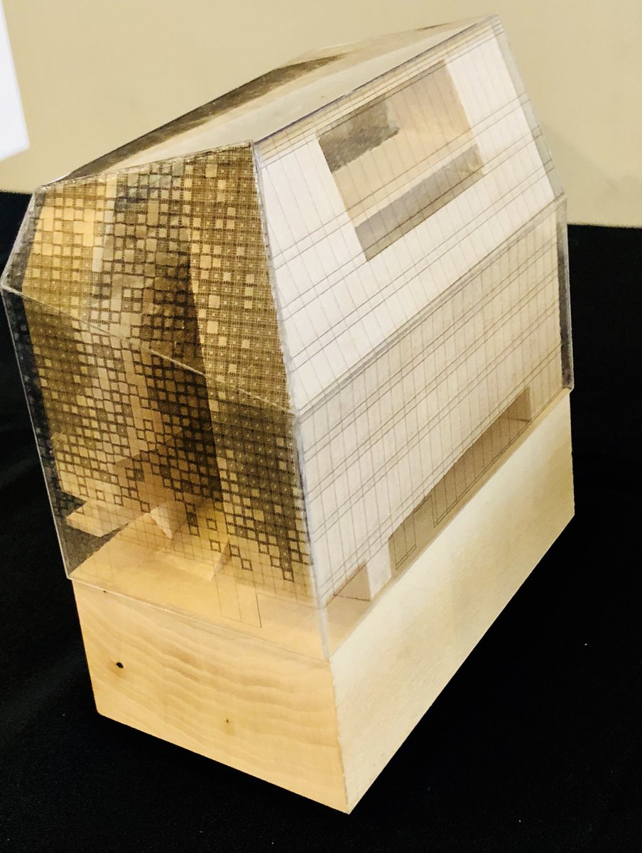
Toronto George Brown College: Limberlost Place | 52.5m | 10s | George Brown | Moriyama Teshima Architects

Which of the four finalist design teams' concept do you prefer?

  • Moriyama & Teshima Architects + Acton Ostry Architects

  • Patkau Architects + MJMA

  • Provencher Roy + Turner Fleischer

  • Shigeru Ban + Brook McIlroy


Results are only viewable after voting.
Few new renderings (and model) from M&T's Instagram:

upload_2018-3-27_13-13-56.png


upload_2018-3-27_13-14-15.png


upload_2018-3-27_13-14-35.png


upload_2018-3-27_13-15-12.png


And one from Patkau's Insta:

upload_2018-3-27_13-17-32.png
 

Attachments

  • upload_2018-3-27_13-13-56.png
    upload_2018-3-27_13-13-56.png
    626.2 KB · Views: 797
  • upload_2018-3-27_13-14-15.png
    upload_2018-3-27_13-14-15.png
    380.6 KB · Views: 663
  • upload_2018-3-27_13-14-35.png
    upload_2018-3-27_13-14-35.png
    619.8 KB · Views: 755
  • upload_2018-3-27_13-15-12.png
    upload_2018-3-27_13-15-12.png
    188.5 KB · Views: 675
  • upload_2018-3-27_13-17-32.png
    upload_2018-3-27_13-17-32.png
    690.1 KB · Views: 696
Patkau
Moriyama+Teshima
Shigeru Ban
Provencher Roy

In that order for me. But I can totally see Ban winning simply because it's a Ban building...
 
Well, now I just feel guilty for asking for the voting box on this thread. I didn't realize people would abuse a voting system that means nothing outside of our UT realm.
 
The Moriyama design was the best in my opinion; MJMA second. Moriyama gave a great presentation and their design wasn't based around buzzwords and the concept of "open, flexible space" that has become far too relied upon in design circles much to the frustration of end users. The concept of "breathing rooms", spaces of respite, and the "three bar" arrangement with sliding walls was very coherent and functional, as well as a very clear concept that drove the design. The all CLT construction method was also very interesting and the pitch was very strong.

MJMA in close second. The building science aspect was very strong and the design was sexy, but I am critical of the "everything is open" approach, a somewhat ambiguous concept, and those massive trusses at the top space are ugly - it would be better to just use columns than to have those messing up your floor to floor height in that top-level space.

I'm normally a big MJMA fan and a bit meh on Moriyama but after the presentations, that's my assessment.

Not a fan of Shigeru proposal (despite how striking it is) and Turner Fleischer's design just has way too much going on, especially for an early competition design. The concept was muddy and incoherent.
 

Back
Top