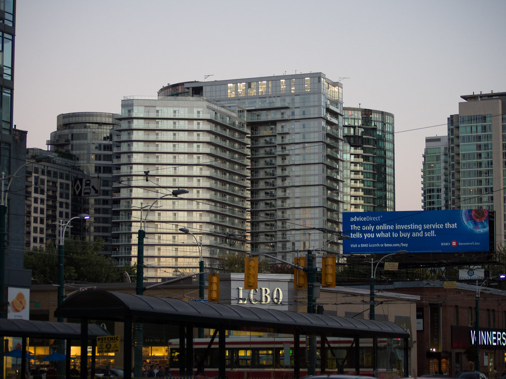
Toronto Fly Condos | ?m | 24s | Empire | Graziani + Corazza

The zipper façade is the only interesting part of the building.

Yes, the zipper had plenty of potential and I quite like the effect (though not the execution). Otherwise this thing is a G+C dud with many head-scratching choices made on its various elevations.
 
Yes, the zipper had plenty of potential and I quite like the effect (though not the execution). Otherwise this thing is a G+C dud with many head-scratching choices made on its various elevations.

It's decent infill that is designed to fade into the background while contributing to a strong streetwall effect.

Once that lot to the west gets built with something more extroverted, this will probably be judged as something solid but unspectacular. Given some of the other buildings that have gone up on Front St over the last 25 years, that's quite arguably some small success.
 
A building can be well-designed/ architecturally appealing but still fade into the background. ;) This fades into the background and contributes to the streetwall but that doesn't gain it much architectural value.
 
Remember that this building was originally proposed with a lot more going on architecturally, and then it was released just as things were falling apart in 2008. It was redesigned more cheaply on purpose so that they could bring the prices in lower, and it managed to sell through the downturn. Think of Fly in its historical context, as a monument to Lehman Brothers!

42


still doesn't make the wall of emergency exits facing Front acceptable.
 
Pic taken august 22, 2013


GxOrtfQ.jpg
 
I wish they would put up some sort of coloured transparent blinds in the mechanical room at the top of this building. Right now it is a white light eyesore at night.
 
Do developers and architects find florescent lights attractive? The same thing is happening at the new buildings going up in the Distillery. You can clearly see unattractive florescent lights in the top floor. Could they not have found a more attractive type of lighting? It looks so cheap and tacky.
 
Do developers and architects find florescent lights attractive? The same thing is happening at the new buildings going up in the Distillery. You can clearly see unattractive florescent lights in the top floor. Could they not have found a more attractive type of lighting? It looks so cheap and tacky.

The interior lights are fine but most of the time, there is added a coloured window film on the interior of the glass or coloured transparent blinds that can be rolled up and down. There are examples of the both of these in CityPlace.
 
I wish they would put up some sort of coloured transparent blinds in the mechanical room at the top of this building. Right now it is a white light eyesore at night.

According to the Empire site coordinator for Fly, the developer was aware of the issue regarding the lighting in the mechanical penthouse, and there were intentions to have it addressed, but the specific nature of the solution (or not) was to be determined, and it would take many months for the issue to work its way through the processes at Empire.
 
translucent or frosted glass would be the best solution for mechanical penthouse cladding, it could be illuminated from the inside without seeing the mess of stuff in the mechanical rooms. I don't know why no developers have done that.
 

Back
Top