You are using an out of date browser. It may not display this or other websites correctly.
You should upgrade or use an alternative browser.
You should upgrade or use an alternative browser.
Toronto Eight Cumberland | 170m | 51s | Great Gulf | a—A
- Thread starter urbandreamer
- Start date
Benito
Senior Member
Today.
jackattack
Active Member
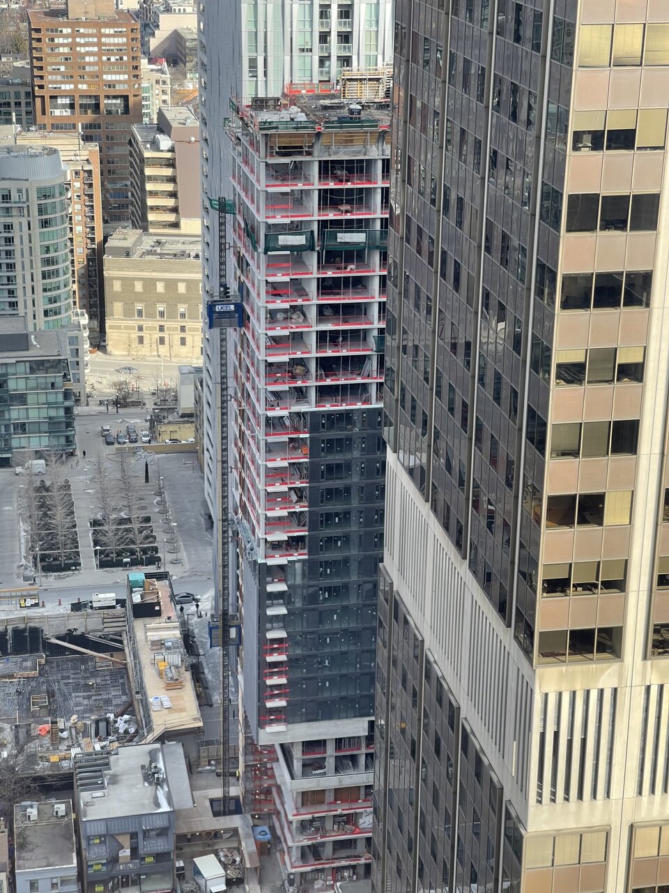
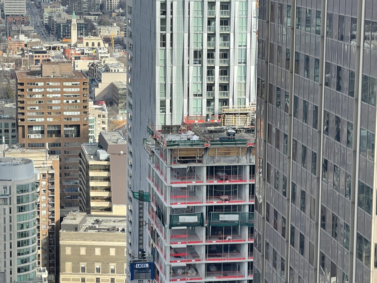
A few from Sun Jan 16:
Looking south from 1 Yorkville
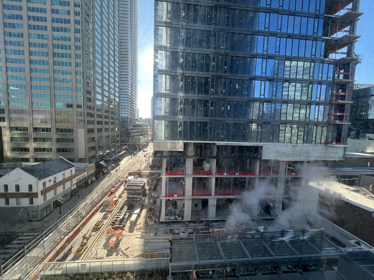
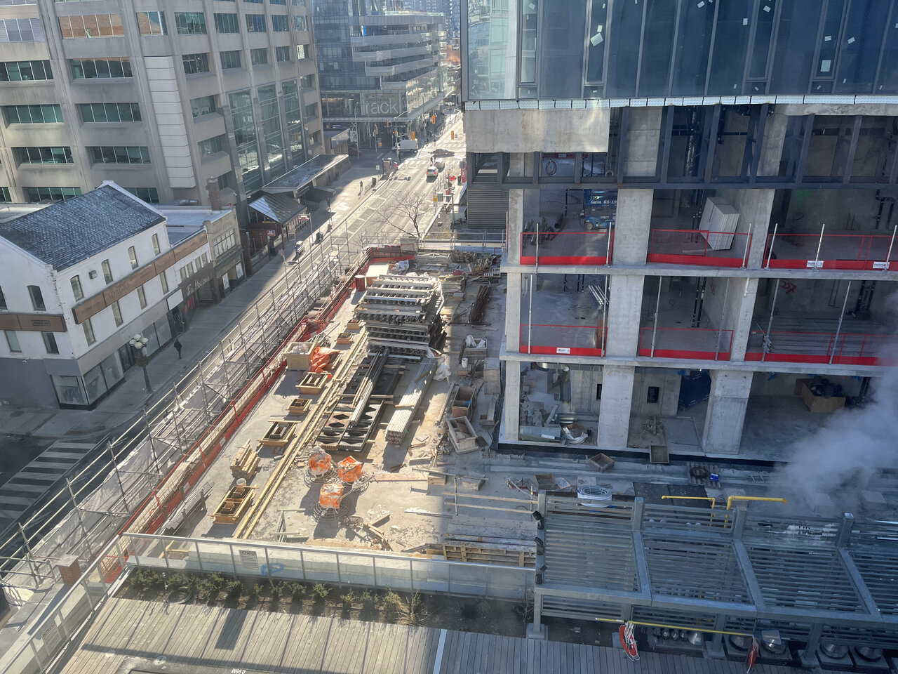
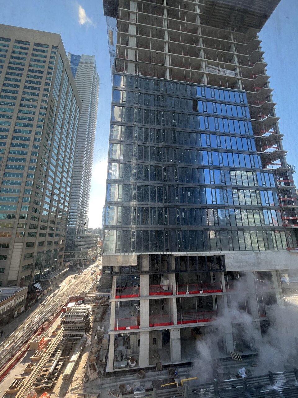
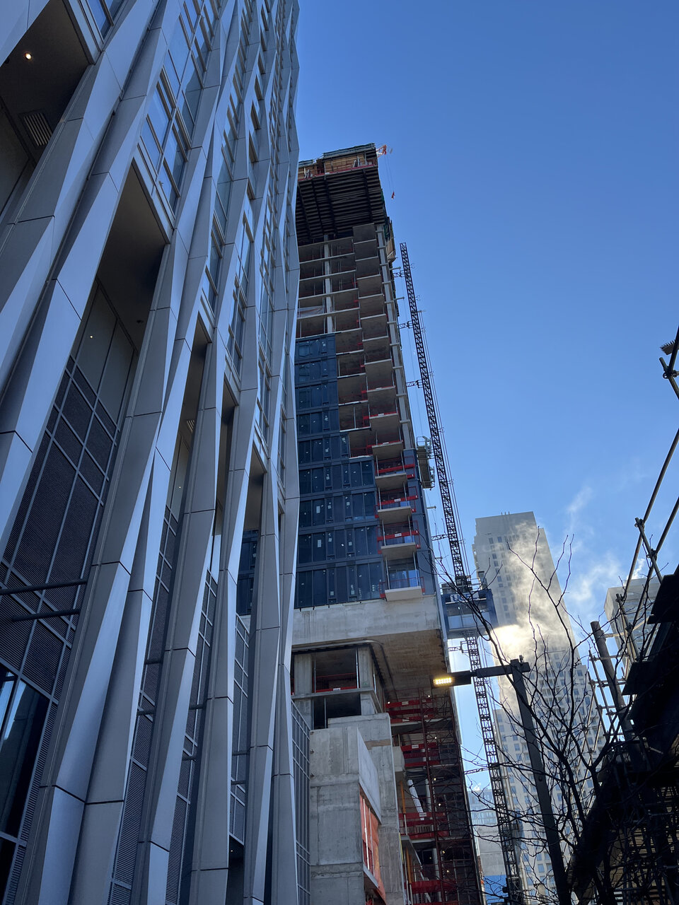
East along Cumberland
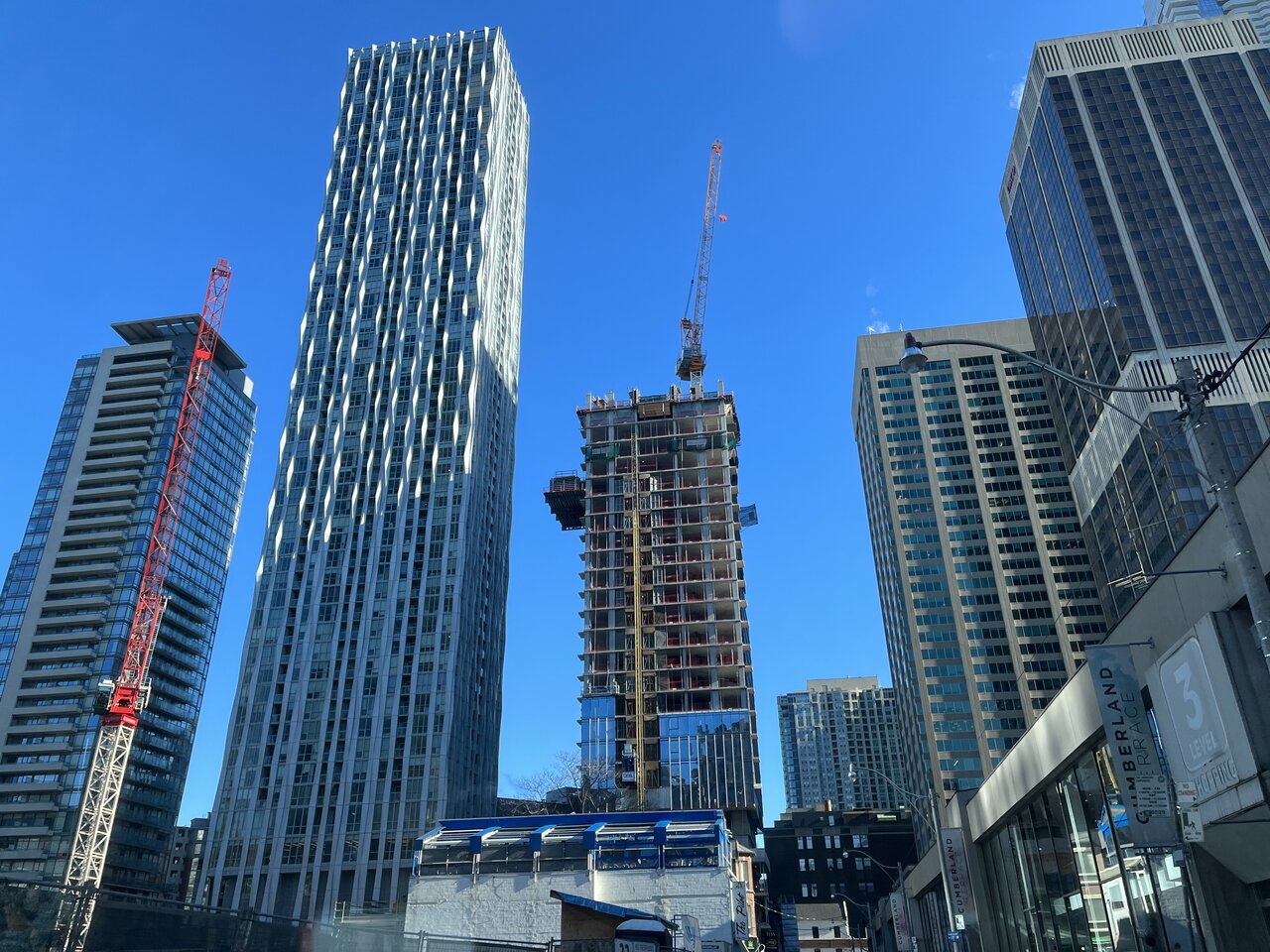
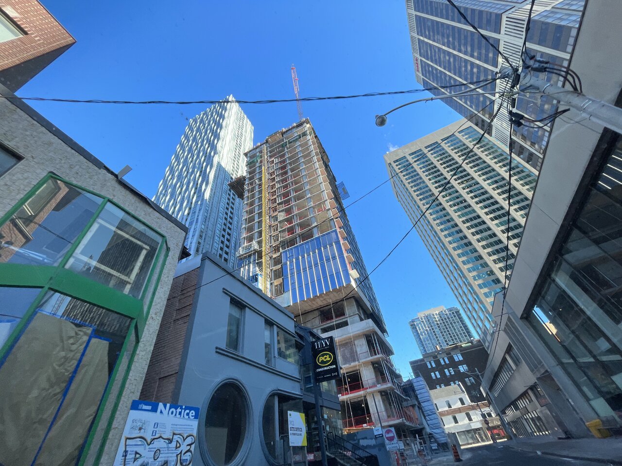
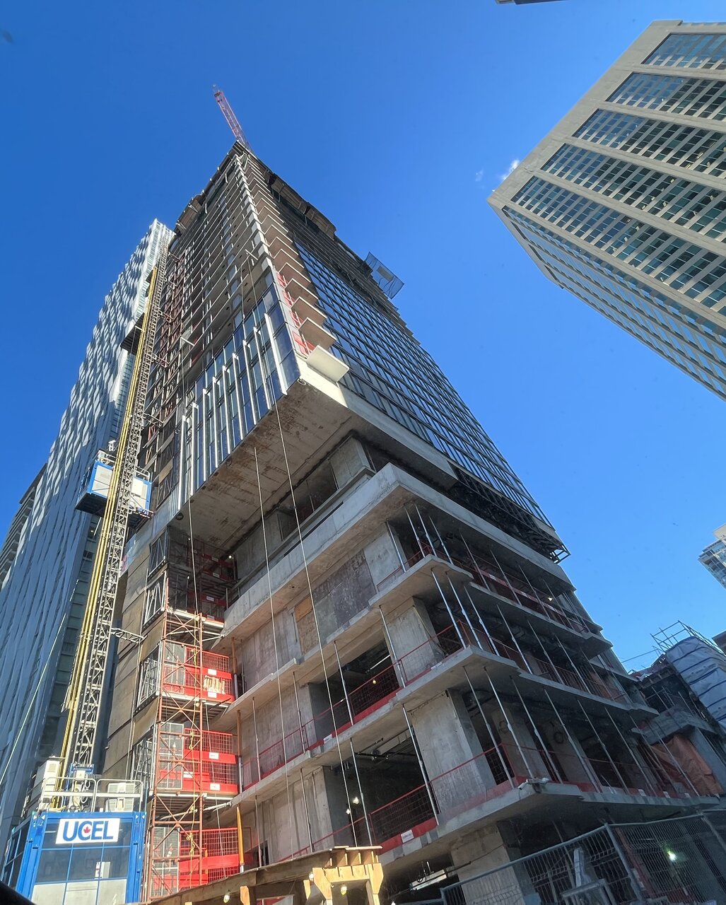
Looking north from 1 Bloor E (48th floor):
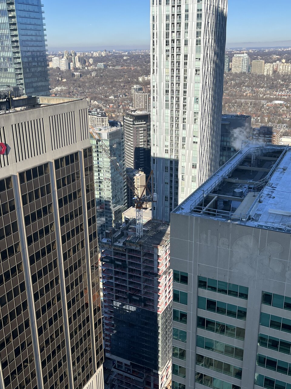
Looking south from 1 Yorkville
East along Cumberland
Looking north from 1 Bloor E (48th floor):
Last edited:
stjames2queenwest
Senior Member
Not gonna lie it’s Pretty hard to be optimistic about this one. Hopefully some fins and blue skies will help.
unrealestate
Active Member
great gulf has become one of the worst developers in the city. they are consistently pumping out low quality trash
limer
Active Member
JSO
New Member
I thought Nobu was bad but this one just doesn't have any hope. Same goes with 357 King West.
ProjectEnd
Superstar
Great post. Really tremendous stuff there.I thought Nobu was bad but this one just doesn't have any hope. Same goes with 357 King West.
Northern Light
Superstar
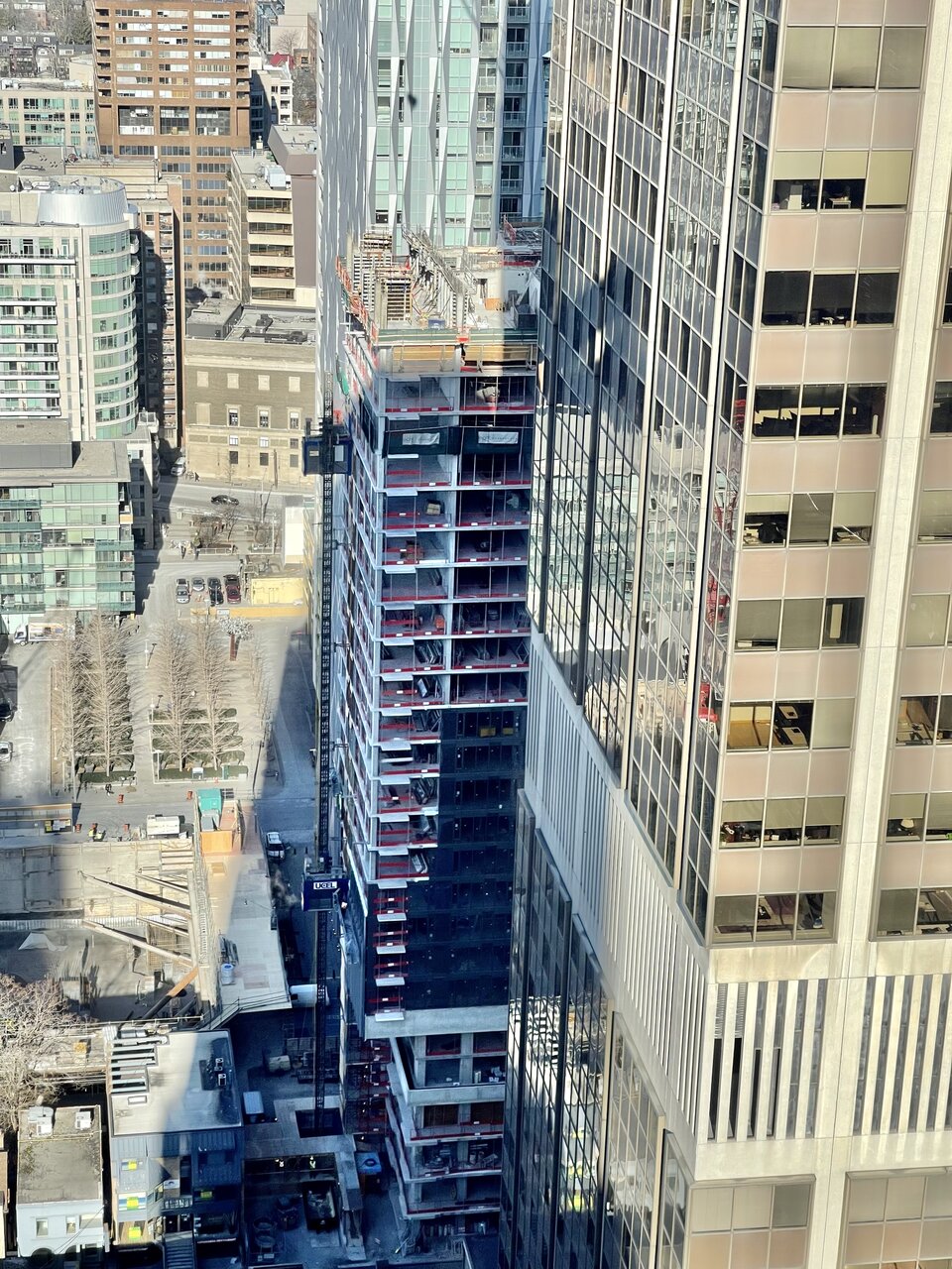
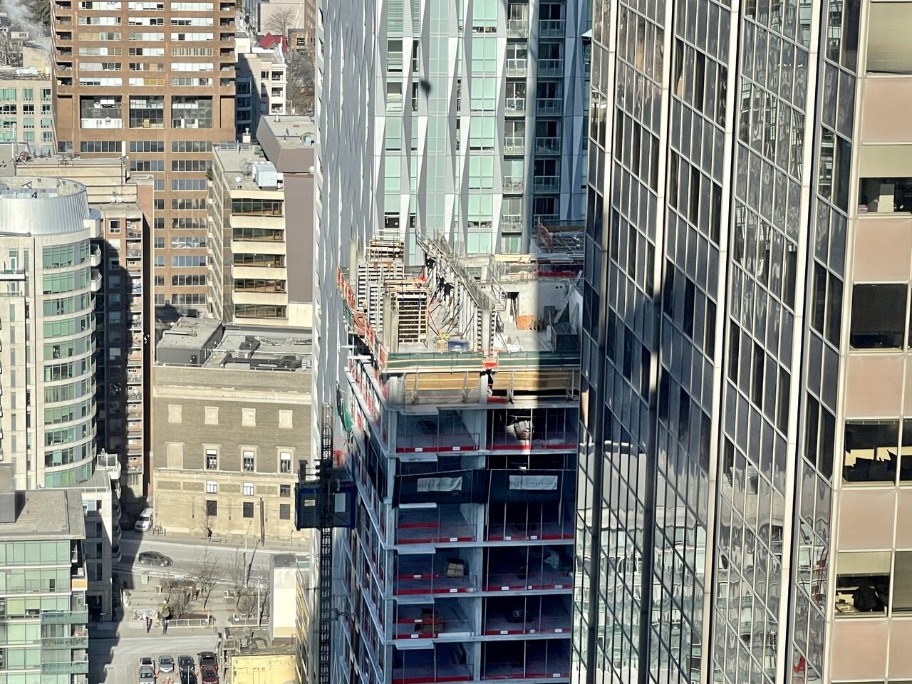
Photos taken February 1st, 2022:
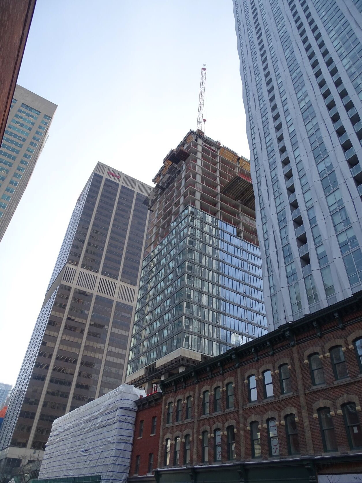
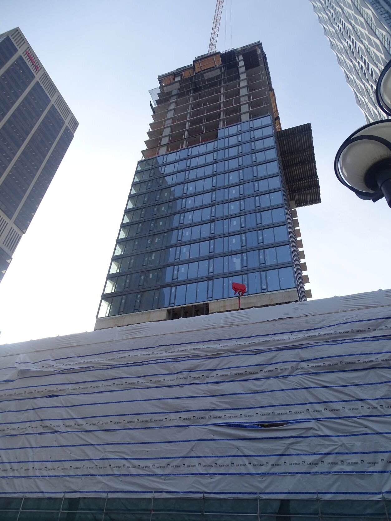
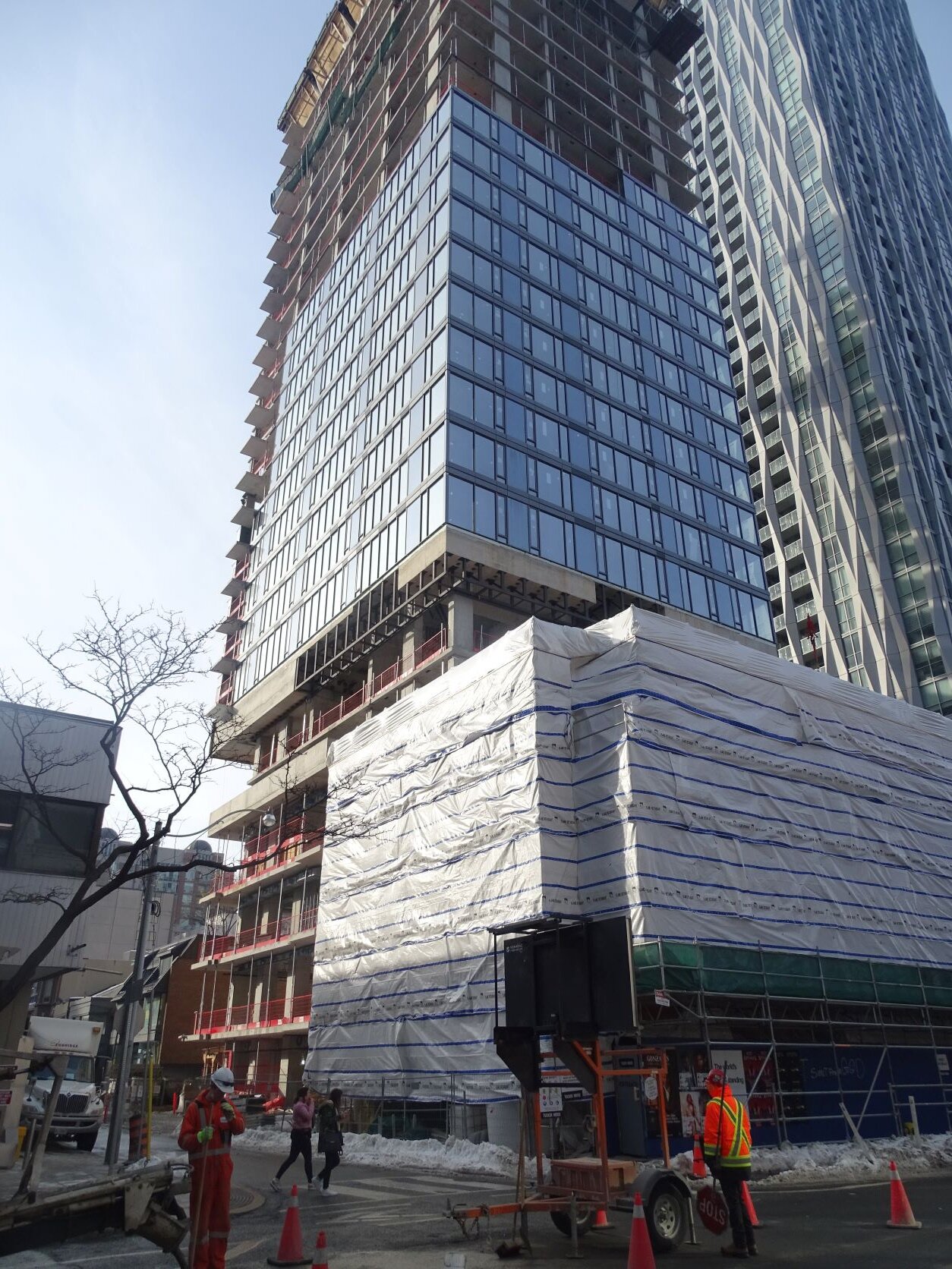
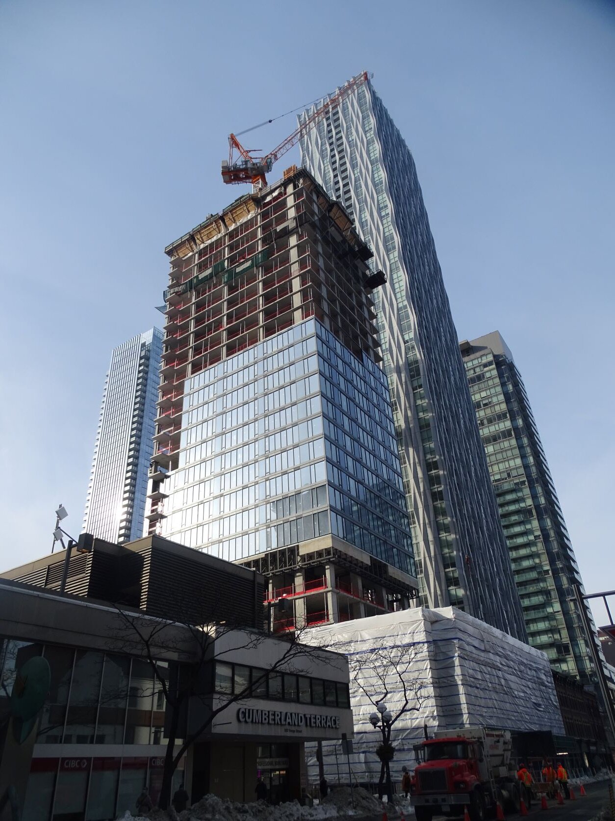
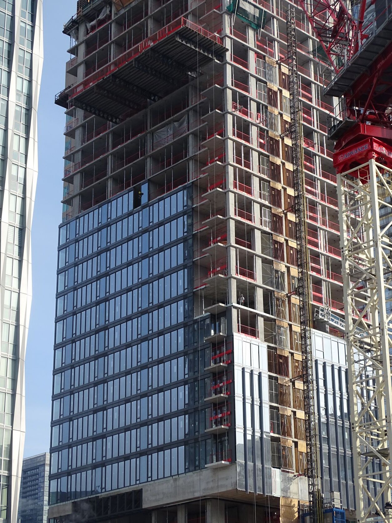
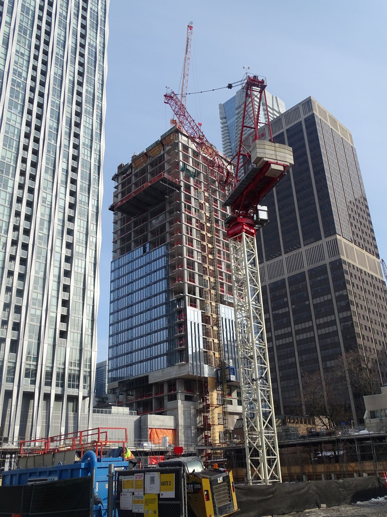
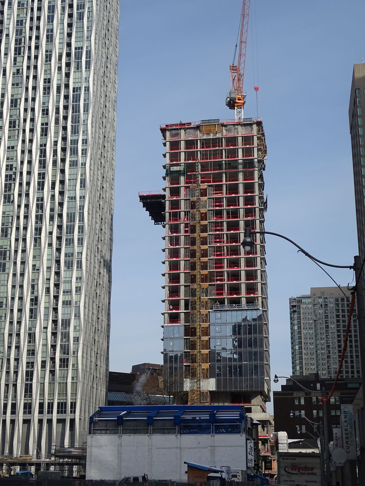
And peeking out over Holts from the south side of Bloor
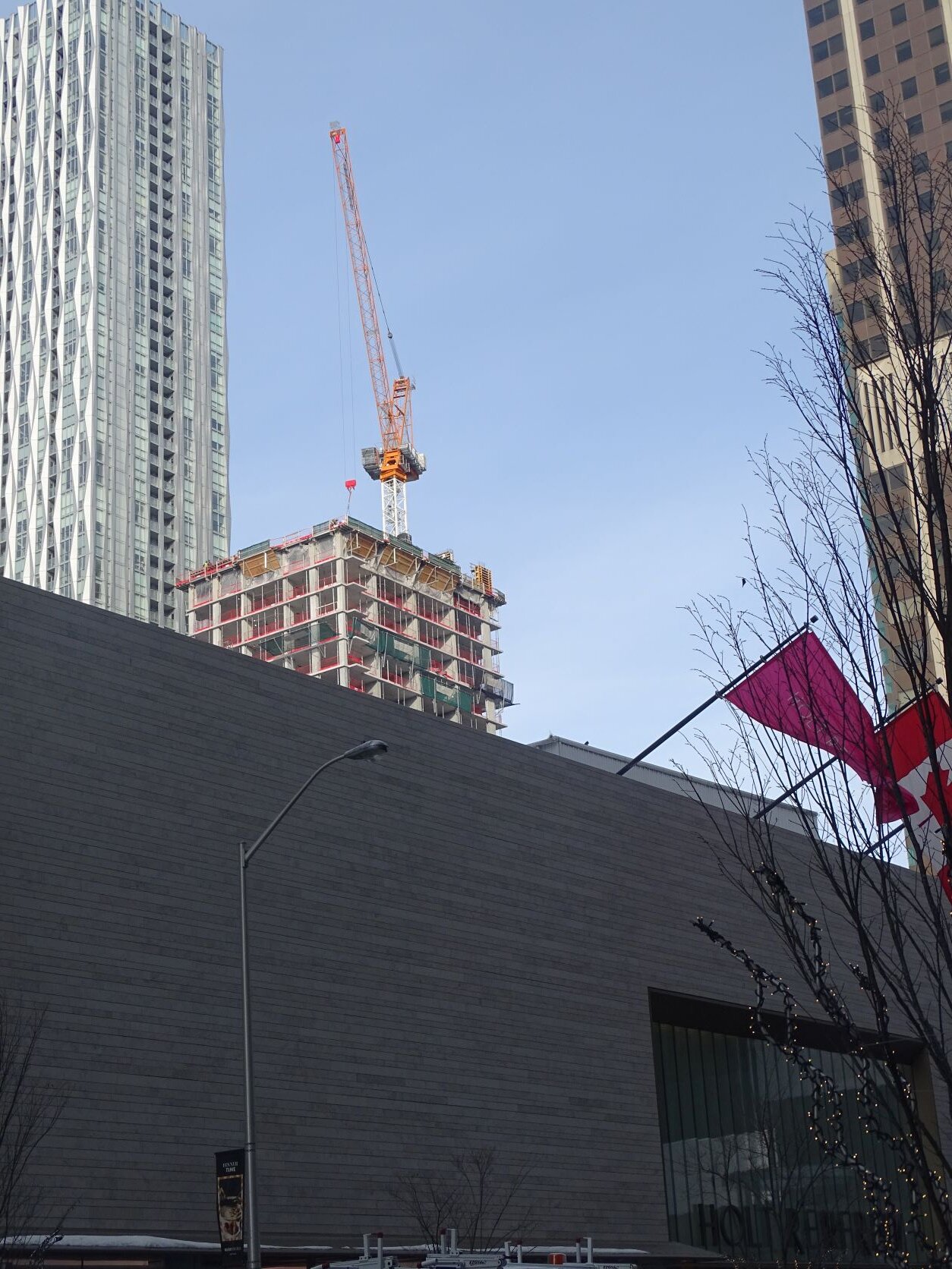
And peeking out over Holts from the south side of Bloor
Benito
Senior Member
Today.
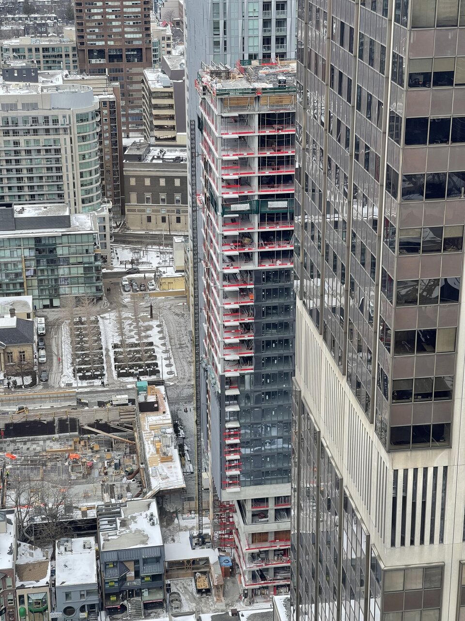
Domenico
Active Member
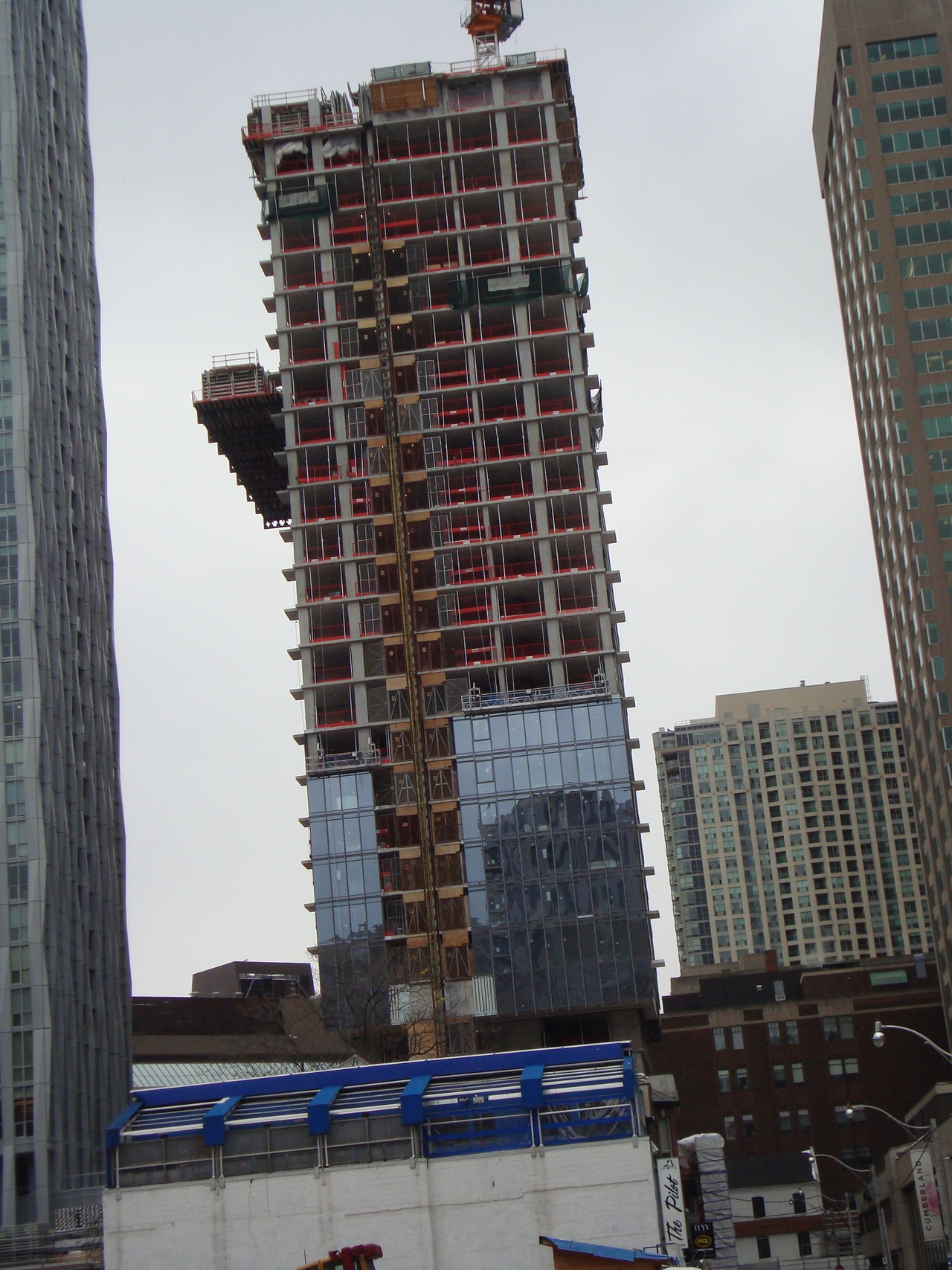
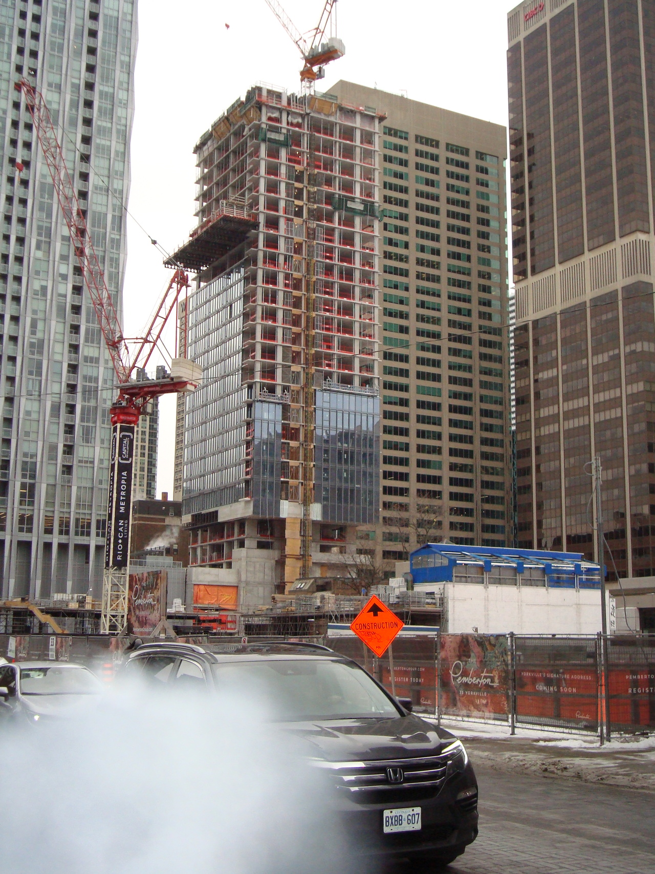
Shot from Bay Street. Moving quickly. Bad moon rising!
UtakataNoAnnex
Senior Member
Even with the reduction in horizontal mullions (as also used on Cumberland at Yorkville Plaza), the grey spandrel still looks soulless, meh and cheapened out. I'm pretty sure they are higher caliber window wall than used on many spandrel boxes we see, but it certainly makes a poor argument for itself that it is somehow supposed to be better or different, IMO.
Furthermore, the dramatic renders of white fins that supposed to define it, feels so far as it's tact on after thought in reality. And it only covers one side facing away from Yonge, so go figure.
...like a bad moon rising, indeed.
PS: I'm not knocking a-A for this @ProjectEnd...as like with all architect firms, they have to work with the tools that are given to them. /sigh
Last edited:
GabrielHurl
Active Member
Yesterday afternoon

Yegger
Active Member
I expected much better for this key location and neighbourhood.
Benito
Senior Member
Today.
