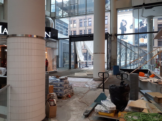
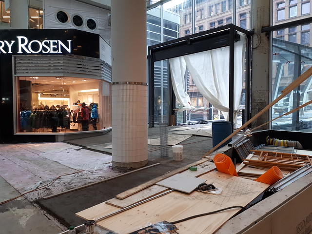
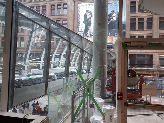
Toronto Eaton Centre (Ongoing Renewal) | ?m | ?s | Cadillac Fairview | Zeidler

It's worth noting that "town planning" used to be an Olympic competition. I wonder if we would medal in it today.

It was really a medal for planning an individual building or building complex. All four gold medals and five of the eight others went to stadiums, the other three went to parks.
 
Today.
F7A7F8BB-CE89-4C1C-8E63-231CA08FD234.jpeg
4A2B6A22-FDE8-4EAA-B432-A8F858A8CCC3.jpeg
 

Attachments

  • F7A7F8BB-CE89-4C1C-8E63-231CA08FD234.jpeg
    F7A7F8BB-CE89-4C1C-8E63-231CA08FD234.jpeg
    258.4 KB · Views: 365
  • 4A2B6A22-FDE8-4EAA-B432-A8F858A8CCC3.jpeg
    4A2B6A22-FDE8-4EAA-B432-A8F858A8CCC3.jpeg
    207.2 KB · Views: 406
With two different typefaces simply leaving some space there would have sufficed. I guess they could just remove the vertical bar and all would be well
 
The symbol between CF and Home is a vertical bar: |

Read here: https://en.wikipedia.org/wiki/Vertical_bar
A vertical bar (from a typographical standpoint) should *always* extend above and below the X-height of the preceding/successive text. It acts as a positive visual gutter between two statements/words and is meant to stand out from the rest of the text. Otherwise the questions arise: Is it a vertical bar? Is it the letter I? Is it a lowercase L?.

Seriously, CF designers should know this. But I suspect that some committee or marketing manager somewhere said "but it looks weird. Make it the same height." Much as I'm sure interesting architectural designs are beaten down into beige-tinted suburban mediocrity when their buildings need a reno.
 
I thought the trailing vertical bar in red was an exclamation point at first, although I did see the first vertical bar as a vertical bar. It is oddly done.
 
Didn't even notice the vertical bar at the end there to be honest. It's the first one that really bothers me!
 

Back
Top