Toronto Concord Canada House | 231.97m | 74s | Concord Adex | Arcadis

You dont need to look at the renderings. If you hear the name "Concord", just automatically know that the project will be bad, and there's virtually no hope for it.

There was that saying that there are 2 things guaranteed in life, but really there are 3 things guaranteed: death, taxes, and virtually all developments from Concord being bad quality.

Yeah I've read that from just being here, but I still look at the renderings and say "if it comes out like that, it will be decent". My prayer is they don't screw up YSL.
 
I must be totally naive because every time I look at the renderings, it doesn't look that bad to me...lol.

The renders don't look 'that bad'..........so much as they look:

1) Bland

2) Unoriginal

3) Disappointing for a 'signature tower' as this was billed

4) Leaves lots of room for Concord to muck it up with poor execution; taking a banal, mundane, lackluster effort and quite possibly turning into an eyesore for a few generations.

I still have hope that for once they prove everyone wrong...lol.
 
One thing that really scares me about this development is the lack of daytime photos of the towers. This is going to be the tallest building in the skyline west of the CN Tower and we're almost certainly getting a cheap spandrel monstrosity.
Menkes has been doing the same with Sugar Wharf, and it's bugged me quite a bit. They are building some of the largest buildings in the city and refuse to be honest about what finishes they are actually using (even in city documents, where this type of stuff should be), we are lucky they are actually pretty okay so far.

As for this project, there are architectural documents (from June 2021) to explain some of what we are going to see. In summary these are going to be generally pretty boring of average quality, unfortunate considered it should be a signature tower.

I'm happy about the density but there should've been something more here to really make it stand out, both at grade and looking up. The lights will be cool though... if they work.🤞

Ground floor: It will likely gonna suffer from too much curtain wall at grade and make the walking experience pretty plain, hopefully the plantings and landscaping will break it up. It will look very much like the curtainwall facades on other Cityplace buildings.

1629340771383.png


Midrise podium: Based on documents I expect this part to be finished off decently well. It'll be rather plain with dark grey brick but it shouldn't appear too messy. So again, plain.

1629341034879.png


Towers: Full height windows, depending on the side there is generally not an over abundance of spandrel (should be a bare minimum but design haus really lowered that bar), the color is grey as per usual, that could mean anything though, dark or light who knows my guess is towards the lighter end based on other sources, dark grey mullions. There is still an art component on the crowns, the tower art seems to have shifted to being a focus on the maple leaves. My one concern lies on the slab covers. They are visible on these elevations also showing how the lights would function... I think they intend to make the leaves visible during the day but i'm not sure if i'm reading the elevations wrong. SEE EDIT BELOW


1629341277493.png
1629342357406.png


EDIT: Okay I don't know why I didn't connect the fact that the slab covers were a physical part of the balcony but that means my prediction was right, and also explains the lack of daylight renders. The tower will feature the leaf motifs made out of white grey and gold metals slabs which will be visible during the day, and which will have LEDs mounted on top of (light blue on documents). This may really change how the tower looks; but it really does ride on the right materials being chosen or the pattern may just flop.

1629343840769.png


It is visible in this render but looks incredibly sloppy... Obviously the render artist didn't know what they were.

1629344104470.png
 

Attachments

  • 1629343138976.png
    1629343138976.png
    267.5 KB · Views: 152
Last edited:
Menkes has been doing the same with Sugar Wharf, and it's bugged me quite a bit. They are building some of the largest buildings in the city and refuse to be honest about what finishes they are actually using (even in city documents, where this type of stuff should be), we are lucky they are actually pretty okay so far.

As for this project, there are architectural documents (from June 2021) to explain some of what we are going to see. In summary these are going to be generally pretty boring of average quality, unfortunate considered it should be a signature tower.

I'm happy about the density but there should've been something more here to really make it stand out, both at grade and looking up. The lights will be cool though... if they work.🤞

Ground floor: It will likely gonna suffer from too much curtain wall at grade and make the walking experience pretty plain, hopefully the plantings and landscaping will break it up. It will look very much like the curtainwall facades on other Cityplace buildings.

View attachment 342557

Midrise podium: Based on documents I expect this part to be finished off decently well. It'll be rather plain with dark grey brick but it shouldn't appear too messy. So again, plain.

View attachment 342558

Towers: Full height windows, depending on the side there is generally not an over abundance of spandrel (should be a bare minimum but design haus really lowered that bar), the color is grey as per usual, that could mean anything though, dark or light who knows my guess is towards the lighter end based on other sources, dark grey mullions. There is still an art component on the crowns, but the loss of art along the inner tower corners will make them boring as well. My one concern lies on the slab covers. They are visible on these elevations also showing how the lights would function... I think they intend to make the leaves visible during the day but i'm not sure if i'm reading the elevations wrong. SEE EDIT BELOW


View attachment 342559View attachment 342563

Particularly this section really needed some color, now it'll be a boring wall (North facing) will likely be blocked by by other developments anyways, but that's no reason to just like give up.

View attachment 342564

EDIT: Okay I don't know why I didn't connect the fact that the slab covers were a physical part of the balcony but that means my prediction was right, and also explains the lack of daylight renders. The tower will feature the leaf motifs made out of white grey and gold metals slabs which will be visible during the day, and which will have LEDs mounted on top of (light blue on documents). This may really change how the tower looks; but it really does ride on the right materials being chosen.

View attachment 342566

It is visible in this render but looks incredibly sloppy... Obviously the render artist didn't know what they were.

View attachment 342567
Okay, since there's no detail renders giving an idea of what the metal slab covers will look like let alone the towers, I made a quick photoshop on another Cityplace building to give an idea now knowing the colours.

Note that the window wall will be a bit different (no waist height mullions). Also the slab covers being used appear thicker than the ones I drew, least to say, the pattern will only be visible from a distance. But maybe, just maybe if done well (it'll be ugly if done poorly) these may actually make these buildings interesting enough to be... 'signature'? whatever that is. Glad to see some gold nevertheless, and explains where the tower public art component went to. Hope I'm not the only one just realizing this haha.

canadahouse.jpg


Also excuse my rough interpretation of the leaf, the documents show something clearer (and larger)

canadahouse1.jpg
 
Last edited:
I don't have super high expectations but I agree with c-mac that the renders seem inoffensive and bland at worst. Could they totally screw it up and it be horrible, absolutely it's Concord.

It's definitely not going to be some centerpiece prestigious building. But hey, I'll take something that's decent and isn't an eyesore in this area any day
 
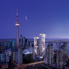
This has been popping up on my Facebook page, with the caption: For better views, you'll have to move into the CN Tower. Concord Canada House is redefining waterfront life in Toronto. And when you click on it, it takes you to their website with the tagline: An Iconic Addition To Downtown Toronto.😂😂😂

239858919_23848890912110415_261714337257754759_n.jpg

Credit: Concord Canada House
 
This has been popping up on my Facebook page, with the caption: For better views, you'll have to move into the CN Tower. Concord Canada House is redefining waterfront life in Toronto. And when you click on it, it takes you to their website with the tagline: An Iconic Addition To Downtown Toronto.😂😂😂

View attachment 348554
Credit: Concord Canada House

I very much disagree with the idea that the CN Tower would have a better view.

It follows logically that the better view is the one in which you will NOT see Concord Canada House!

So CCH does indeed have the better view!
 
I very much disagree with the idea that the CN Tower would have a better view.

It follows logically that the better view is the one in which you will NOT see Concord Canada House!

So CCH does indeed have the better view!
I'm with you there. Just like in Paris they say the Tour Montparnasse has a better view than the Eiffel Tower because that's the only place where you can't see the Tour Montparnasse.
 
I'm with you there. Just like in Paris they say the Tour Montparnasse has a better view than the Eiffel Tower because that's the only place where you can't see the Tour Montparnasse.
There was a late 19th Century writer named Guy de Maupassant. He supposedly ate lunch in the Eiffel Tower's restaurant every day because it was the one place in Paris where the tower was not visible.
 

Back
Top