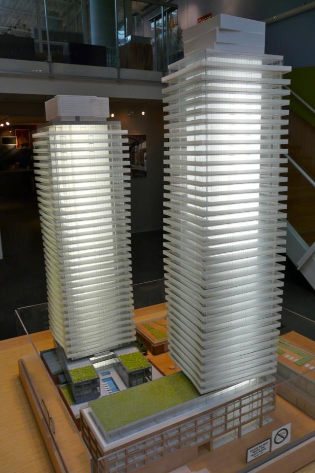
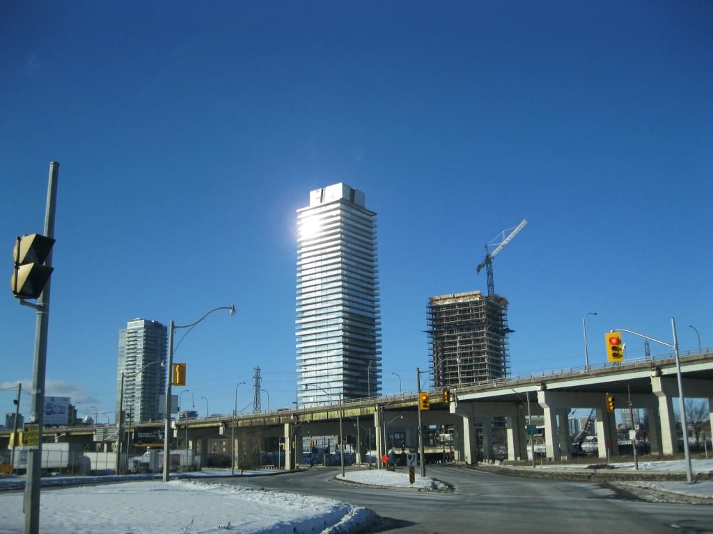
Toronto Clear Spirit | 131.36m | 40s | Cityscape | a—A

From a distance, the mechanical box looks quite inelegant. The tower has this delicate look with its subtle angularity and quality glass, and then there's this heavy looking box on the roof with generic cladding that's out of proportion with the rest of the building, like the architects just gave up designing the building at that point. At least, I hope that's not the final cladding we see for the box. The first tower in the Distillery District also doesn't have a very refined roof line, but this one looks worse.
 
The retail looks good, so I disagree with the comment above / the industrial look works great here !

Here's the best part, those angled pillars at the podium; You can walk right up to em / around em, it's great ! This really looks amazing, great focus on the details so far.

Well, then I guess you'll be happy because we are seeing this same industrial look in all the new retail spaces of condos, in Toronto. Too bad they didn't inflict this stylish look into all the retail/public areas of all our new 5 star hotels. I can just picture the ceiling of the Four Seasons with the same stylish roof as Bed, Bath & Beyond. I'm sure once word spreads, tourists from around the world will flock here to see our grey spandrel boxes and our ubiquitous but very trendy, unfinished ceilings. Yes, cheap assed-looking ceilings, indeed, something to be proud of. And just imagine, there are probably hundreds more on the way. YIPEE!!!

And on a serious note, what's up with the florescent-like lighting in the rooftop box? It just doesn't look right.
 
Last edited:
But ceilings here, why similar in concept to bed batch and beyond, are much better ! We'll need someone to take pictures to compare.

Note if you saw the unfinished concrete wall outside that retail shop ... that's temporary ... if you walked over to see the east face of the building you'll see what that'll be clad with.

Well yes, of course they are better then BB&B but they are still not beautiful, interesting or original. It's just more of the same leave-it-as-is design we have been seeing in most new retail spaces. It wasn't desirable in Metropolis or BB&B and I was just expecting something a lot more stylish and creative. I just took a quick look around the last time I was there, so I didn't see all parts of the building in detail. I would much rather see designs that have a distinctive look that reflects the history of the district. I'm not a big fan of minimalism. I actually prefer detailed designs and materials that reflect warmth. Flat glass walls may be the in thing but I find them dreadfully boring and lacking in any creativity whatsoever. I much prefer red brick walls, wooden window frames and copper trim. Even if developers want to go modern, at least give us something with some design details and creativity. A little more originality would be much appreciated!
 
From a distance, the mechanical box looks quite inelegant. The tower has this delicate look with its subtle angularity and quality glass, and then there's this heavy looking box on the roof with generic cladding that's out of proportion with the rest of the building, like the architects just gave up designing the building at that point. At least, I hope that's not the final cladding we see for the box. The first tower in the Distillery District also doesn't have a very refined roof line, but this one looks worse.

Agreed, it really detracts from an otherwise stellar building. aA seems to be really hit or miss when it comes to integrating or disguising mechanical on their point towers. Burano is passable and thank goodness the mechanical for Market Wharf isn't at the top (the monstrous slab is bad enough). *Cough*X*Cough*. But then the mechanical on Casa is arguably the best feature. I hope their Swiss cheese on top of Ice doesn't ruin that one.

I don't intend to start an aA flame war, I like most of their work. Their record on mechanical however is not great.

That's a good point. SP!RE, NXT, 18 Yorkville, and the Four Seasons have architecturally refined roof levels. Casa has a "hat" but in my opinion, the slab is slightly too thin to properly resolve the architecture, and there's a generic mechanical grill between the top floor and the slab which doesn't look that refined. X's mechanical box greatly compromised the success of the architecture, and this project in the Distillery District might be aA's worst in this regard. (It might even be the worst example in the city.)
 
Last edited:
From a distance, the mechanical box looks quite inelegant. The tower has this delicate look with its subtle angularity and quality glass, and then there's this heavy looking box on the roof with generic cladding that's out of proportion with the rest of the building, like the architects just gave up designing the building at that point. At least, I hope that's not the final cladding we see for the box. The first tower in the Distillery District also doesn't have a very refined roof line, but this one looks worse.

It is the final cladding, and the mechanical box actually has higher quality glass and frames than the rest of the tower. It's true curtainwall, and they're very large units, much larger than anything else on the building. The proportions might be questionable, and the design might be iffy, but the execution was superlative. For what it's worth the views from inside the mechanical box are stunning.
 
It is the final cladding, and the mechanical box actually has higher quality glass and frames than the rest of the tower. It's true curtainwall, and they're very large units, much larger than anything else on the building. The proportions might be questionable, and the design might be iffy, but the execution was superlative. For what it's worth the views from inside the mechanical box are stunning.

Well if that is the case I would have preferred they use less expensive materials and stuck with the original staggered design:

urbantoronto-5491-17297.jpg

From here.

Looks as though we got something more similar to what was/is planned for the top of it's neighbour, the Gooderham. Hell, it's current form would have been fine had a different colour been chosen such that it didn't stick out so badly.
 
Wow. Shinier than a rendering. That's a first!

42
 

Back
Top