Toronto Cinema Tower | 142.64m | 43s | Daniels | Kirkor Architects

Comparing it to the render, it appears as though it still needs some paint. If not, than that really is bad.

And urban dreamer, this would be the artists fault not kirkor's.
 
Original renders:
Actual:

JAm5QxU.jpg
WOW. That looks like an entrance to a roller coaster ride. What's worse, it looks like it's made out of styrofoam!
I would seriously hate coming home to a cave like entrance like that. What a shame.
 
Last edited by a moderator:
I think this makes me like the building more, actually. Before, it was just boring. Now, it's kind of ridiculous. Perhaps I'll write my councillor and ask that the City institute a "1% for Outsider Art" program on new construction.
 
Well, just confirmed the project must have a rather low budget to start off with, given the 1% rule. Everything makes *complete* sense now. Razzie for this one.

Come to think of it, Toronto can use an H. R. Giger tower - designed by Santiago Calatrava with all the structural elements painted a glossy black.

Logan:

WOW. That looks like an entrance to a roller coaster ride. What's worse, it looks like it's made out of styrofoam!
I would seriously hate coming home to a cave like entrance like that. What a shame.

Well, on the other hand heading to a cave for people with Neanderthal tastes is entirely appropriate.

AoD
 
Last edited:
CINEMA TOWER’S INNOVATIVE PUBLIC ARTWORK
Posted on October 5th, 2011

Like many cities across North America, Toronto has a Percent for Public Art program. This means that every new development must devote one percent of construction costs towards an artwork that may be enjoyed by the public.

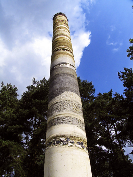
or may not, as the case may be.

in this case, the public is quite definitively not going to enjoy the art. because A. its incredibly ugly, and B. it's not art.

exceptions really need to be put into place when developers who KNOW NOTHING ABOUT ART commission garbage like this, from hacks like this guy, in order to win concessions from the city.

they should actually be penalized for foisting such utter crap on the city, not rewarded.
 
Last edited:
I can see what the artist was trying to do, but talk about terrible execution. The proportions, colours, and textures are all wrong. And why not clad that column in the middle as well? Would an extra set of column covers really have blown the budget?

At least this is hidden midblock on Widmer where the average Torontonian will probably never see it. It would have been disgraceful on Adelaide

Edit: Imagine the exact same concept, but instead of using that material (is it fibreglass?) the artist had gone off, cut actual stone to the same irregular profile, laminated it all together to create a sense of geological layering, and then treated / damaged the outer edges to give the impression of something cut out of the earth. And instead of such a cartoonish interpretation on the columns what if they'd gone with round columns, painted them to look like core samples, and then done a clear expoxy finish?

29_b_core.jpg

From http://www.dolphinwilding.com/gallery/33/94.html
 
Last edited:

Back
Top