You are using an out of date browser. It may not display this or other websites correctly.
You should upgrade or use an alternative browser.
You should upgrade or use an alternative browser.
Toronto Casa III Condos | 179.52m | 55s | Cresford | a—A
- Thread starter AlbertC
- Start date
G.L.17
Senior Member
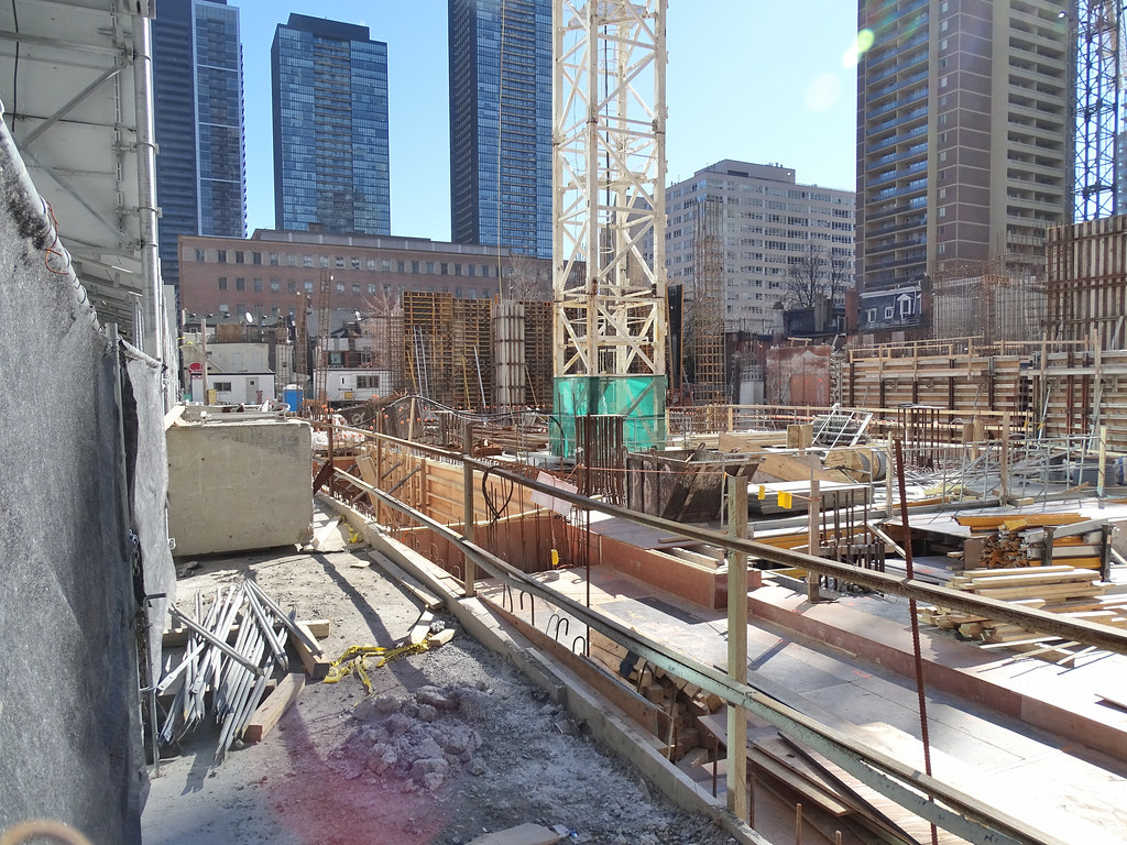
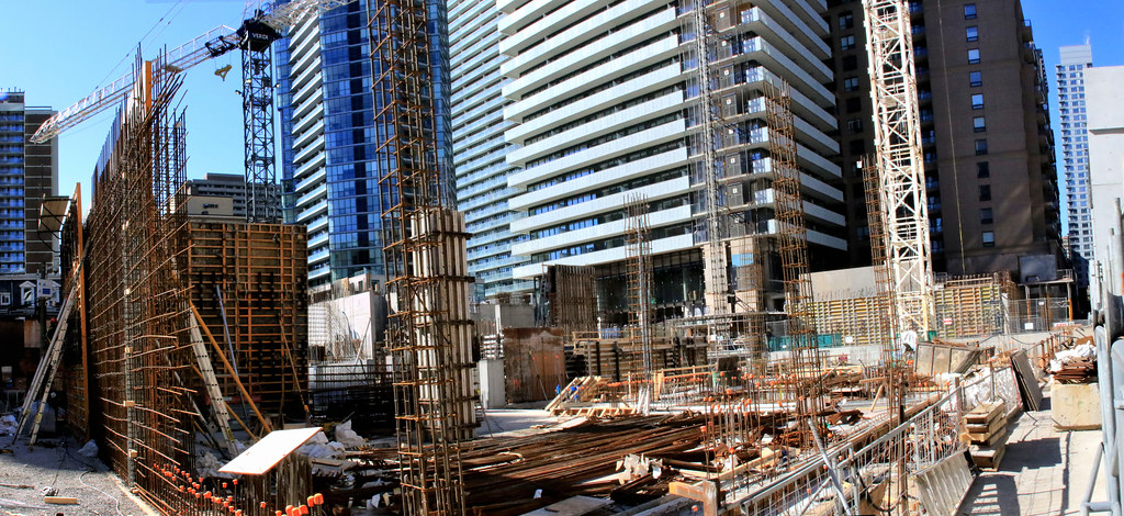
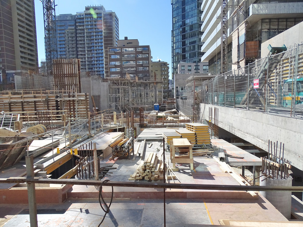
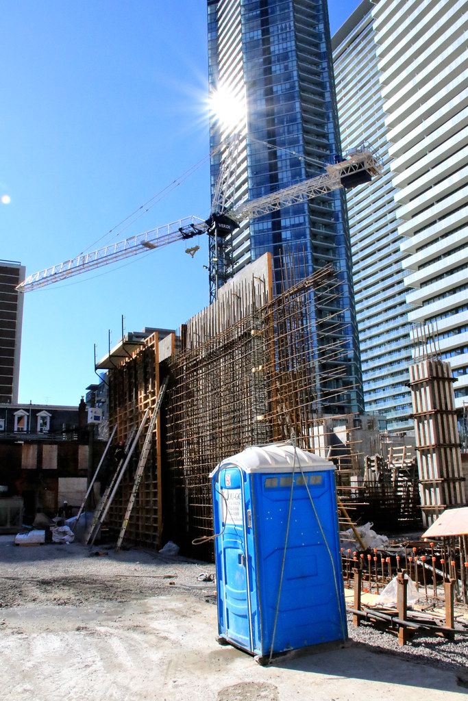
Starting to rise:


Attachments
-
 IMG_1046.jpg1.4 MB · Views: 1,670
 -
 IMG_1054.JPG2.1 MB · Views: 1,722
 -
 IMG_1051.JPG2.1 MB · Views: 1,676
 -
 IMG_1050.JPG1.8 MB · Views: 1,687
 -
 IMG_1048.JPG1.8 MB · Views: 1,626
 -
 IMG_1055.JPG2 MB · Views: 1,661
 -
 IMG_1057.JPG2.2 MB · Views: 1,665
 -
 IMG_1056.JPG2.1 MB · Views: 1,691
 -
 IMG_1058.JPG2.4 MB · Views: 2,228
Ramako
Moderator
There are so few renderings of this tower. Does anyone know what the top is supposed to look like?
Automation Gallery
Superstar
Still don't understand why these 2 bulldogs, (Casa-2/3) didn't break the 200 meter mark,
..they were both originally proposed taller (60s-200m+) and chopped, was there a shadow issue here? or did the city as usual want them shorter?
..they were both originally proposed taller (60s-200m+) and chopped, was there a shadow issue here? or did the city as usual want them shorter?
Benito
Senior Member
drum118
Superstar
March 19


Miscreant
Senior Member
Member Bio
- Joined
- Oct 9, 2011
- Messages
- 3,616
- Reaction score
- 1,795
- Location
- Where it's urban. And dense.
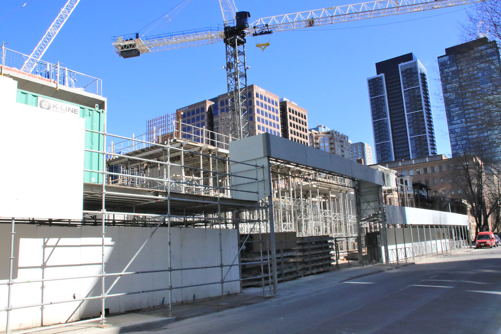
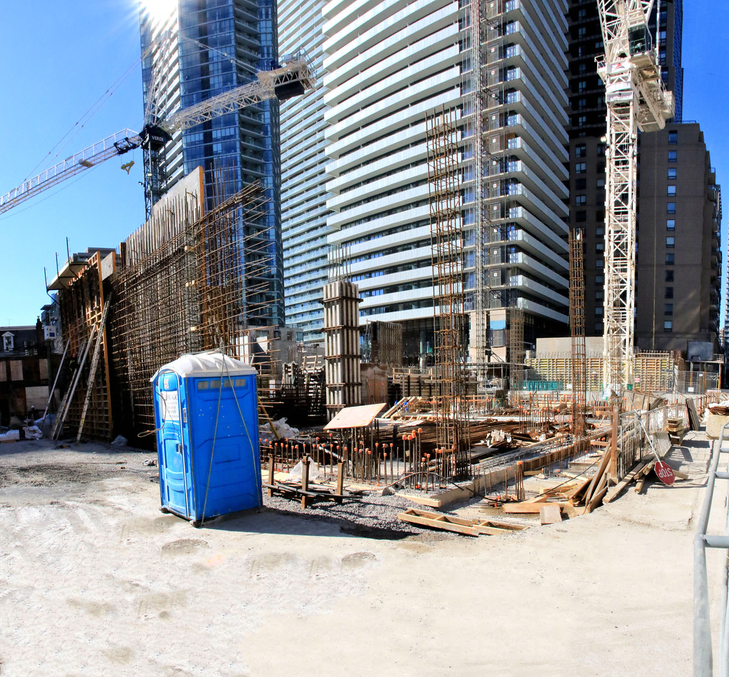
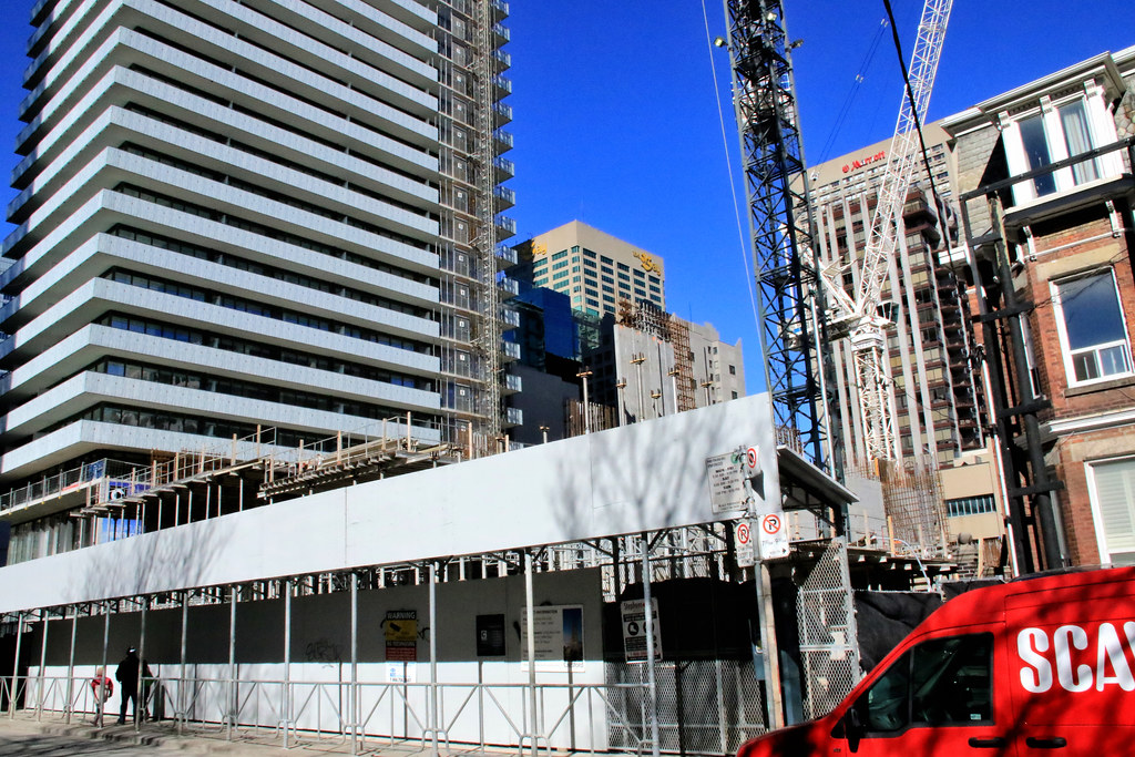
Looks like it's making great progress. I'm excited to see it past the podium when it'll presumably really shoot up like Casa II.
Benito
Senior Member
ADRM
Senior Member
Looking good but, boy, did Chaz ever not turn out as represented in the renderings...
Red October
Senior Member
How so?
ADRM
Senior Member
Having a tough time putting my finger on it, exactly—I guess it's mostly down to the colour of the glass, namely that I think it's much more transparent and a little more green than at least I thought it had been represented. Have a look at the renders, from UT and BuzzBuzz. Maybe it's the colour of the facade in between each floor? Again, not totally sure, but I think I generally had slightly higher hopes for the contribution this building would make to the skyline.


Attachments
stjames2queenwest
Senior Member
Ya it's a bit different I think emphasis on the angles and perspective are what make you feel that way.
I am happy it turned out darker.
I wish it had less mullions or darker mullions.
I like the crown/ roof it's an interesting shape (atleast from my point of view - eastern facade looking west towards it)
AND the Chaz club lounge barnacle lights change colour now, and it's SO MUCH BETTER than the solid red it has been for months.
There are still a couple spots where the lights seem to be malfunctioning and not coming on. It shuffles through the spectrum, but the purple, yellow, pink, lime green, etc all look great next to the current turquoise of the casa lighting.
I am curious about what they will do with casa II & II's mech levels.
ADRM
Senior Member
Yeah, great points—I think, specifically, your focus on the mullions and angles/perspective are right. I think also I was disappointed by the renderings themselves; the building's layout, footprint, and form had some potential, but it always left me wanting more. I think a more interesting facade could've done wonders—think injecting some One St. Thomas into the picture might've done the trick.
Super interested, too, to see how the Casa 2/3 mechanicals turn out. I really hope they don't just throw some neons up there, a la Cityplace, and call it a day.
Super interested, too, to see how the Casa 2/3 mechanicals turn out. I really hope they don't just throw some neons up there, a la Cityplace, and call it a day.


