Toronto Casa II Condos | 184.09m | 56s | Cresford | a—A

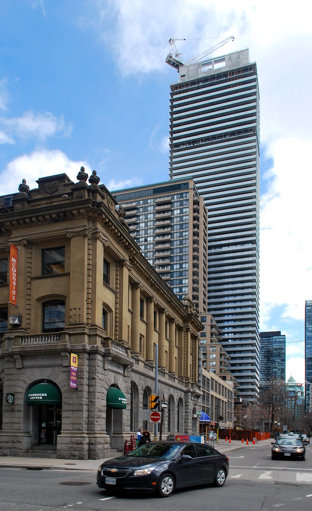
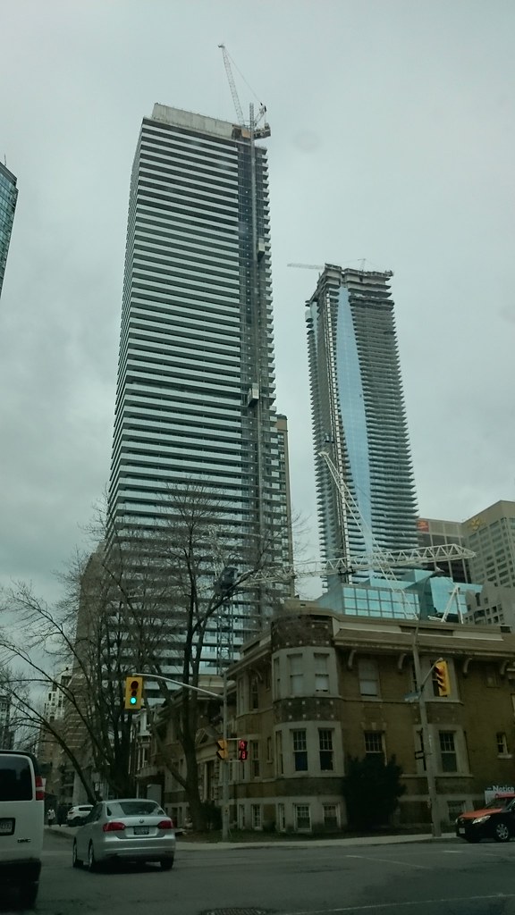
The mechanical penthouse on this thing is quite sizeable! I wonder if there are some damper tanks up there.
I would suspect that there are as well, given the size of the mechanical, and given the broad west face relative to the slenderness of the structure.

42
 
I know this will change with TeaHouse coming in etc., but that shot looks oddly sparse to me. There are still some places on Yonge where, at least from certain angles, things can look pretty open.

Yeah, it's actually quite remarkable how much development is slated for Yonge between Bloor and Queens Quay. That entire stretch will look dramatically different in 10 years. I like going through the UT Growth to Watch for Series and opening up Google Street View links each in a new tab corresponding to the address of each slated development; that really gives a sense of how each relates to the other and what the streetscape will feel like.
 
March 30th:

casaIMG_2796.jpg
 

Attachments

  • casaIMG_2796.jpg
    casaIMG_2796.jpg
    580 KB · Views: 1,415
Is the roof of Casa II really that much higher than L Tower's pinnacle? I know there's a roughly 100' difference in street elevation but that looks like much more.
 
116 foot elevation difference. Looks about right.

You also have to factor in the height it was taken at which is 267 feet above L towers elevation so there is a cascading effect going on as you look south the elevation drops as the distance increases which makes the height gap more dramatic.
 
From yesterday:

DSC00422.jpg

DSC00421.jpg

DSC00424.jpg

DSC00425.jpg

DSC00420.jpg


42
 

Attachments

  • DSC00420.jpg
    DSC00420.jpg
    727.1 KB · Views: 1,020
  • DSC00421.jpg
    DSC00421.jpg
    319.8 KB · Views: 1,019
  • DSC00422.jpg
    DSC00422.jpg
    481.7 KB · Views: 1,014
  • DSC00424.jpg
    DSC00424.jpg
    686.3 KB · Views: 1,024
  • DSC00425.jpg
    DSC00425.jpg
    344 KB · Views: 1,028
Have to say the balcony detailing on this tower is top notch from the painted undersides to the intricately etched glass railing. Doesn't quite make up for the monotony of the design, but it does point out how much details matter.
 
Have to say the balcony detailing on this tower is top notch from the painted undersides to the intricately etched glass railing. Doesn't quite make up for the monotony of the design, but it does point out how much details matter.

Yeah painted (or otherwise anything other than unfinished concrete) balconies IMO actually make a huge difference in the overall perceived quality of a building's design. Exhibit on Bloor also has a really nice treatment in the works, I'm heartened to see—I'll try and grab a pic this weekend.

I'm also not a huge fan of the monotony of this design (some seem to suggest it's intentionally minimal/simplistic/Mies-esque, but it seems more like a kid's drawing of a skyscraper with balconies to me), but at least these details contribute to the overall quality.
 
Looks like it's white and illuminated with lighting. I would be shocked if the roof is actually that gold color.
 
I'm also not a huge fan of the monotony of this design (some seem to suggest it's intentionally minimal/simplistic/Mies-esque, but it seems more like a kid's drawing of a skyscraper with balconies to me), but at least these details contribute to the overall quality.

I don't mind the design, only problem is there is also a Casa I, Casa III, and probably a few more of them coming in the near future.
 

Back
Top