Toronto Casa | 147.52m | 46s | Cresford | a—A

Beautiful shots, DT. Once the railing on the top level is put up and the Cresford banner comes down the exterior will be all but done.

As for the main lobby entrance which is still partly half done and has had ugly boards up for the past few months... I'm told they've been having problems with putting in that final glass door as the last one or two simply self destructed under the weight of the window wall settling. Not sure if that's totally true, but that's what I've heard.

I'm also hoping that the white security desk that's there now is only temporary. It looks like something they picked up from Grand & Toy. Very cheap compared to the rest of the lobby surroundings.
 
Doesn't sound true at all. The glass would be sitting on a setting block, and if they ordered the right size glass there'd be almost half an inch of clearance above the glass in the upper shoe. Not to mention the three-sixteenths clearance between the header and the door. Likelier that either the wrong size glass was ordered, or someone hit them while bringing something through
 
March 31 2010 update

Thought Many on UT Loves CASA...
Click to Enlarge


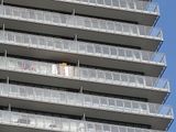
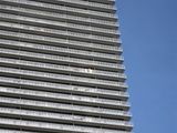
...See the Problem with Large Balconies?
 
Okay, okay. I slagged your building. You slag mine. Now we're even.

But yes, I have noticed that one unit with all that crap there. However, even on your wide shot it's not like it's glaringly bad when there is a lot of junk on the balconies. It's not great, but it's not horrendous. That said, I'm sure the condo board will institute rules.
 
LOL nono casaguy no offense intended at all ...

I guess the 'junk on balcony' issue is just a natural fact arising from large balconies with clear glazing thereby exposing people's crap ~
 
I saw that horrendous and distracting balcony immediately upon looking up at Casa from Yonge St yesterday – and it affirms what I’ve been saying all along: the “vertical garage sale” look detracts from the splendid minimalist/transparent design of the tower and makes the overall project look terrible. It’s already happening, folks. Shame.
 
Last edited:
I saw that horrendous and distracting balcony immediately upon looking up at Casa from Yonge St yesterday – and it affirms what I’ve been saying all along: the “vertical garage sale” look detracts from the splendid minimalist/transparent design of the tower and makes the overall project look terrible. It’s already happening, folks. Shame.

Maybe frosted glass balconies are the way to go? But then I guess it kills your view.
 
It's not worth starting a new thread for it, but the Green P lot across the street from Casa has a sign up saying that they're applying to add 2 more floors to the existing 5 storey garage.
 
It's not worth starting a new thread for it, but the Green P lot across the street from Casa has a sign up saying that they're applying to add 2 more floors to the existing 5 storey garage.

Too bad. That'll just make it more expensive to knock down.
 
Allegedly, some time ago a study was commissioned exploring how the city could maximize the green Ps by building condos on top.
 
Okay, okay. I slagged your building. You slag mine. Now we're even.

But yes, I have noticed that one unit with all that crap there. However, even on your wide shot it's not like it's glaringly bad when there is a lot of junk on the balconies. It's not great, but it's not horrendous. That said, I'm sure the condo board will institute rules.

All these big condos have similar rules. Seasonal furniture only; no storage, no bicycles.

A building like Casa will simply have to be more vigilant about enforcing the rules, that's all. The main thing will be to make sure you have a really good, experienced property management company.
 

Back
Top