CanadianNational
Senior Member
Thanks for those great photos.
This does look really great. Crisp. Ultrasharp.
This does look really great. Crisp. Ultrasharp.
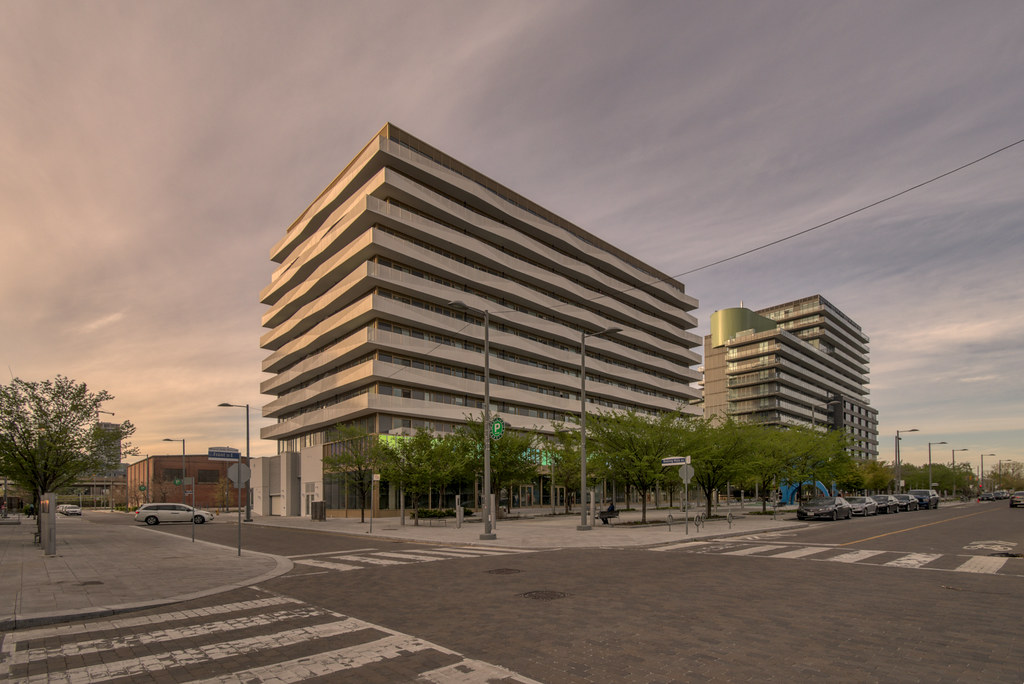
Home run. Arguably the best project in the Canary District.
Despite the blandness of some of the buildings, I do like how this area is turning out. Much of the south side of the street still consists of parking lots and construction sites, but as you can see from the shot taken from the park, with the consistency in height, wide sidewalks and neat rows of trees, this stretch of Front St East is starting to look like our version of a Parisian boulevard.
Despite the blandness of some of the buildings, I do like how this area is turning out. Much of the south side of the street still consists of parking lots and construction sites, but as you can see from the shot taken from the park, with the consistency in height, wide sidewalks and neat rows of trees, this stretch of Front St East is starting to look like our version of a Parisian boulevard.
 Canary Block Condos by Marcanadian, on Flickr
 Canary Block Condos by Marcanadian, on Flickr
 Canary Block Condos by Marcanadian, on Flickr
 Canary Block Condos by Marcanadian, on Flickr
 Canary Block Condos by Marcanadian, on Flickr
Stunning shots!!Saturday:
Canary Block Condos by Marcanadian, on Flickr
Canary Block Condos by Marcanadian, on Flickr
Canary Block Condos by Marcanadian, on Flickr
Canary Block Condos by Marcanadian, on Flickr
Canary Block Condos by Marcanadian, on Flickr