Toronto Burano | ?m | 48s | Lanterra | a—A

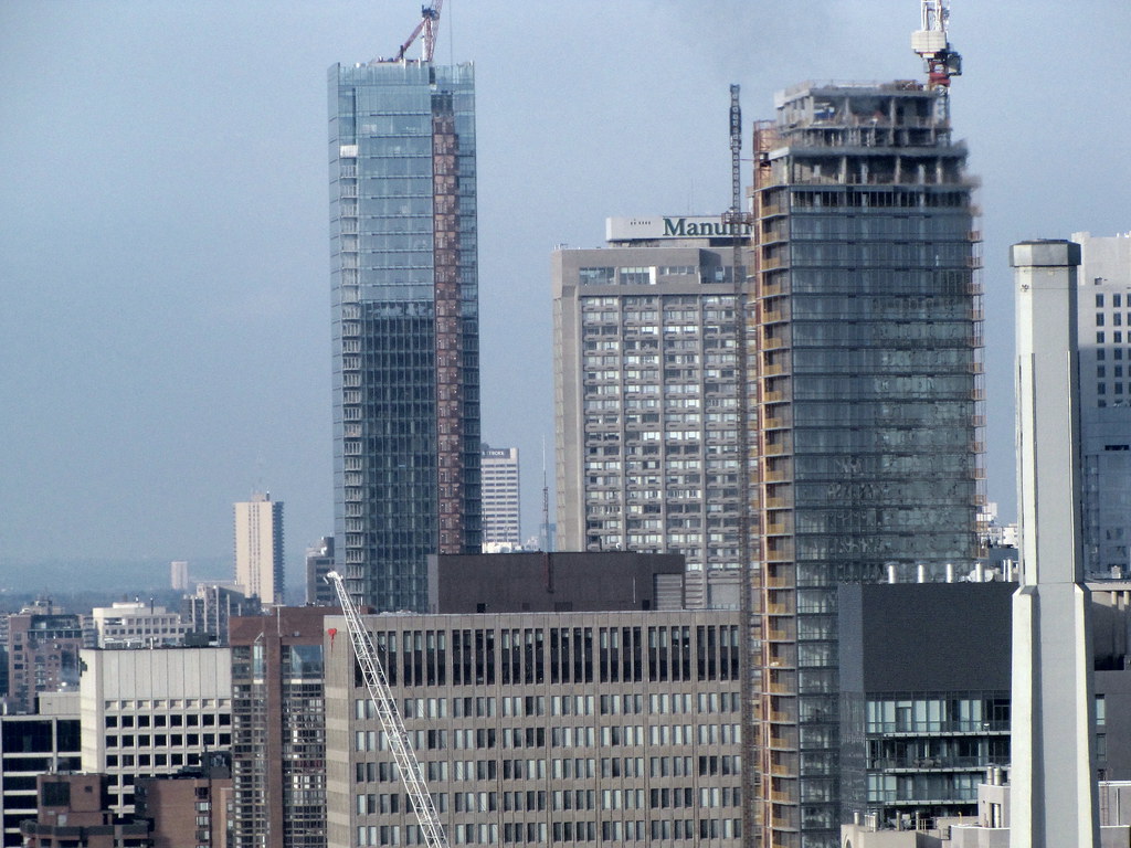
great pics Jasonzed! the mechanical box setbacks add some interest, but appear a little bit out of place with the rest of the building.. i'm sure it'll look better once completed.

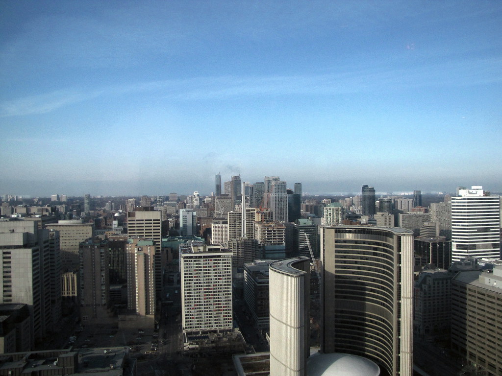
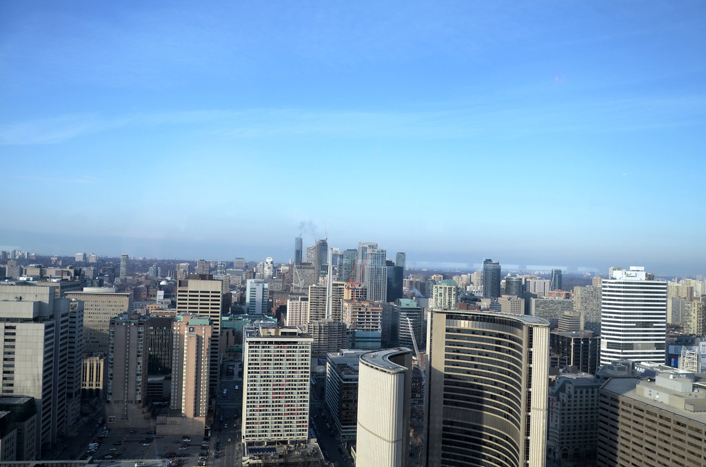
and that last pic is great of the bay street canyon. great depth and density.
 
5 Dec 2011: Focus on podiums when it's raining!

044dh.jpg


045qn.jpg


BuraAno is nice, but this neo-gothic tower is better:

040sna.jpg


I mean, can you imagine it in 2121?
 
Last edited:
I personally think the slanted panes of glass on the podium are shaping up really tastefully. I look forward to when the boards are down so we can see the whole thing, especially with interior lighting.
 
that last pic is crazy cool as it shows that the skyline's spine LITERALLY runs down bay street. it just pops up in height out of nowhere! it's sad that sorta height is short lived, with the rest of that view being mainly 100m and below.
 
Picture from urbandreamer:
045qn.jpg


Look at those stinky overhead wires.

Imagine, a city like Toronto with all its overhead wires.
 
Last edited:
what i do find kinda cool is the way the balconies extend away from the building and sorta hang there like that.... it's like a mini catwalk hovering in the air! LOL!.. wonder how many ppl will actually use that space.. probably kinda scary hanging out over the ledge.
 
I'm going to pretend you didn't just say any of that. "More restraint" from Mr. Clewes?! Wow, some people have no sense of fun.
 
I agree , one of the problems T.O has is its population. It is small compared to other cities around the world.

I believe a bigger working population will help drive demand thus more innovation and risk will be emphasized in its product. ( Like the Hearst Tower in NYC)
http://en.wikipedia.org/wiki/File:Hearstowernyc.JPG

I hope T.O will get something like this in the future (maybe in 30 years).

Are you kidding, because that building is one of the ugliest building i have ever seen?? The bottom part isn't that bad but the top part, it's short and boring, and makes me want to shoot myself in the head every time I see that building. What a eye sore. I crapped nicer piles of crap than this building. LOL!!!!!!!!!!!!! :cool:
 
I wonder how much more expensive it would be for the developer to actually continue the form of the building all the way to the top around the mechanical. I think it really takes a lot away from the building's appeal.
 
I really like the angles on Burano, which also adds some drama to the height from some vantage points s it seems to soar higher than it actually is. I really like the old and new on the podium, and the angled glass adds some much needed flare to a stretch of Bay that has lacked visual interest. This one really surprised me, it's a really nice project and for me is the sharpest looking tower between Bloor and the FD.
 

Back
Top