You are using an out of date browser. It may not display this or other websites correctly.
You should upgrade or use an alternative browser.
You should upgrade or use an alternative browser.
Toronto Axiom Condos | 74.98m | 21s | Greenpark | Kirkor Architects
- Thread starter Dane
- Start date
tripwire
Active Member
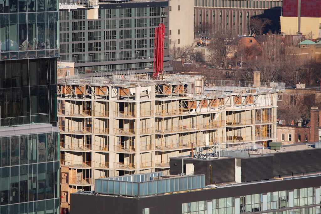
That cladding is not looking good....
GenerationLee
Senior Member
Kirkor....*shudders*
dusk
Active Member
Momin
Senior Member
someMidTowner
¯\_(ツ)_/¯
Razz
Senior Member
G.L.17
Senior Member
dusk
Active Member
TheKingEast
Senior Member
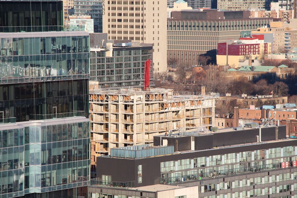
Wow at the shadowing on those southern units in the neighbouring building. Completely blacked out. This stretch deserved better designed buildings.
agoraflaneur
Active Member
Wow at the shadowing on those southern units in the neighbouring building. Completely blacked out. This stretch deserved better designed buildings.
Genuine question: how would you design a building adjacent to another building that does not shadow? Can you show me some examples? In European cities I have lived in like Barcelona and Paris - whose cityscapes I love - the apartments of the middle class were often extremely dark, because the number of windows was limited.


