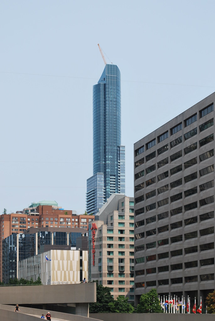
Toronto Aura at College Park | 271.87m | 78s | Canderel | Graziani + Corazza

Taken today:
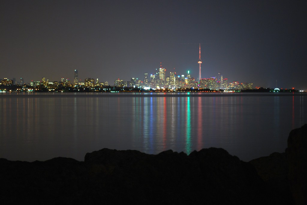
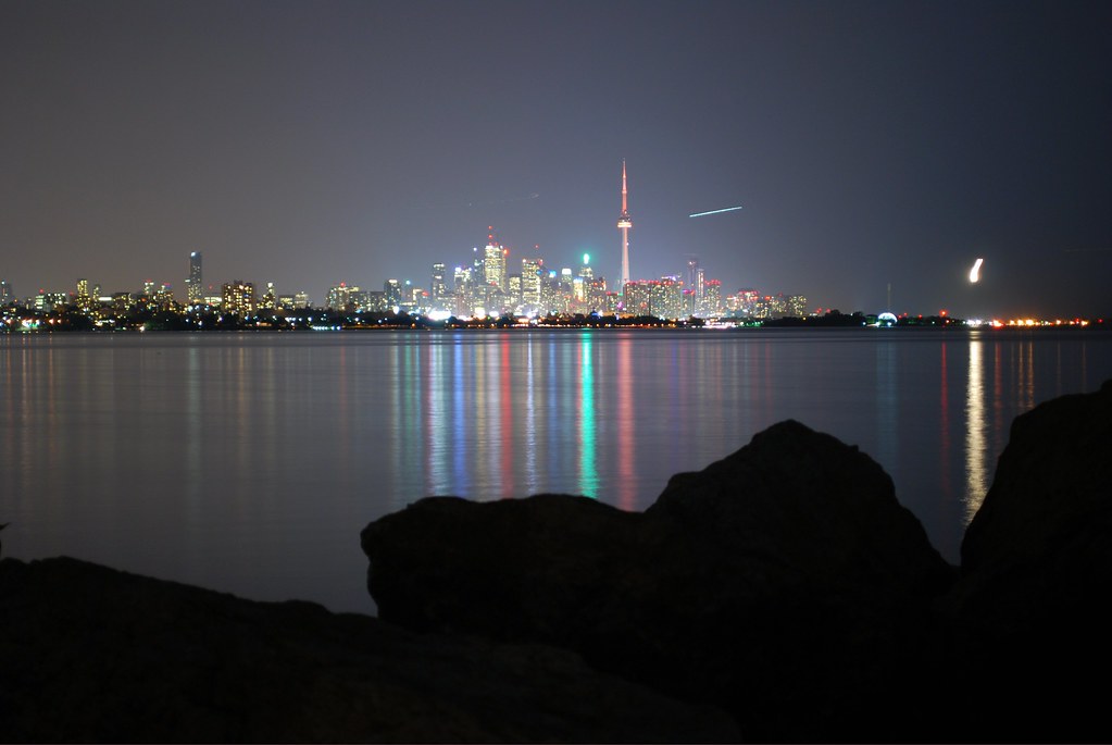
I don't mind Aura's silhouette on the skyline but a actual visible setback wouldn't have been so bad if viewable from the east/west.
Also, glass appears to be going up on the lower slope as per the webcam.

14867678483_0ec63840c9_b.jpg


14661108320_2e7f6af537_b.jpg
 
Seems they got the roofline right, which is a friggin' miracle for Toronto. That alone makes this project a partial victory though there is still much to criticize, like the overall cheapness and dreadful retail.
 
Do we agree Aura--visually--belongs in one of these bins?
[/QUOTE]

Does anybody agree on anything on this site? NO!

Lots of people like Aura on this site, in spite of all its obvious flaws. Aura's impressive due to its sheer size, its curves and its sexy roofline. Its quirky, unconventional features like mismatched setbacks and the way its positioned towards Dundas Square, give it some charm too. Who knows, maybe the terrible shopping centre might develop into some kind of world bazaar or some kind of arts flea market and redeem itself in some way. In Toronto, anything is possible. Many former dull, lifeless areas have transformed into something cool. It could happen here too with a little bit of creativity and leadership. We will have to wait and see if the lighting adds to its over-all appeal.

I'll bet when the next Pug Awards come out, this will not be near the bottom.

Oh, by the way, I went to eat at the food court and I really liked the food. I went to the Japanese/Korean stall on the east side. I had no idea what the food was but I got the Korean mix of meat & spicy chicken. (You get a choice of 2 meat dishes, 1 veggie dish and rice) I don't know what it was called but it was so good and the price (about 8 or 9 dollars) was pretty good too. I will be back again.
 
Last edited:

Apologies to the mods for reposting this photo so soon after its original posting, but I believe it's needed to assist with what I'm about to say.

Over the years this tower has been repeatedly slighted for its execution -- more specifically for its use of spandrel, and the design and massing of its podium and lower tower portions.

While these criticisms aren't entirely without merit, in light of how the upper part of the tower is being done, they're both over-exaggerated and overblown.

Aesthetically, the most important parts of any tower how it relates to the street and how it finishes at its top. These now appear to be the areas where this tower excels.

I agree that the lower portion of its tower is somewhat clumsy, and the use of spandrel and associate materials don't come together well especially on the north side, but the tower caps off deftly and interestingly, in a way that echoes the asymmetry of its mid portions. It's also sleek and looming in a way that draws most attention away from its less well executed parts. And it meets the street nicely, both in terms of design as well as function: its restaurants, bars, shops as well as the generous and partially sheltered sidewalk around it ensure that its context remains vibrant at nearly all hours.

Other buildings may have more consistent quality throughout their design and cladding, other buildings may have a better mix of integrated uses, but overall I think this building excels where it counts and will serve as a handsome landmark. Overall I think it's raised the bar for buildings in Toronto.

I'm looking forward to its successors.
 
Over the years this tower has been repeatedly slighted for its execution -- more specifically for its use of spandrel, and the design and massing of its podium and lower tower portions.

While these criticisms aren't entirely without merit, in light of how the upper part of the tower is being done, they're both over-exaggerated and overblown.

Aesthetically, the most important parts of any tower how it relates to the street and how it finishes at its top. These now appear to be the areas where this tower excels.

I agree that the lower portion of its tower is somewhat clumsy, and the use of spandrel and associate materials don't come together well especially on the north side, but the tower caps off deftly and interestingly, in a way that echoes the asymmetry of its mid portions.

Personally speaking, I don't think that the top of the tower excuses what's below. Nothing changes about how the building meets the street, or the million mullion mess that runs half way up (including the uneven variations in floor height). By your own admission this building has permanent problems, and in my opinion, they are not excused or made irrelevant by how it has been completed up top.

You might forgive the noted shortcomings because of how the tower has been topped off (which is admittedly quite nice), but for those of us who find the rest of it to be something of a mess, it's no consolation.
 

Back
Top