Toronto Aura at College Park | 271.87m | 78s | Canderel | Graziani + Corazza

I did as well ... its actually interesting.

For all the complaints of 'typical glass box' this really doesn't fit the stereotype for multiple reasons; The glass is different, I think the effect won't be clear until another 5 stories of cladding or so. Secondly, the shape, this isn't a typical box, it has quite a few angles, particularly around the transition from the base to the tower.
 
I think people are just annoyed at the construction going on at the corner there. It was annoying during Pride.
 
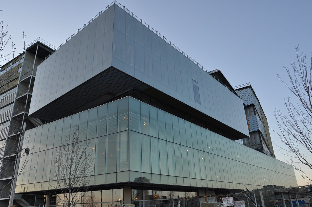
Another good looking building with cladding that has a similar pattern as Aura's, The Nestle Building;

sm1img0052.jpg
 
Last edited:
We get it. 78 towering storeys of banality. Yaaaay

I'm very glad that such a tall building with retail is going up where there used to be a parking lot, though I must agree that the vertical ocean of blue glass aesthetic is absurdly boring, as is that of Shangri-La and countless others. I really hope this when-in-doubt-cover-in-glass trend will lessen at some point.
 
I'm very glad that such a tall building with retail is going up where there used to be a parking lot, though I must agree that the vertical ocean of blue glass aesthetic is absurdly boring, as is that of Shangri-La and countless others. I really hope this when-in-doubt-cover-in-glass trend will lessen at some point.

Agreed. That's pretty my my view.
 
I'm very glad that such a tall building with retail is going up where there used to be a parking lot, though I must agree that the vertical ocean of blue glass aesthetic is absurdly boring, as is that of Shangri-La and countless others. I really hope this when-in-doubt-cover-in-glass trend will lessen at some point.

One thing that makes this different than the "ocean of blue glass" is how dark the blue of the glass looks and will look as it goes up taller. Instead of looking like just another addition to the SL/BAC style blue glass it will end up looking like something different in the skyline.

Then again it's not even close to being done so I'm still hoping I won't end up disappointed.
 
God I hate steel spandrels... and what's with these strips of coloured glass in between the windows? Are those strips on the Aura windows turquoise? This cheap and lame technique seems to be popping up everywhere... What is the technical name for these? It just screams uncreativity and blandness. Why not just make those strips transparent glass windows? They're all over Trump too...

Here's an example of what I'm talking about. This is the new Schulich building at York. Most of the building is actually quite well done, with granite or limestone tiles horizontally waving back and forth. However, on the West corner, this nastiness comes out of nowhere:

schulich-school-of-business-york-university-toronto-on-2.JPG
 

Back
Top