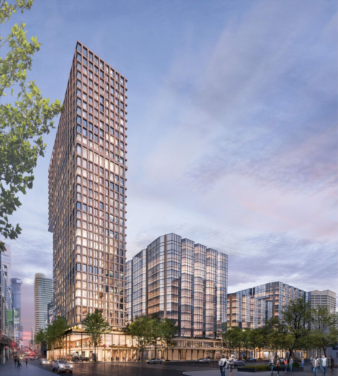
New front page story includes this…

…and other higher quality renderings, as does the database file.
42
…and other higher quality renderings, as does the database file.
42
All it needs is chamfered corners.It would be nice if the tower in some way reflected the design of the original building. This is just like, a pleasant but bland condo tower.
Agreed! I was just thinking exactly that while looking at the new renders in the front page article. That one little detail would make all the difference.All it needs is chamfered corners.
...I couldn't see in the article if they're doing anything to the AoB proper. Or if the original plans for the place got put on hold (hopefully). So any news of note on that?New front page story includes this…
Add to that death-trap staircases, drafty windows and harsh air conditioning.Worked in this building. Kinda surprised they are considering this and wondering who would lease these floors. Probably the worst building I have worked in, the floors are old. There's still ashtrays in the bathroom back when you could smoke indoors and they are carpeted (gross). It's far from Union meaning most commuters had to take the TTC from Union which is an inconvenience compared to the buildings closer in the PATH and the amount of crazy homeless people that hang out in the building makes it feel sketchy. Add to that the perfect suicide style atrium. Many days co-workers would jokingly look over and comment how the building is perfect for someone to jump after a bad day at the office. Was never a fan.
...and when I line up here because it all looks yummy..I won't let anyone know at UT that I'm lining up here. >.<There's nothing surprising about Torontonians' endless willingness to stand in line for unremarkable schlock.