Toronto Aqualina at Bayside | 47.85m | 13s | Tridel | Arquitectonica

Standards of UTers have become lower than ever, based on the commentary above. "It has gimmicky red beams so I like it." "It's actually not terrible! So that's good!"

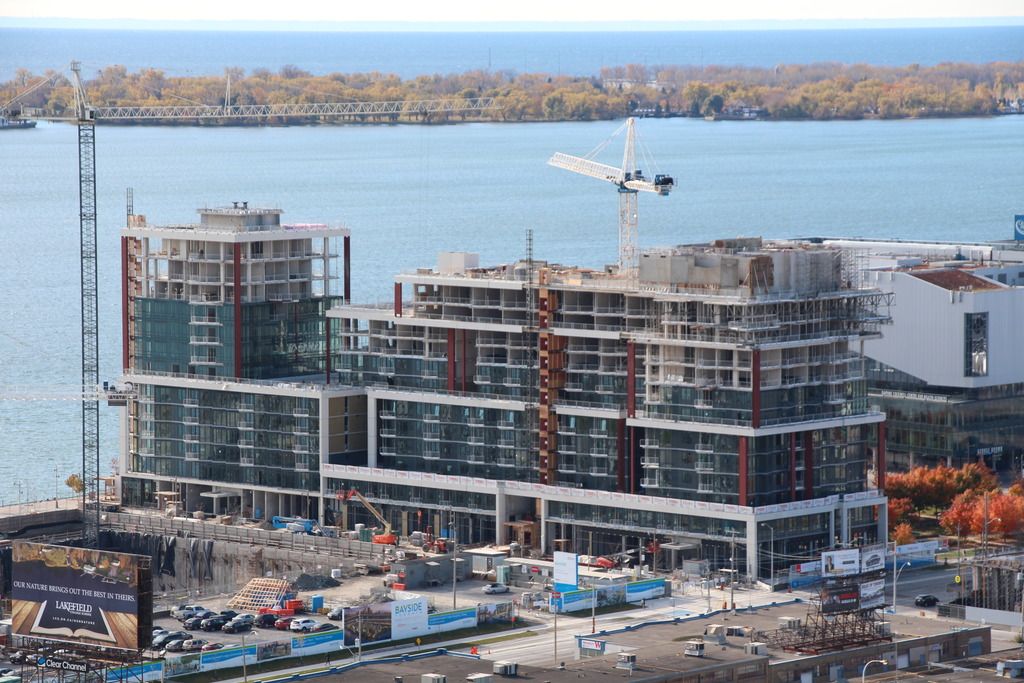
I find the Queen's Quay elevation to be the biggest insult of all. But even considering the rest of the project, its materiality is not up to snuff and its architecture does very little to activate the public spaces, other than the fact that the building happens to run alongside the park. Blech.

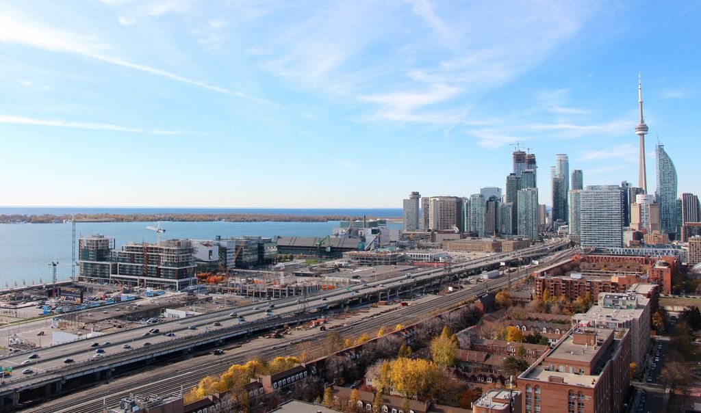
This is our waterfront; the public spaces have been well done (kudos to WaterfrontTO) but we should not be applauding this type of building which is not deserving of its location.

It's okay to be pleasantly surprised when something you thought was going to be awful might not be quite as awful as anticipated while at the same time wishing we had a more exciting product overall.
 
ADRM, I finally got to see this project up close last week, ( good pictures can only do so much after all ), and it really wasn't so bad, although I can't say I was " pleasantly surprised ". Here's hoping that when this waterfront precinct gets built out, it will be evident that the whole somewhat exceeds it's parts .
 
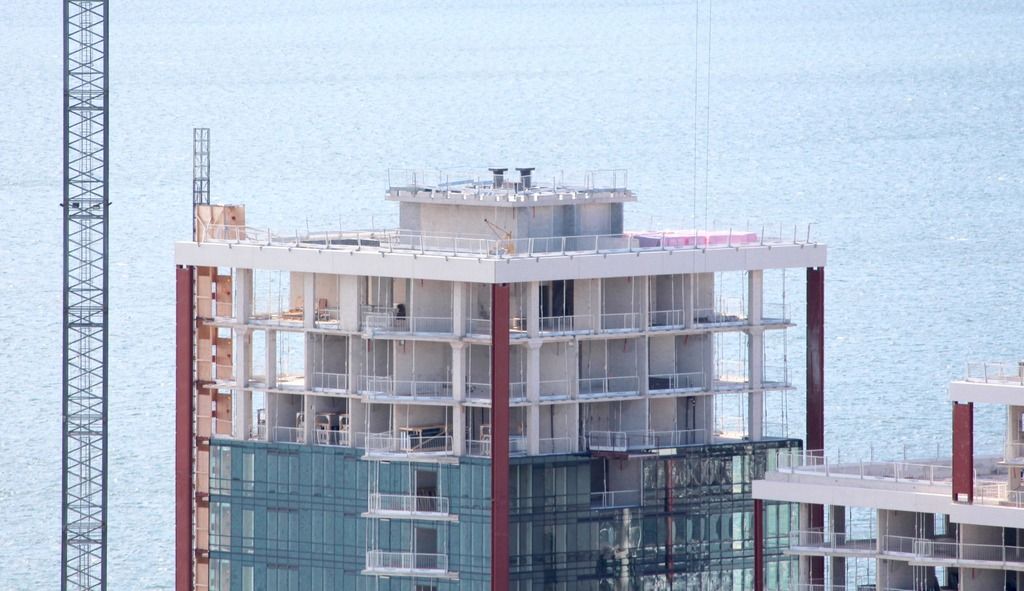
Disappointed to read that the red beams will be covered. Been catching glimpses of it recently and think it makes the building look phenomenal. Strong, bold, colourful. Why is it that we don't often see colour like this incorporated into new developments, particularly those with strong sightlines such as along the waterfront? Would really boost the wow factor of our skyline imo.
 
You got to be kidding ! The red with the deep turquoise windows really make the building pop out from a distance. How can they do that!
 
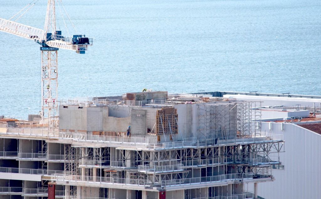
Why is it so shocking? The red beams show that they will be covered in white precast, Tridel's staple. Tridel is not capable of innovative architecture. This is our waterfront and this is the best they can come up with? REALLY?!?!
 
Last edited by a moderator:
Good thing Tridel isn't an architect
 
I prefer the red pop of colour as well. However, a white framing in and around the varied bluish-toned glass should give it a clean nautical look.

Aqualina1.jpg


Aqualina2.jpg


Aqualina3.jpg


Aqualina4.jpg


Aqualina5.jpg
 

Attachments

  • Aqualina1.jpg
    Aqualina1.jpg
    1.4 MB · Views: 1,090
  • Aqualina2.jpg
    Aqualina2.jpg
    1.6 MB · Views: 1,026
  • Aqualina3.jpg
    Aqualina3.jpg
    1.4 MB · Views: 1,036
  • Aqualina4.jpg
    Aqualina4.jpg
    1.4 MB · Views: 1,076
  • Aqualina5.jpg
    Aqualina5.jpg
    1.6 MB · Views: 1,097
The curtain wall on the south facade makes the spandrel on the rest of the building looks even worse by contrast, and makes the building inconsistent and awkward. They really couldn't make the pro forma work for curtain wall on the entire building? This is supposed to be a landmark. I question that level of pride they have in their buildings and this city.
 
Last edited:
The curtain wall on the south facade makes the spandrel on the rest of the building looks even worse by contrast, and makes the building inconsistent and awkward. They really couldn't make the pro forma work for curtain wall on the entire building? This is supposed to be a landmark. I question that level of pride they have in their buildings and this city.
Bang on.
 
The curtain wall on the south facade makes the spandrel on the rest of the building looks even worse by contrast, and makes the building inconsistent and awkward. They really couldn't make the pro forma work for curtain wall on the entire building? This is supposed to be a landmark. I question that level of pride they have in their buildings and this city.

Exactly. The curtain wall draws attention to the fact that they cheaped out on the rest of the building.
 
All the buildings going up on the Waterfront have been dud so far. Even Pier 27 I had high hopes for doens't look that good in person.
 

Back
Top