Rascacielo
Senior Member
I remember walking by and seeing "office space for rent" last year. Unless they've changed it to residential (which is tricky given the podium's extra-large floorplate).I thought it had office use in much of the podium ?
I remember walking by and seeing "office space for rent" last year. Unless they've changed it to residential (which is tricky given the podium's extra-large floorplate).I thought it had office use in much of the podium ?
ok sorry. had no ideaThis is a residential project.
Previously the podium for sure had just shy of 10,000 sq-m of office space. I believe only the ground floor had retail. This mix may have changed at some point, but the podium floor plates certainly are not residential.Wasn’t there a recent CofA application to change the zoning for the office portion? They may have other uses in mind or maybe there is already a tenant? Anyways it is not a huge amount of space and they are a year out from completion so a lot can change.
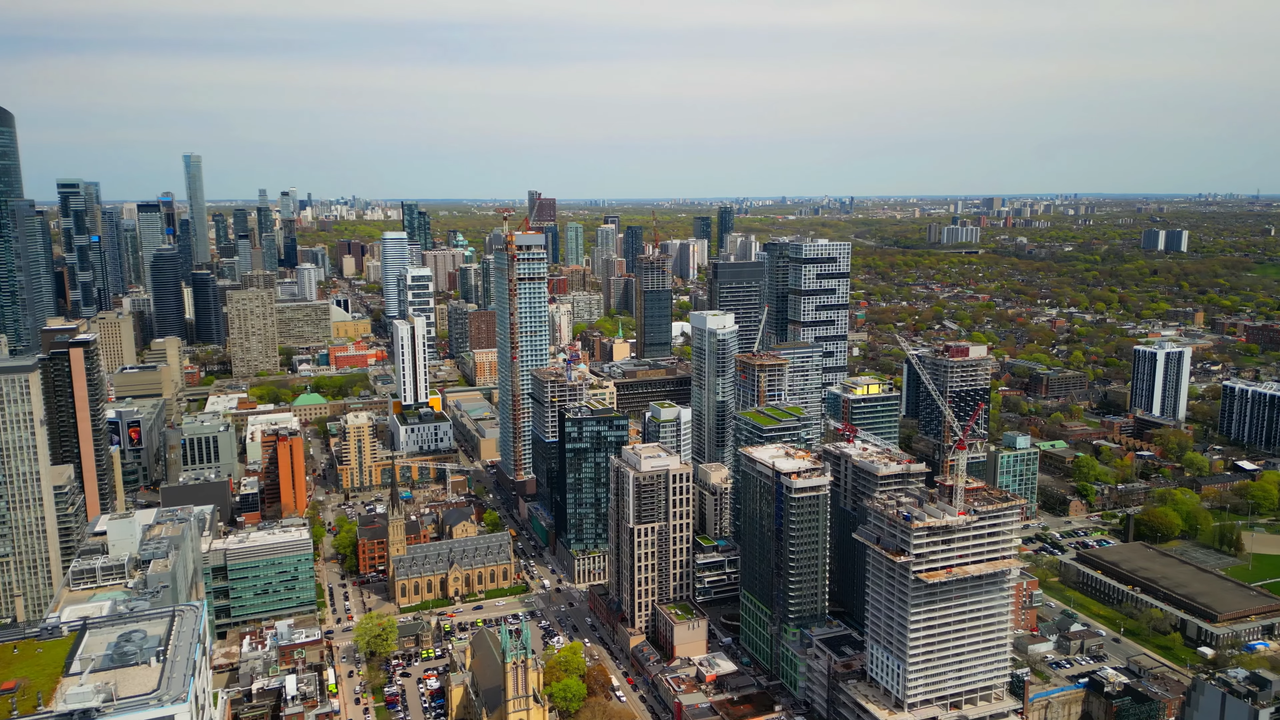
Here's one of my shots from last August. Note the sign on the hoarding, showing availability of office space. I don't know if it's still there.
View attachment 477808
 80queen.com
ok sorry. had no idea
I think 80 is the office component and 88 is residentialWell what's weird about that is looks to say "80Queen.com" not 88, but the website shows this building with office space, so I have no idea what's going on.
80 Queen Condos
Do you consider the mint-green spandrels as 'colours' or neutrals? To me they're definitely neutrals.Poor 88 Queen! Once the Belle of the Ball when its podium was being clad, it is now the red-headed (or mint-clad) stepchild.
The colour combination is a head-scratcher, but I don't think it's a deal-breaker. It's a scoop of chocolate and a scoop of mint. And aside from the colour, the tower looks fine - balanced and organized.
Posters on this forum are often like "No more neutrals! We want more colour!" And then when a non-neutral colour is given to them, it's like "Not that colour!" Neutrals are used so often because they are blandly acceptable. Orange, green, yellow, red, purple - particularly when they aren't accents - are always going to upset someone.
It does, plus retail at street level.I thought it had office use in much of the podium ?