Toronto 49 Ontario Street | 152.4m | 44s | Dream | a—A

the mid-block connection is welcome, tough it'll largely read like a dark service lane here. This thing just seems very banal in its current state..
I've corrected the link to the Site Plan Approval application in @ferusian's post: no docs are in for it yet… so maybe it'll look less banal once the new docs are posted.

42
 
Site Plan Approval application submitted:

Development Applications

Updated project description:
Revised project description:
Site Plan Approval application for three buildings of 10, 34 and 39 storeys containing 646 square metres of retail, 13,074 square metres of office, and 53,293 square metres of residential with 894 dwelling units. A 499 square metre public park is proposed along Berkeley Street. 959 bicycles parking spaces and 205 vehicle parking spaces are proposed.

Dream + architectsAlliance: 39 storeys (136.05 metres including MPH)

1620702197378.png


1620702235528.png


Massing model:

1620702491825.png


Ground floor plan:

1620702752513.png


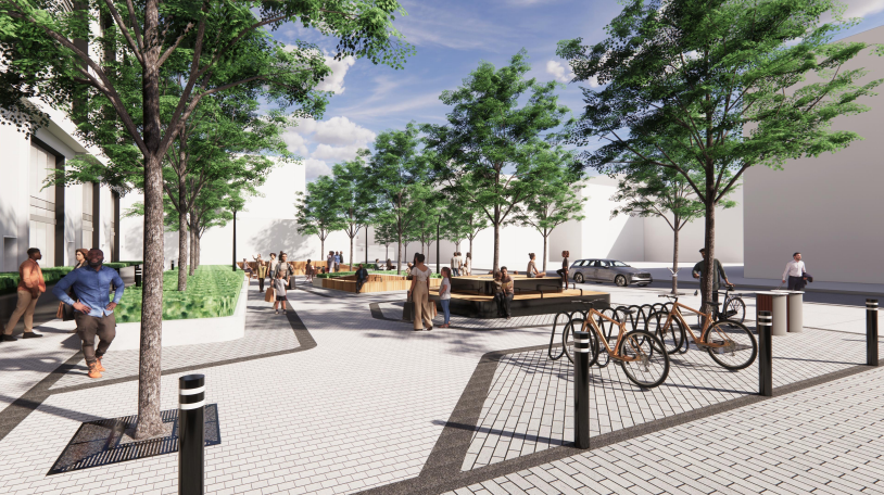
Public park (STUDIOtla):

8dc2eb9afdc841ac50952470e6dfeac3.png


1620702645896.png


1620702658735.png


Notable revisions include:

1620702376248.png
 
Yuck. Another big block development in a neighbourhood that deserves better.
Any type of building having punctured windows to create more details on facade gets my vote ! Nice and rich looking in my opinion as seen in the photos up above !
 
I was wondering if the left hand tower being over the 150m mark in the plans up above. Has just past in this new rendering to be a skyscraper in height. Or has it always been at that way lol!
 
It feels too big for the space IMHO, kind of like Time and Space. But it's really too early to say for sure.
 
It feels too big for the space IMHO, kind of like Time and Space. But it's really too early to say for sure.
This is lightyears beyond T&S. The towers are slimmer and well separated, and the block is broken up with a POPS pedestrian walkway through the middle. The heights of all 3 buildings are staggered so as to not resemble a monolith or Borg spacecraft.

Plus- the architecture and materials on this one blow T&S out of the water. I’m not worried.
 
Yeah it is pretty early to say. I do think the towers are a tad too tall for the area, and the podium looks very chunky in the rendering. And there's so many cases where they cheap out on materials, etc. But I'd definitely like to be wrong!
 
An improvement over the previous proposal and will fit in nicely with all the other developments nearby.
 
Yeah it is pretty early to say. I do think the towers are a tad too tall for the area, and the podium looks very chunky in the rendering. And there's so many cases where they cheap out on materials, etc. But I'd definitely like to be wrong!

Well proponent here is literally a dream team so I wouldn't worry too much.
 

Back
Top