Toronto 401 Bay Street | 143.86m | 33s | Cadillac Fairview | WZMH

How the tower imposes itself on Nathan Phillips Square

I62A2628.jpg


I think the best thing for all of us would be if the OTPP sold off Cadillac Fairview, and let that firm blow away to the wind never to be heard of again.

Or magically have CF be banned from being involved in renovating any of their holdings. Because it's clear when it comes to renovations, they have no idea what on earth they are doing.

Is there anyway we can find a list of the dopes who approved this?
 
A look at the finished, literally, product.

View attachment 389036

For the record, the 'like' is an appreciation of your efforts and not those of CF.

The tower component is unfortunate........but that base.............OMG...........that is seriously awful.
 
I think the best thing for all of us would be if the OTPP sold off Cadillac Fairview, and let that firm blow away to the wind never to be heard of again.

Or magically have CF be banned from being involved in renovating any of their holdings. Because it's clear when it comes to renovations, they have no idea what on earth they are doing.

Is there anyway we can find a list of the dopes who approved this?
If you'll remember, CF are disclaiming responsibility for this, and citing some clause in a contract with an unnamed tenant here who forced their hand re: the recladding. Just saying…

42
 
If you'll remember, CF are disclaiming responsibility for this, and citing some clause in a contract with an unnamed tenant here who forced their hand re: the recladding. Just saying…

42
Apparently CF thinks everyone is naive, and that everyday is April Fools Day, and that people will fall for that rubbish.
 
Still in the minority camp thinking this was a huge improvement over the ugly brutalist structure that was underneath. The redo is not unique or stunning but it's bright and airy in comparison with its white and glass facade.
 
Still in the minority camp thinking this was a huge improvement over the ugly brutalist structure that was underneath. The redo is not unique or stunning but it's bright and airy in comparison with its white and glass facade.
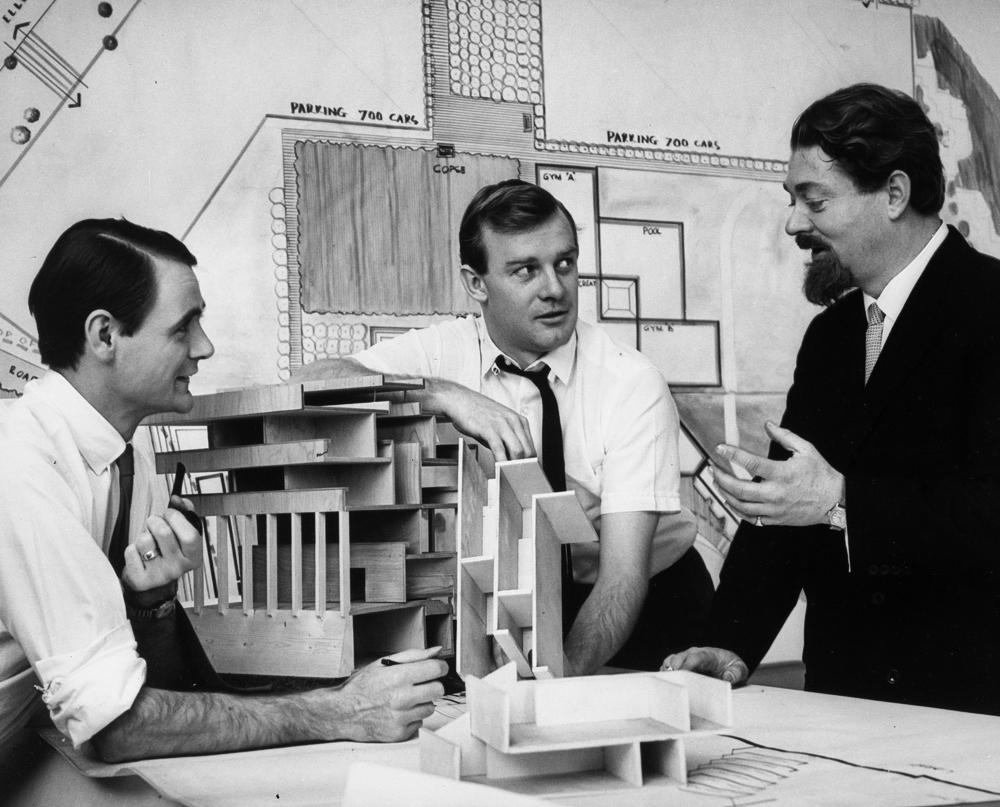
While he didn't design it, he used to belong to the firm that designed it, and was the most illustrious designer of "ugly brutalist structures" in Toronto. And I wouldn't be surprised if you're the sort who's never heard of him.

 
Still in the minority camp thinking this was a huge improvement over the ugly brutalist structure that was underneath. The redo is not unique or stunning but it's bright and airy in comparison with its white and glass facade.
I'm not sure what you see as "improvement" when the gloomy overcast clouds above appear more cheerful as picted.
 

Back
Top