You are using an out of date browser. It may not display this or other websites correctly.
You should upgrade or use an alternative browser.
You should upgrade or use an alternative browser.
Toronto 383 Sorauren Avenue | 33.83m | 10s | Gairloch | a—A
- Thread starter BMyers
- Start date
hawc
Senior Member
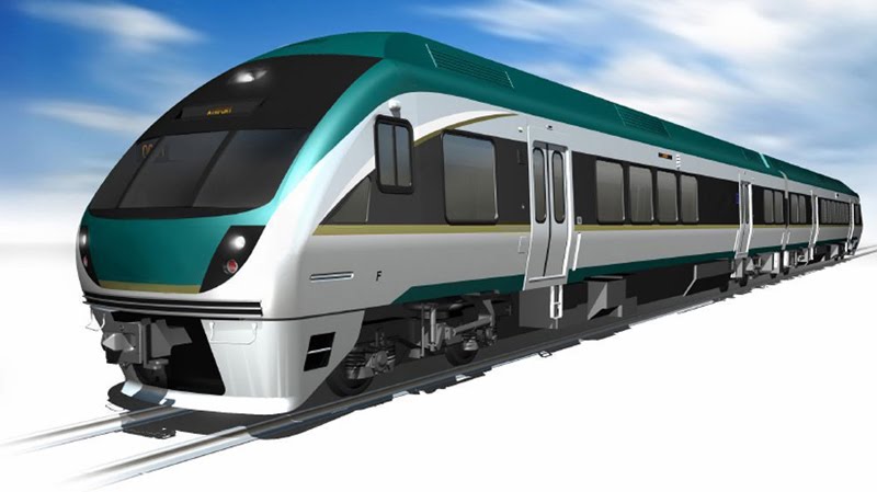
My understanding is that the railcar sets which are to be used on the Pearson link are comparable to the Budd self propelled railcars, only with much more modern, much less polluting diesel engines and exhaust emission controls.
Correct.

hawc
Senior Member
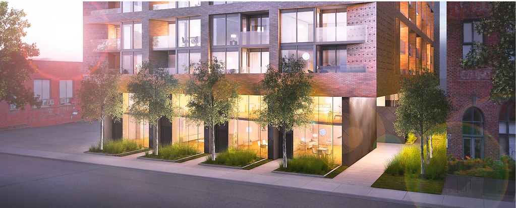
Where the tree lined alley is between the two buildings is where the current driveway and sole entrance to the underground parking garage for RWL. Sucks that the cars will no longer be able to get in and out of the garage.


Also I still maintain that those folks in 383 Sorauren on the south side will have a gorgeous view from their windows into the windows of RWL not 15 feet away. Makes no sense to me.

Also I still maintain that those folks in 383 Sorauren on the south side will have a gorgeous view from their windows into the windows of RWL not 15 feet away. Makes no sense to me.
sentinel
Active Member
Also I still maintain that those folks in 383 Sorauren on the south side will have a gorgeous view from their windows into the windows of RWL not 15 feet away. Makes no sense to me.
Well, it is a VERY nice brick wall, after all.
urbandreamer
recession proof
I used to live in an Annex Victorian. Had a fantastic million dollar view of the red brick house next door. It was about 5 feet away--great view of the hotties next door  The majority of SFH in Toronto have only one view--the front street.
Strange website though--looks noobie.
Strange website though--looks noobie.
WSEG
New Member
revised building image looks great...besides the lane-way screw-up. nice to see a fresh approach to a modern midrise building. was getting kinda bored of the all glass box look.
as per the rezoning submission drawings...it still appears there is over 30 ft between the two buildings. It is funny how everyone is so excited for mid-rise infill projects, but then all complain about the lack of view. pretty tough to get both a view and good mid-rise built form in a growing city.
as per the rezoning submission drawings...it still appears there is over 30 ft between the two buildings. It is funny how everyone is so excited for mid-rise infill projects, but then all complain about the lack of view. pretty tough to get both a view and good mid-rise built form in a growing city.
SP!RE
°°°°°°
The "frame" of brick that extended above the top level and its simple windows were very interesting to me; I've mostly lost interest in this development now that it's lost those features.
ChesterCopperpot
Senior Member
The brick frame has not been eliminated - that's only a partial rendering
SP!RE
°°°°°°
Every newer rendering shows that the top of the brick frame that extended over the top level has been eliminated.
ChesterCopperpot
Senior Member
The only new rendering is the rendering posted on this page.
I can assure you - the brick frame is still in the proposal (for now)
I can assure you - the brick frame is still in the proposal (for now)
AlbertC
Superstar
I'm quite impressed by the final renderings. The extended top row of framing has been maintained. Though it has been altered to be of thicker definition and redesigned to integrate the balcony placements as seen in the lower section. Overall I find this a pleasing evolution of design, and one of aA's finest mid-rises to date.
SP!RE
°°°°°°
Where did you see those final renderings? You've piqued my interest!
urbandreamer
recession proof
Probably Toronto's best project to date. You gotta be in the right place at the right time to see the freshest renderporn 
ChesterCopperpot
Senior Member
Gorgeous!
42
42

