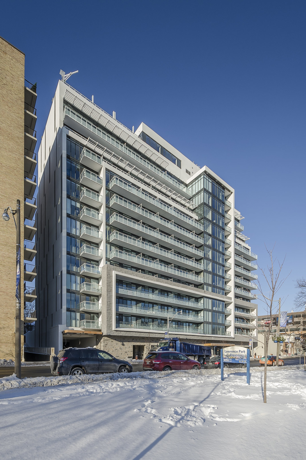
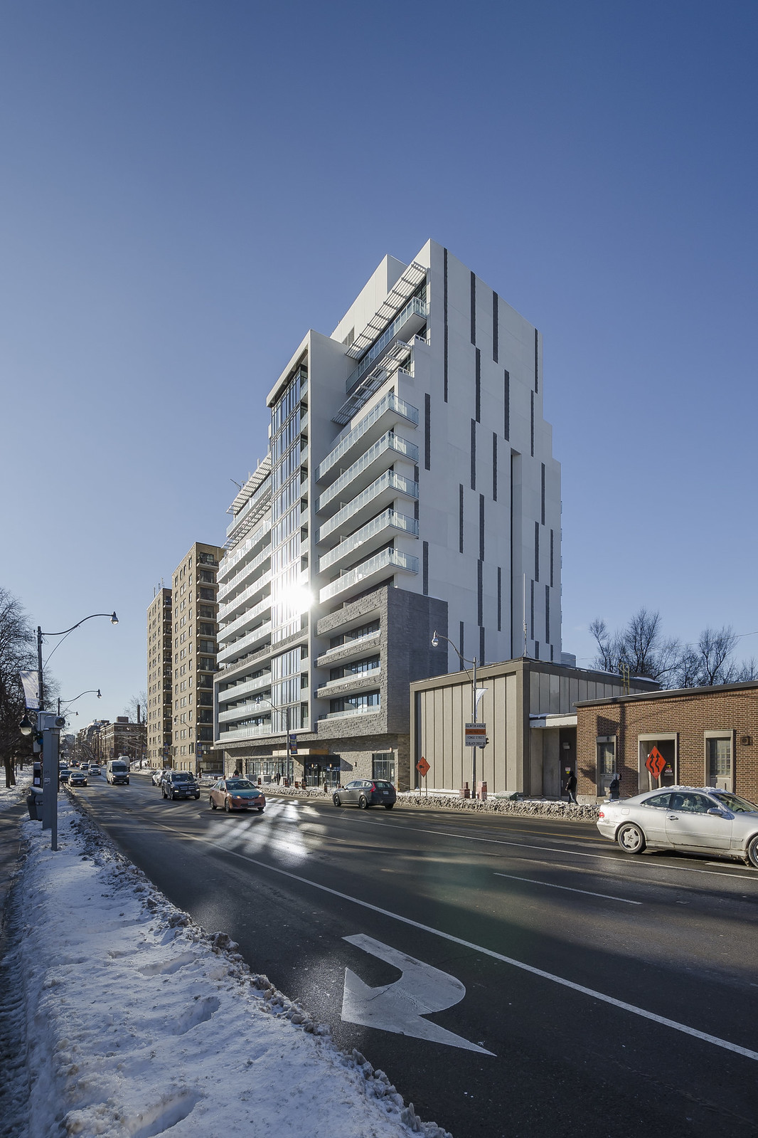
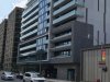
The precast stone looks out of place. A larger scaled stone with a finer textured surface would be more appropriate here.
Especially at street level, the crude stone façade looks like it belongs on the exterior of a 70's restaurant or theatre. It yearns for more glazing.
The precast stone above the ground floor looks to be painted monochromatically, which looks fake and plastic-y compared to the ground floor which looks to have a (slightly) more natural varied tone to it.
Those cheap and wimpy Home Depot exterior wall sconces are also out of place.
The glazed stripe down the middle of the front façade would have been very nice done in curtain wall, and in the renderings this portion was supposed to feature staggered mullion patterning to create some visual interest (though now a very clichéd architectural design motif in Toronto), but didn't make it to construction.