The Preservationist
Active Member
At least having the bank building restored over the current Pizza Pizza motif will be a plus...

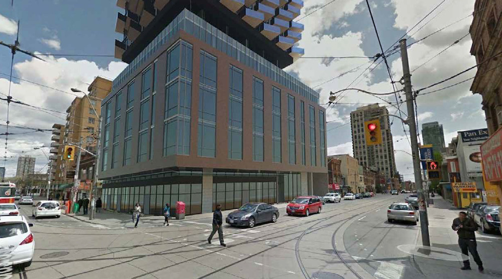
52-storey, 615 dwelling units, building with retail space at grade
Looks nice and different
Gee I'm glad the city dodged a bullet here, those two extra storeys might have caused total chaos with shadows in the area...
Updated architectural plans and renderings from Feb. 8 resubmission:
Updated project description:
CenterCourt + IBI Group: 52 storeys (166.10 metres including MPH)
View attachment 303073
View attachment 303074
View attachment 303075
View attachment 303076
View attachment 303077
Notable revisions include:
Development Applications
- Height decreased from 54 storeys to 52 storeys
- Total number of residential dwelling units reduced from 648 to 615
- Total retail GFA increased from 240 sq. metres to 315 sq. metres
Likely to cut costs in building this, for good or bad.Wow they really flattened out all the balconies. That was the only interesting element from the previous design.
I certainly liked the angled balconies in the previous design, but I also like the gradually lightening/thinning frames as this one rises, and the zig-zag effect that the staggered black louvre sections create. I'd be happy to see the old design show up somewhere else at some point, but I won't mind this one.Wow they really flattened out all the balconies. That was the only interesting element from the previous design.