Toronto 171-175 Lowther Avenue | 44.85m | 11s | Raleigh Residences | Gabriel Fain Architects

Northern Light

Superstar
Member Bio
Joined
May 20, 2007
Messages
35,557
Reaction score
103,628
Location
Toronto/EY
Not sure what's contemplated here..........

There's lobbying from Bousfields on behalf of Reznick Events Carpets.

But the Registry notes that it pertains to a 'minor variance'.

For these 3 properties:
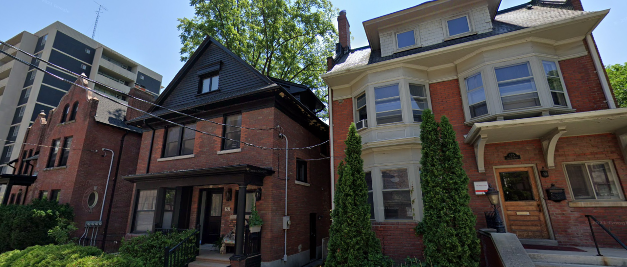
1641419991739.png


Aerial:

1641420056079.png


Site Size ~1200m2 /13000ft2

Heritage Status: None of the three properties has any protection (listing or designation)

Permissions on the site aren't very high:
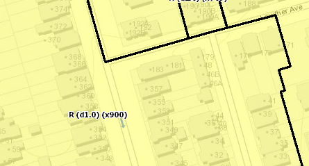
1641420501572.png
 
Whoa! Wonder what's in store here and across the street at the church bought by TAS. Used to live in 171, these are all pretty handsome Victorians.
 

Gabriel Fain:
With great support from city planning staff and neighbourhood associations we are submitting a project that aims to redefine mid-rise policy in the city. Gone are the days of angular planes. Away with terracing and wedding cake shaped buildings. Heights and setbacks based entirely on context. Very soon shadow studies will no longer define the built form of our city. We want to usher in a new era of architecturally driven housing. Dense housing that speaks to history, context and people not archaic policy with no regard for how we want to live. Rental housing. Punched windows. Thermally broken balconies. A building which we hope captures the spirit of our thinking on city building.

Gabriel Fain Architects_Lowther 1_Laurier Verd.jpg


Existing conditions:
unnamed.jpg
 
Some Annexonianites will be up-in-arms, but hey, they live in an MTSA or two or three! It will be interesting to see this one progress.

42
 
@Paclo with the excellent follow up, 21 months'ish after I first reported this site being in play.

****

On the substance here, I see one heritage facade/building retained.
'
The other two removed, but replaced with brick and a scale at grade that many will find appealing. I like where this one is heading, but I will take issue with inconsistent window shapes. Lets pick a theme and stick to it.

We have some hard rectangles mixed in with the arches and it reads as a non-sequitur to me.

The roofline of the podium levels is less of an issue, but still jars a bit given the arches below. I think a bit of thematic consistency and I'm pretty much there.

****

I really want to applaud the inclusion of thermally broken balconies, that's something we should be seeing as standard at this point; but good on Gabriel for being a leader here.
I have mixed feelings about that podium. Part of me likes the chaos / randomness of it. Reminds me of the the split level brick retail in Yorkville
 
An ersatz Uno Prii-inspired tower randomly emerges from a disjointed, featureless, 3-storey podium (groan) of brick masonry. This being 2023, the latter is punctured by predictably awkward openings of various shapes and sizes, like an infant's box puzzle.

I suppose this mashup design is meant to abstract reference Annex vernacular - but in my opinion, the whole composition is less than the sum of its parts.
I like the Prii-inspired upper portion, that updated modern interpretation works in my eyes. I'm inclined to agree on the base though - it's too disjointed, I'd hoped we're past the jaunty asymmetrical thing by now. I do however love the red brick podium from a material and scale standpoint, and how it merges the two vernaculars dominant in the Annex.
 
The exaggeration on this rendering is frankly ridiculous. It's an 11 storey proposal but it looks more than double the building behind it (34 Walmer Rd) which is a 10 storey building.

I can understand some exaggeration but this is absurd.
 
The exaggeration on this rendering is frankly ridiculous. It's an 11 storey proposal but it looks more than double the building behind it (34 Walmer Rd) which is a 10 storey building.

I can understand some exaggeration but this is absurd.
perspective?
 
I rather like both the base and the Prii-inspired tower. I understand the criticism that they clash, but am willing to give this one the benefit of the doubt. I also like the scale for infill here. It fits, unlike the recent proposal at 40 Walmer.
 

Community Consultation Meeting for 40 Walmer Road and 171-175 Lowther Avenue


Monday, December 18, 2023 6:00 PM - 8:00 PM
(UTC-05:00) Eastern Time (US & Canada)


Back
Top