News   Nov 18, 2024
 1.4K     1 
News   Nov 18, 2024
 728     0 
News   Nov 18, 2024
 1.7K     1 

Top 10 Favourite Toronto Buildings

The Leaside Towers, yes, among my favourites as well! Almost got a place there when I worked at UTSC. They seem to me like buildings from the future circ. 1968 just plopped in the middle of nowhere. I'll add to that by saying their midtown cousin and my current abode, the Manulife Centre, is also amongst my faves. I agree with the other picks here but I'll throw in a few more:

- Park Plaza (the original, now the Hyatt), Avenue at Bloor. Love the massing at street level, and it just says "big city hotel" to me, even moreso than the Royal York
- University College. I discover something new about it everytime I look at it, and I had classes in there (and worked there) for a number of years.
- The Ross Building at York. It has an unapologetic, stern austerity to it I've always loved even if the classrooms in it are cubbyholes.
- Canada Life. A strange, admirable, and unique instance of an attempt at grandeur in this city that seems more common in Montreal or Chicago.
- The Colonnade. Still largely intact in its Mad Men-era glory. I feel like I should have a jacket and tie on when I walk in there. Sophistication defined.
- Scarborough College. Like the Colonnade, still largely intact from its construction (even its floor tiles haven't been changed), with some really unique spaces and uses of form.
- 10 and 20 Avoca Avenue. Something about their clean, uninterrupted lines have always appealed to me. And they are apparently gorgeous apartments on the inside. This building, as well as the Forest Hill complex (especially 135 Antibes) at Antibes Drive in North York and the Spadina Hill towers at St. Clair, to me all capture the brief moment in time of glamorous, urbane apartment living in Toronto. If you've ever watched the 1970s Bob Newhart show you'll know what I mean.
- The original Commerce Court, East, 1931. As close as we'll get to American Radiator.

Edit: I'm going to throw Robarts in there, but Robarts at a particular time in the early to mid-90's when all of the original signage and fixtures were largely still intact from when the building was completed (I remember the card catalogue!). Lousy as a working library (which it was not designed for as originally no one was allowed past the second floor) but it appeals to me all the same. Honourable mention to Scott Library at York for similar reasons.
 
Last edited:
I am very partial to the Coke HQ on Overlea in East York. I understand they are moving downtown, which places the building in heritage limb o. It is a beautiful, sparkling example of 60s Modernism, possibly the best remaining of its kind in all of Toronto's 50/60s office parks and the quality of its materials are still top-notch and not decaying at all. It would be a terrible shame to lose this building. Toronto must get on the ball for preserving this era of architecture or it will all be gone forever.

If there is already a thread for this feel free to point it out.
 
I used to detest BCE towers for some reason. Then someone on this site completely changed my mind - now I love them. Strange how one's appreciation can just flip like that.
We dont have a lot of 'wow' architecture but our financial core is really very fine in an understated way.
I think the 1FCP recladding is outstanding!

While I'm just neutral on the TD Canada Trust Towers/Brookfield Place, Calatrava's atrium is one of my favourite interior spaces in Toronto.

Favourite demolished structures:
Board of Trade building
Temple building
Toronto Star building
Bank of Toronto building (King and Bay)
Bank of Montreal Building (King and Bay)

Existing buildings (older)
Confederation Life building
Toronto Old City Hall
Canada Permanent Building
Commerce Court North
Concourse Building
Whitney Block
Gooderham and Worts complex

Existing buildings (newer)
TD Centre (particularly the bank pavillion)
Brookfield Place (in particular the atrium)
Commerce Court East (again, interior spaces)

Of the newest new buildings, the OCAD building on stilts (it's just fun and I love the way it sneaks up on you) is probably my favourite.
 
* The Commercial Bank
William Thomas, 1845.

Although it is 'only' a facade, moved inside the Galleria at Brookfield Place from 17 Wellington Street West, this one's my favourite of the few surviving grand, Greek Revival commercial buildings ( Cumberland and Ridout's 7th Post Office on Toronto Street and their York County Courthouse on Adelaide, both from 1851, being the others ). It was built in 1845, Toronto's annus mirabilis for Classically-inspired design, which also gave us Kivas Tully's Bank of Montreal building at the north west corner of Yonge and Front and John Howard's Bank of British North America at the north east corner of Yonge and Wellington.
 
* The Commercial Bank
William Thomas, 1845.

http://www.bluffton.edu/~sullivanm/canada/toronto/calatrava/6054.jpg

From a design point of view, what I most enjoy about this building is the forced perspective used in the two door surrounds on the main floor, and as framing for the second floor windows. The only other example I know of, in Toronto buildings of that era, is at John Ewart's St. Andrew's Church, where it can be seen as a window surround above the main entrance and as an element in the lowest stage of the spire:

http://www.toronto.ca/culture/images/VC-howard/MTL-1196_m.jpg

Stand at the north side of the Galleria, in Brookfield Place, and the forced perspective used on the Commercial Bank will be clear. Move closer to the building and the trickery takes effect - the entrance doors and the windows appear taller and slimmer. Design is about tricking the eye.
 
http://www.bluffton.edu/~sullivanm/canada/toronto/calatrava/6054.jpg

From a design point of view, what I most enjoy about this building is the forced perspective used in the two door surrounds on the main floor, and as framing for the second floor windows. The only other example I know of, in Toronto buildings of that era, is at John Ewart's St. Andrew's Church, where it can be seen as a window surround above the main entrance and as an element in the lowest stage of the spire:

http://www.toronto.ca/culture/images/VC-howard/MTL-1196_m.jpg

Interesting. Not being familiar with "forced perspective" I would have called the disproportionality the architect's mistake, not his design.

Could "forced perspective" be why the spires of Toronto churches quite often seem too small for the steeple? I seriously always thought it was because they ran out of money during construction, but perhaps viewed from the right angle it makes the church appear taller. Here's an egregious example:

urbantoronto-2858-8082.jpg
 
Forced perspective is a design trick, not a mistake. Though, as you point out, it could be seen as a mistake ( or, at least, baffling ) if you only observe the Commercial Bank from across the Galleria; as you move closer to the building, however, there's a point where the effect takes over, the eye is fooled, and the windows and doors appear sleeker and taller. It's fun to move gradually closer until you can define exactly where that "tipping point" occurs.

Michelangelo use the technique, in reverse, when sculpting David - the top of the figure is anatomically larger than it needs to be in order to counteract the foreshortening effect when seen from below. The Statue of Liberty is another example.

This afternoon I happened to be on Parliament Street, and dropped by the cemetery of St. James-the-Less where William Thomas is buried just to the north of the entrance to the little chapel ( by Cumberland and Storm ). Thomas designed the gravestone, which is as distinctive and well-proportioned as his buildings ( though not in as good condition, I'm sorry to report ) for his dead children, but he's buried there too. The stone is slightly angled, like the window surrounds of his bank building. Perhaps he wanted the view from below to look ... just so?

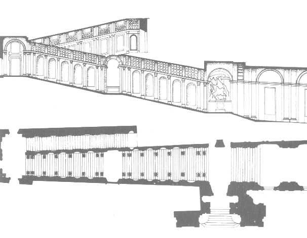
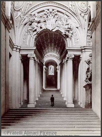
Similar technique used by Bernini in his Scala Regia in the Vatican (http://100swallows.wordpress.com/2008/11/09/berninis-ingenious-stairs/):

bernini-stairs.jpg


bernini-scala-regia.jpg
 
* St. Lawrence Hall
William Thomas, 1850.

I think what I like most about the St. Lawrence is how in-your-face it is, compared to Osgoode Hall which is set back beyond a broad lawn with trees and has a central block recessed between symmetrical wings. The small site didn't give Thomas much of an alternative but to give it great street presence. And, like John Howard's Chewett Buildings of 1834, it was mixed-use - commercial at street level, with an entrance to the farmers' market, a grand assembly room upstairs for political meetings and cultural events. Symmetry and Classical harmony and the repitition of forms, like Osgoode, but a central portico where depth is only suggested by pilasters; there's a setback with the large central attic, which leads the eye upwards to the domed cupola supported by columns.
 
I think what I like most about the St. Lawrence is how in-your-face it is, compared to Osgoode Hall which is set back beyond a broad lawn with trees and has a central block recessed between symmetrical wings. The small site didn't give Thomas much of an alternative but to give it great street presence. And, like John Howard's Chewett Buildings of 1834, it was mixed-use - commercial at street level, with an entrance to the farmers' market, a grand assembly room upstairs for political meetings and cultural events. Symmetry and Classical harmony and the repitition of forms, like Osgoode, but a central portico where depth is only suggested by pilasters; there's a setback with the large central attic, which leads the eye upwards to the domed cupola supported by columns.

Really? I know I should defer to your obvious expertise, but I'm just not seeing it. From the cornice up, I've always thought this building is a disaster. The attic storey is awkward and eclipses the pediment. The attic and the setback eclipse the dome (though I like the dome from the south). The facade just seems to loom over you from the street. Maybe it needs a couple of strong horizontal lines, like a parapet or a string course lower down. I'm not saying I want it gone of course. But there's better buildings in town. Maybe even that neat Georgian block across the street.
 
I know what you mean, but I think the building gives off different messages from different locations. From a distance, you see the dome which, when built, would have been a quote from Henry Bowyer Lane's domed 1845 City Hall immediately to the south; standing near the building on the street the three bay central section with pediment would have been strong ( as it is now, because the attic is set back ); and from across the street the attic would be seen as a vertical extension of that central section, with round headed windows and decorative elements that aren't part of the lower floors but which suggest the cultural nature of the building with images of mirth and music. I think the building's a good play of verticals ( all those two storey pilasters marching across the entire width ) and horizontals ( the ground floor is visually differentiated from the second and third floors, and on either side of the central section it was used for commercial purposes ). Perhaps the attic was intended to strengthen the identity and importance of the central, civic section of the building?
 
I don't think it is much of a feature in English Palladian civic buildings and large private residences, but the "obtrusive attic" form, as we might christen it, appears on other Classically-inspired civic buildings built in Upper Canada at that time so perhaps it is a local variation of the form? George Browne's Kingston City Hall of 1844 has one; Edward Horsey's Frontenac County Courthouse of 1855 has one; John G. Howard's Provincial Lunatic Asylum of 1850 has one - as does his enormous, unbuilt proposal of 1834 for a guildhall etc. on King Street East in Toronto pictured in Unbuilt Toronto 2. Pediments were only one part of Classical structures, and in their earlier form ( the Arch of Tiberius in Orange, for instance ) they're sometimes quite overshadowed by what's going on up above.

Kingston City Hall:
http://homepages.rootsweb.ancestry.com/~maryc/kingston city hall.JPG

Frontenac County Courthouse:
http://upload.wikimedia.org/wikipedia/commons/1/18/Frontenac_County_Courthouse_1860.jpg

Provincial Lunatic Asylum:
http://www.toronto.ca/culture/images/VC-howard/A75-77_fullview_m.jpg

Arch of Tiberius, Orange:
http://upload.wikimedia.org/wikipedia/commons/0/0b/Arc_de_Triomphe_d'Orange.jpg
 
And if we're reaching beyond the Palladian, the Osgoode Hall centre block may count as well...
 
Patience, grasshopper, I'm getting to Osgoode next. It's the third building on my list, and I've got some 'splainin' to do since I asked everyone else to also give the reasoning behind their choices.
 

Back
Top