adma
Superstar
Shell didn't even have their logo or name on it! That would never happen today.
Though the 60s digital pre-Bulova version did incorporate "shells" on its narrow sides--and of course, that was "Shell red"...
Shell didn't even have their logo or name on it! That would never happen today.
No offence to those who are advocating to rebuild this, but it is kind of ugly. How about we build something similar but nicer?
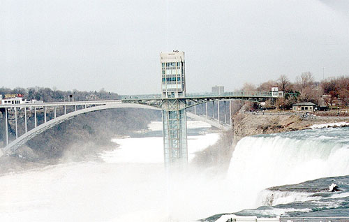
Isn't there a similar tower in Niagara Falls?


Beautiful though those timeless Golden Section proportions were - and especially powerful in the service of boldly Modernist form - perhaps the Shell Tower is nonetheless more powerful as a symbol than as a rebuilt object?
We can mourn the loss of Shell, and the Bata Headquarters, but still admire those that remain - such as the TD Centre. We can also celebrate a strong continuity with Toronto's Modernist past by recognizing it in the work of our leading neo-Modernists today. It is a living language of expression, and what our leading contemporary architects are doing today is a link with it, despite a brief flirtation with PoMo in the '80s and a few faux monstrosities today.
Isn't rebuilding akin to facadism - a weak and unsatisfying approach?


