

D
donmillsview
Guest
Other than when I initially saw that reddish stucco, I've always liked 'Space'. Should come as some vindication for the builder which battled substantial NIMBY'ism for this project. I wonder what Hume would have thought had they built the original rendering?
-
Visual interest not lost in Space
CHRISTOPHER HUME
It may not be the most elegant downtown condo, but there's something endearingly earnest about Space.
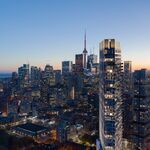
Located at 255 Richmond St. E., just west of Sherbourne St., this brand new building tries hard to present a different vision of the urban residential building. In many ways, it succeeds.
This building has no pretentions about its role in the city, but it fills the site and brings life to a fully serviced part of Toronto that has never lived up to its urban potential.
Space accepts the rough and tumble environment that is Richmond and raises the level of the streetscape without looking ridiculous in the process.
The condo starts at grade as a one-storey red brick structure. Then it turns into red stucco and higher still, grey and glass. Large areas of glazing that look out at an angle are connected by horizontal bands of balconies.
This three-buildings-in-one approach helps cut down the bulk of what could easily have been another ominous slab looming over the street. The play between horizontal and vertical elements also means a less monolithic appearance.
And by stepping the façade back on the west side of the site, and extending the red brick base up on the east, where it turns into a kind of masonry fence punctuated with rectangular openings, the designers have clearly tried yet again to add an element of visual interest to the complex.
Here, at least, they are not lost in Space.
--------------------------------------------------------------------------------
GRADE: B
-
Visual interest not lost in Space
CHRISTOPHER HUME
It may not be the most elegant downtown condo, but there's something endearingly earnest about Space.
Located at 255 Richmond St. E., just west of Sherbourne St., this brand new building tries hard to present a different vision of the urban residential building. In many ways, it succeeds.
This building has no pretentions about its role in the city, but it fills the site and brings life to a fully serviced part of Toronto that has never lived up to its urban potential.
Space accepts the rough and tumble environment that is Richmond and raises the level of the streetscape without looking ridiculous in the process.
The condo starts at grade as a one-storey red brick structure. Then it turns into red stucco and higher still, grey and glass. Large areas of glazing that look out at an angle are connected by horizontal bands of balconies.
This three-buildings-in-one approach helps cut down the bulk of what could easily have been another ominous slab looming over the street. The play between horizontal and vertical elements also means a less monolithic appearance.
And by stepping the façade back on the west side of the site, and extending the red brick base up on the east, where it turns into a kind of masonry fence punctuated with rectangular openings, the designers have clearly tried yet again to add an element of visual interest to the complex.
Here, at least, they are not lost in Space.
--------------------------------------------------------------------------------
GRADE: B