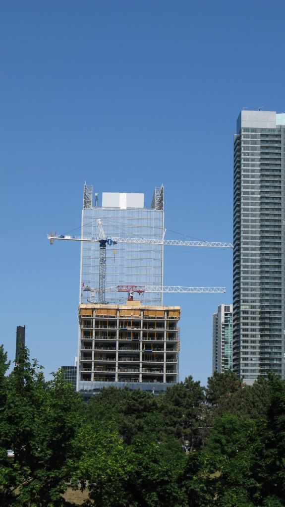
Southcore Financial Ctr: PricewaterhouseCoopers Tower (18 York St, bcIMC, 26s, KPMB)

Right, cause thousands of panels of glass stuck together to form a cube really screams great architecture.

Sorry, I honestly don't mind these, but if by 'ugly architecture' your referring to older buildings in the core then were on completely different pages.

It's interesting that a 26s glass cube gets this much commentary. It's been said before, but here's hoping that ICE at least cracks the mold in this Valley of the Monotonous.
 
18 york by me


sany0969u.jpg
 
I like that a different colour of glass is being used, and I enjoy how reflective it is. Like a good deal of architecture in this city, the nicest thing I can say about this building is that it's respectable filler.

Here's hoping that our next foray into high density office development is something we'll be proud to point out to our friends and family who visit from other, more thoughtfully constructed locales around the globe....
 
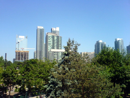
from today. 18 York from Sherwood Forest, I mean, the Skydome.

4642558831_94b13904b8.jpg
 
May 25 2010 update

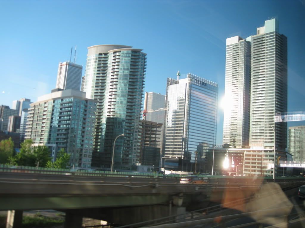
from the Gardiner ...

Now on the 14th floor
Click to Enlarge


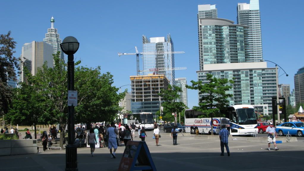
18 Yorks complements this view nicely
IMG_5151.jpg
 
With the Ice condo towers and office building yet to come at this intersection, Maple Leaf Square to the east, and a redeveloped Union Station in due course, the distinctive transformation that's underway here is a delight to behold. I can't think of anything recently built hereabouts that'll match it.
 
i'm glad 18 York will hide at least 1 side of Telus (the ugly sides that show the white mech. box) :D

I really wish that the mechanical box was painted purple or clad with purple glass/panels of some sort. Now that would've looked awesome.
 
One thing that strikes me about 18 York is how, despite being generally similar to Union Tower in size and shape, the two office towers are becoming quite visually distinct from each other due to their differing window-wall treatments (plus the rooftops, once 18 York is finished)

The early renders made me think that we would have two near-clones facing each other across York Street, but that happily seems not to be the case.
 
It would have been nice if the form was thoughtfully embellished (or all out mutated into something interesting), and I wish we could have absorbed more office space to make it taller against its neighbours, but the cladding on this building is honestly just...really nice.
 

Back
Top