


DENTROBATE54
Banned
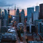
Helvetica font is common to all stations. Only Downsview deviates from this by the usage of sentence case over TITLE CASE for it's name signs. Nice that Museum at least retains this trend in a system increasingly consisting of dissimilar stations (tacky fuschia stripes all over the Sheppard line even on entrance signs, for instance, that makes one yearn for the simplistic elegance of a white 'subway' sign with an iconic red rocket or red banner with simple bold white lettering).
") . I think red isn't that logical since it's the TTC's colour. A single red subway line would seem to have some precedence or importance. That and of course it's already used to designate surface routes.
. I think red isn't that logical since it's the TTC's colour. A single red subway line would seem to have some precedence or importance. That and of course it's already used to designate surface routes.