News   Nov 29, 2024
 755     0 
News   Nov 29, 2024
 307     0 
News   Nov 29, 2024
 624     1 

QEW - Mississauga/Credit River Project

What's the scope? Presumably it remain as 3 lanes in each direction.
The road structure will be widened to accommodate a 3+HOV setup but it will be only painted as 3 regular lanes for now with temporary jersey barriers, sort of like what existed on the 400 at King Road for years. At some point in the future MTO will then widen the entire stretch of the QEW from the 427 to the 403.

a new auxiliary lane will be added between Mississauga Road and Hurontario going eastbound though.
I believe they are going to reconfigure the Mississauga Rd on-off ramps for QEW EB as well. The left turn ramp off South Service will be removed and a single ramp at Mississauga Rd will remain. Will likely alleviate the bottleneck at the curve before the bridge.
 
yes, you are correct. Those travelling on South Service Road eastbound will travel straight across the intersection with Mississauga Road onto a new on-ramp instead of having to turn left before the intersection as you have to do today.

Like the Dixie Road Interchange project, there are a few minor operational improvements but the actual mainline widening is just being accommodated in the project to allow for it to occur in the future. I don't believe MTO has even formally completed the EA for the mainline widening east of Winston Churchill.
 
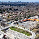
Looking West along Premium Way. The QEW bridge starts where the fancy light poles begin on the middle left.

DSC_0919.jpg
 
Oct 24

Looking Westbound, west of Hurontario
DJI_0944.JPG

DJI_0945.JPG
DJI_0947.JPG

DJI_0948.JPG
DJI_0949.JPG


Looking Eastbound
DJI_0956.JPG


Northeast. Mcity visible on the horizon.
DJI_0951ce.jpg
 
Feb 27
More up on my site

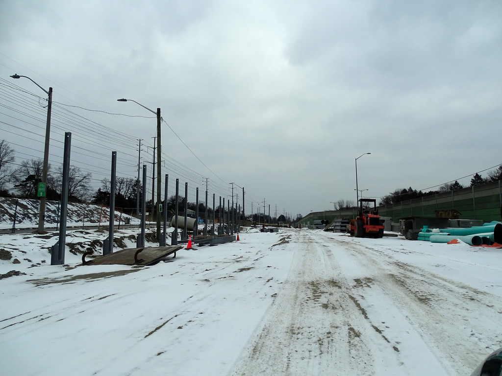
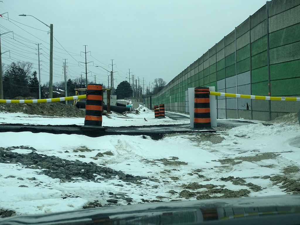
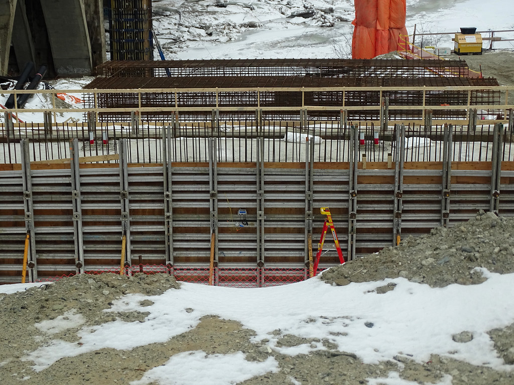
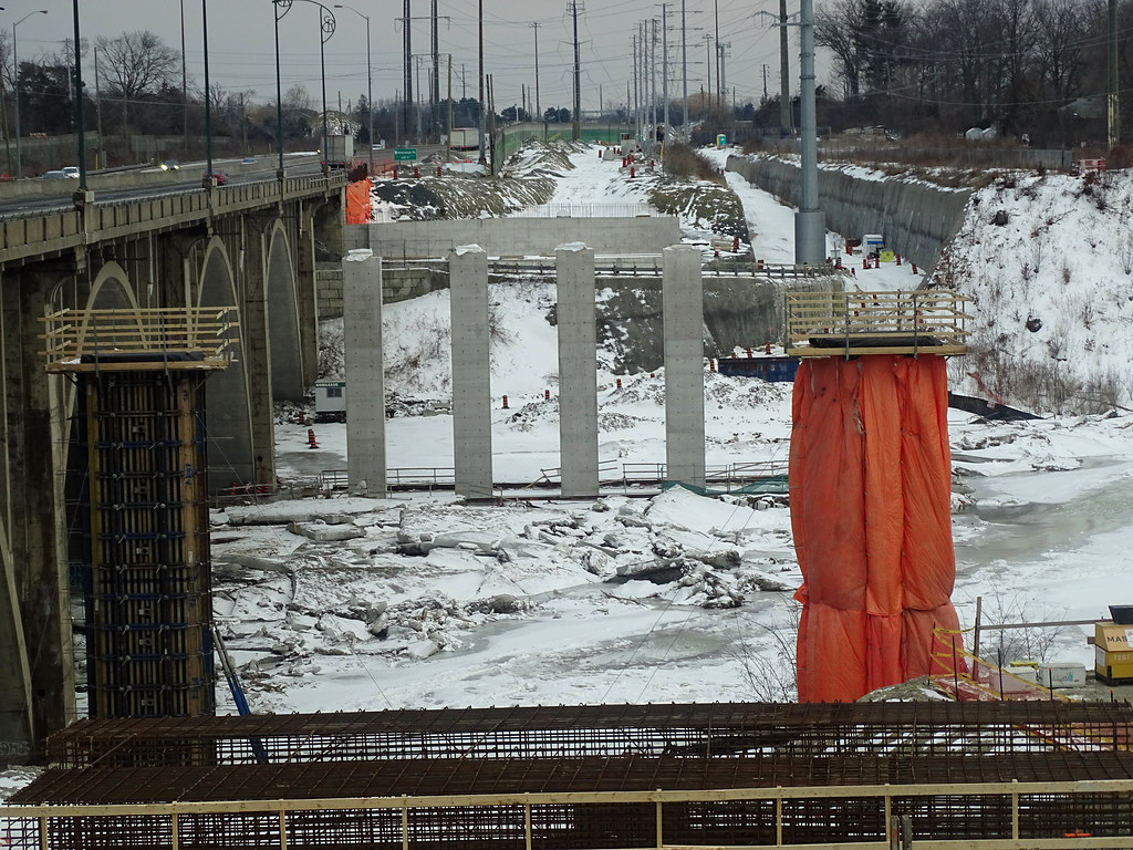
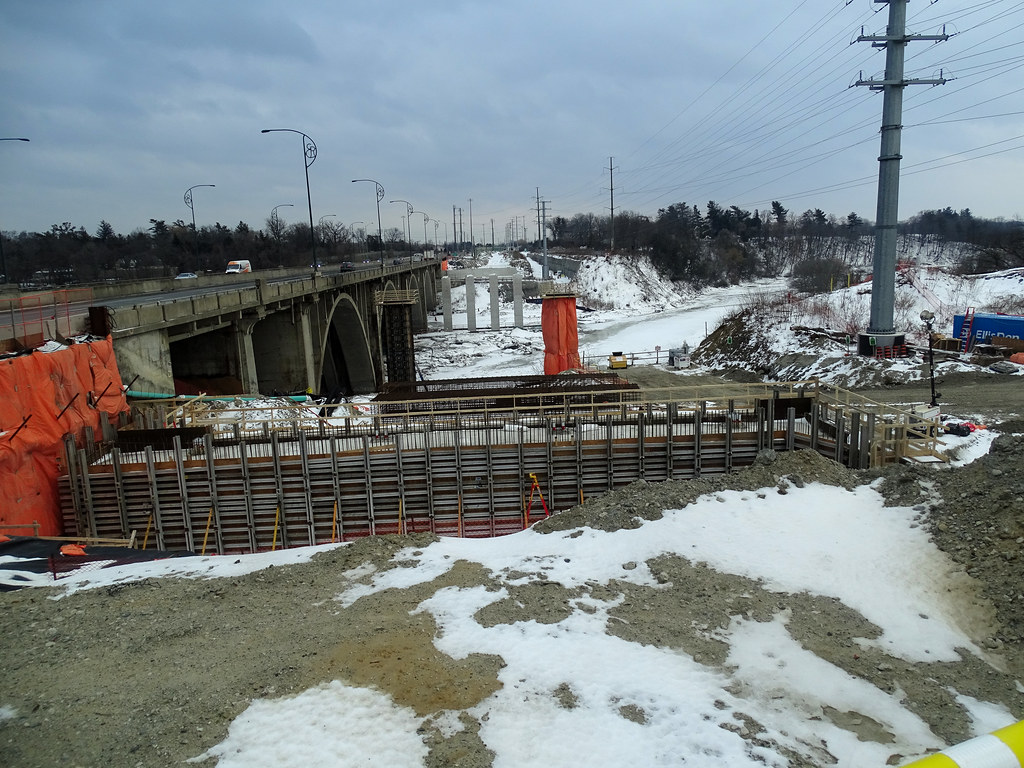
Asphalt sidewalk place next to the existing sound barrier wall.

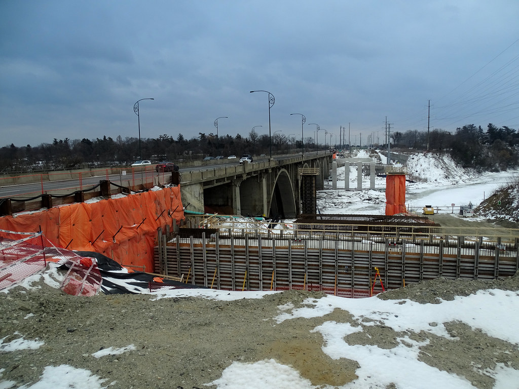
New sound barrier wall going up on the east side of the river Beside the road
51909890007_6c00db6f07_b.jpg

51911175724_5698bd8875_b.jpg

51910952923_a53f720f70_b.jpg

51911175979_b57608af69_b.jpg

51910953363_d61f5f97ab_b.jpg

51910859086_217d66cb75_b.jpg

51910953528_9a099e04b1_b.jpg

51911476670_8893ba9d6f_b.jpg

51909890472_781f6c741e_b.jpg
 
I never realized how nice it was. Sorry if this has already been posted, but there are many views of the existing bridge here on the project website.

I think such architecture, design and heritage issues should be dealt with finesse. It's still hard to believe that the Burlington Skyway, a bridge that was designed to be a landmark high-level bridge, got a completely generic second span in the 1980s.

The 1980s addition seriously detracts from the landmark quality of the original and arguably detracts from Hamilton's sense of place. It was a mistake that shouldn't be repeated.
But it was with the credit river bridge lol 😆
 
I think such architecture, design and heritage issues should be dealt with finesse. It's still hard to believe that the Burlington Skyway, a bridge that was designed to be a landmark high-level bridge, got a completely generic second span in the 1980s.
At some point, culturally as a nation, our highest priority became “value for money” to the extreme. As a consequence our infrastructure looks and feels pedestrian, where if we paid a little bit more and took a few more risks we’d end up with something more beautiful.
 
I never realized how nice it was. Sorry if this has already been posted, but there are many views of the existing bridge here on the project website.

I think such architecture, design and heritage issues should be dealt with finesse. It's still hard to believe that the Burlington Skyway, a bridge that was designed to be a landmark high-level bridge, got a completely generic second span in the 1980s.

The 1980s addition seriously detracts from the landmark quality of the original and arguably detracts from Hamilton's sense of place. It was a mistake that shouldn't be repeated.
MTO is in the process of replacing the Garden City Skyway in St. Catharines.. I wonder if they are planning anything "above ordinary" or if it'll just be another plain old bridge. After the Burlington Skyway, it's MTO's second-largest bridge.
 
BTW, you can see this with Metrolinx’s designs for the OL bridges over the Don Valley: they could go for something ambitious, with a sense of place, but no - so far the plan is a concrete guideway.

The issue is at least partially public literacy: people point to the ‘palatial’ TYSSE subway stations as the reason for cost overruns, and even on this forum people have singled out public art (until it was canned, ML’s public art component was 1% or less of total costs) and public realm as contributing to escalating public costs - while the real reason is our overuse of TBM, inability to bank ROWs, political dithering and more.
 
At some point, culturally as a nation, our highest priority became “value for money” to the extreme. As a consequence our infrastructure looks and feels pedestrian, where if we paid a little bit more and took a few more risks we’d end up with something more beautiful.

I don't disagree; but I also want to pitch in for the idea that sometimes the money is on the table and is spent poorly.

I'm thinking of the TYSSE where we over-built, cavernous stations, by commissioned starchitects with lavish budgets, and yet we have sections without wall finishes (notably trackside walls), but even missing sections of ceiling finish.
The cost to get those things right were small, and could have been paid for with the 'public art' budget pretty much, or by modifying the designs to shrink ceilings heights or station depth by even a few feet, or trim capacity by even 5%.
So many different choices were available. Even the starchitects didn't 'own' their work.

Beyond that, however, lets look at bridges, since that's being discussed above.

Parapet walls used to be covered in different surfaces including stone, brick, various spray applications to make them more attractive. At some point here, engineers decried that such surfaces made bridges harder to inspect.

A legitimate concern, but one that could be addressed several ways other than using bare concrete. If it was really desirable to see the surface concrete with the naked eye, one could use cladding (brick/stone etc.) that could be removed for inspection purposes. Alternatively, one can inspect structure w/any number of different diagnostic technologies these days that can easily see through an exterior coating....

Of course, the latter would cost some money....

But I digress; even the engineers have admitted, the concrete walls can be dull, a preferred solution was settled on, that they could be poured into forms, giving the illusion of some other surface. (not sure why, but I haven't seen any experiments with dyed concrete, I think a terra cotta shade could be quite nice).....

Back to poured forms though; we don't consistently use them, we don't apply them in ways that allow fulsome design expression, and we too often use forms that we shouldn't because the design impression is poor.

Examples follow:

Basic bridge parapet wall:

1646402779851.png


This is the Gerrard Bridge over the Don River/DVP. Exceedingly bland!

But could we do better?

Here's the Lawrence Avenue East bridge over the GO tracks:

1646402927467.png


Much nicer! Not stone, just concrete, but poured into a form to make it look like stone. Same railings as the Gerrard bridge, but in black instead of plain/unpainted.

For contrast, this is the refurbed Millwood bridge over the DVP and Don River which also saw forms used for its concrete:

1646403074768.png


What is that design? Seriously. Also note the unpainted railing which contributes to monochromatic dullness.

This bridge, Dawes Road over Taylor Creek had decorative forms used........

1646403207307.png


Can you tell? LOL..... they only used them on the outside of the bridge to emulate the stone coating that used to appear on the bridge, but not on the top/interior side. Sigh.

****

Moving on from parapet walls, to the railings above. The designs need not be historical, or black, but having a design just a bit less utilitarian with some sort of good colour chosen does wonders.

This is from the southern extent of the Bathurst Street bridge over the rail corridor:

1646403490565.png


Clearly the form of the parapet is dull as dishwater, but the railings here have a measure of elegance.

*****

So much can be done for relatively little cost. Often entirely within existing design budgets, for literally an extra 1% Sigh.
 
Last edited:

Back
Top