


sche
Active Member
Amazing thread and analysis! Really interesting to read through.
I think for many urban design failures, including these 'modern parks', a lot of the problems come when the designers focus more on what it looks like from the air, rather than what it looks like from street level.
You see this in all of the examples from above:
- June Callwood's undulating pattern meant to be modelled after sound waves from a quote, only visible from the air, plus its excessive use of the bright pink
- Sherbourne Common North's tree, bench, and path arrangement, which forms a pattern of horizontal lines & angles from the air
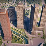
- Village of Yorkville Park and Wellesley-Magill Park's grid of trees, which might look interesting from above but is uninviting from street level
Edit: Even the beloved Music Garden has issues with the one element designed solely from the air - the spiral path. It's so indirect that people create desire lines and just cut across, which damages the flowers and plants.
This focus on design from the air in turn leads to a neglect of the actual experience from ground level, and leads to a lot of the issues described, like a lack of clear entrances, paths that don't seem to lead anywhere, poor sightlines, nonexistent/illogically placed seating, etc..
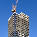
This also applies to things like architecture too - for example, any condo that puts blank glass at street level and instead details the balconies and/or crown; or a lot of tower-in-the-park apartment blocks; or windswept 1960s-80s plazas, or Roy Thomson Hall, where the Simcoe St frontage consists of blank glass and concrete while effort was put into the roof.
I think for many urban design failures, including these 'modern parks', a lot of the problems come when the designers focus more on what it looks like from the air, rather than what it looks like from street level.
You see this in all of the examples from above:
- June Callwood's undulating pattern meant to be modelled after sound waves from a quote, only visible from the air, plus its excessive use of the bright pink
- Sherbourne Common North's tree, bench, and path arrangement, which forms a pattern of horizontal lines & angles from the air
- Village of Yorkville Park and Wellesley-Magill Park's grid of trees, which might look interesting from above but is uninviting from street level
Edit: Even the beloved Music Garden has issues with the one element designed solely from the air - the spiral path. It's so indirect that people create desire lines and just cut across, which damages the flowers and plants.
This focus on design from the air in turn leads to a neglect of the actual experience from ground level, and leads to a lot of the issues described, like a lack of clear entrances, paths that don't seem to lead anywhere, poor sightlines, nonexistent/illogically placed seating, etc..
This also applies to things like architecture too - for example, any condo that puts blank glass at street level and instead details the balconies and/or crown; or a lot of tower-in-the-park apartment blocks; or windswept 1960s-80s plazas, or Roy Thomson Hall, where the Simcoe St frontage consists of blank glass and concrete while effort was put into the roof.