You are using an out of date browser. It may not display this or other websites correctly.
You should upgrade or use an alternative browser.
You should upgrade or use an alternative browser.
PATH Network Expansion (various, various, various)
- Thread starter interchange42
- Start date
AlvinofDiaspar
Moderator
I am not a graphic designer, but this is something that is along the lines of what I am thinking using Adobe Illustrator:


The proportions, details and colour aren't quite right - but you can have that and a reverse negative space version - for reference, here is a collection of logos from other transit systems:

https://www.flickr.com/photos/25428...-77PshQ-bEpivf-cDx91W-CCRgq-3sw3G-UMu4-bDxRK5
Look at how weak the TTC and Skytrain logos are.
AoD
The proportions, details and colour aren't quite right - but you can have that and a reverse negative space version - for reference, here is a collection of logos from other transit systems:

https://www.flickr.com/photos/25428...-77PshQ-bEpivf-cDx91W-CCRgq-3sw3G-UMu4-bDxRK5
Look at how weak the TTC and Skytrain logos are.
AoD
Attachments
Skeezix
Senior Member
Member Bio
- Joined
- Apr 25, 2007
- Messages
- 4,343
- Reaction score
- 2,691
- Location
- East of this, west of that
I have to say that on the chart above I like the TTC logo much better than the dull alternatives.
P23
Active Member
I have to say that on the chart above I like the TTC logo much better than the dull alternatives.
I think you're just attached to it. It fails in readability, even at larger sizes, and is a mess from a technical perspective with the overuse of strokes and thin line weights. There are a lot of other terrible logos there, but some like Tokyo, Hong Kong, London Underground and even nearby Montreal are not only iconic, but well designed and can still be 'read' at minute sizes. The TTC logo really needs to be updated for the modern age, but it doesn't mean you need to discard the overall shape of the shield and ribbon, it just needs to be simplified and refined.
Skeezix
Senior Member
Member Bio
- Joined
- Apr 25, 2007
- Messages
- 4,343
- Reaction score
- 2,691
- Location
- East of this, west of that
I think you're just attached to it. It fails in readability, even at larger sizes, and is a mess from a technical perspective with the overuse of strokes and thin line weights. There are a lot of other terrible logos there, but some like Tokyo, Hong Kong, London Underground and even nearby Montreal are not only iconic, but well designed and can still be 'read' at minute sizes. The TTC logo really needs to be updated for the modern age, but it doesn't mean you need to discard the overall shape of the shield and ribbon, it just needs to be simplified and refined.
"Just attached to it"? No. With all due respect, I know my own mind, you do not. The TTC logo is beautifully designed and iconic, and there is no "need" to update it. You're obviously entitled to disagree, but maybe stick to your own opinions rather than telling me what motivates mine.
pw20
Senior Member
It seems to me the only weak part of our logo is the inclusion of the TTC acronym in the shield. Certainly the shield and wings and could be flattened / modernized if necessary. BUT even next to some of the others above I quite like it. The TTC could, if they had a better brand, change color for lines/transportation type (similar to the roundel color changes in London) however I don't think we need to throw the baby out with the bathwater on the TTC's logo.
DonValleyRainbow
Senior Member
Member Bio
- Joined
- Mar 5, 2014
- Messages
- 2,867
- Reaction score
- 1,928
- Location
- Kay Gardner Beltline Trail
It seems to me the only weak part of our logo is the inclusion of the TTC acronym in the shield. Certainly the shield and wings and could be flattened / modernized if necessary. BUT even next to some of the others above I quite like it. The TTC could, if they had a better brand, change color for lines/transportation type (similar to the roundel color changes in London) however I don't think we need to throw the baby out with the bathwater on the TTC's logo.
Like this? I have cleaner versions on another computer that I made years ago but here's rough versions.


salsa
Senior Member
Found this interesting slide in the Lower Yonge precinct plan (part of Waterfront Toronto's April board meeting).

Attachments
Midtown Urbanist
Superstar
I don't think it is new news, but it is a great reminder of what could be the future.
Transportfan
Senior Member
Looking at the map, where's the Harbour St. extension going to tie back into Lake Shore?
It's not going to. The idea is that you'll have several streets to choose from to make a left turn on to head back to Lake Shore.
42
42
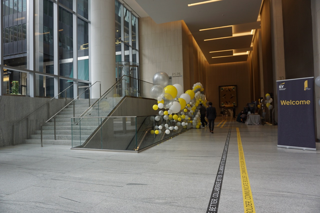
The PATH network has gained a new traffic generator in the core as of today with the opening of the EY Tower at the Richmond Adelaide Centre.
Here's how it connects to the older west-side north-south lane, just to the south of Rexall, and opposite a hall coming in from the Hilton and DBRS Tower to the west.
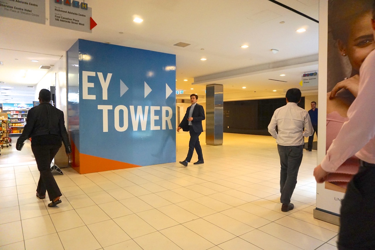
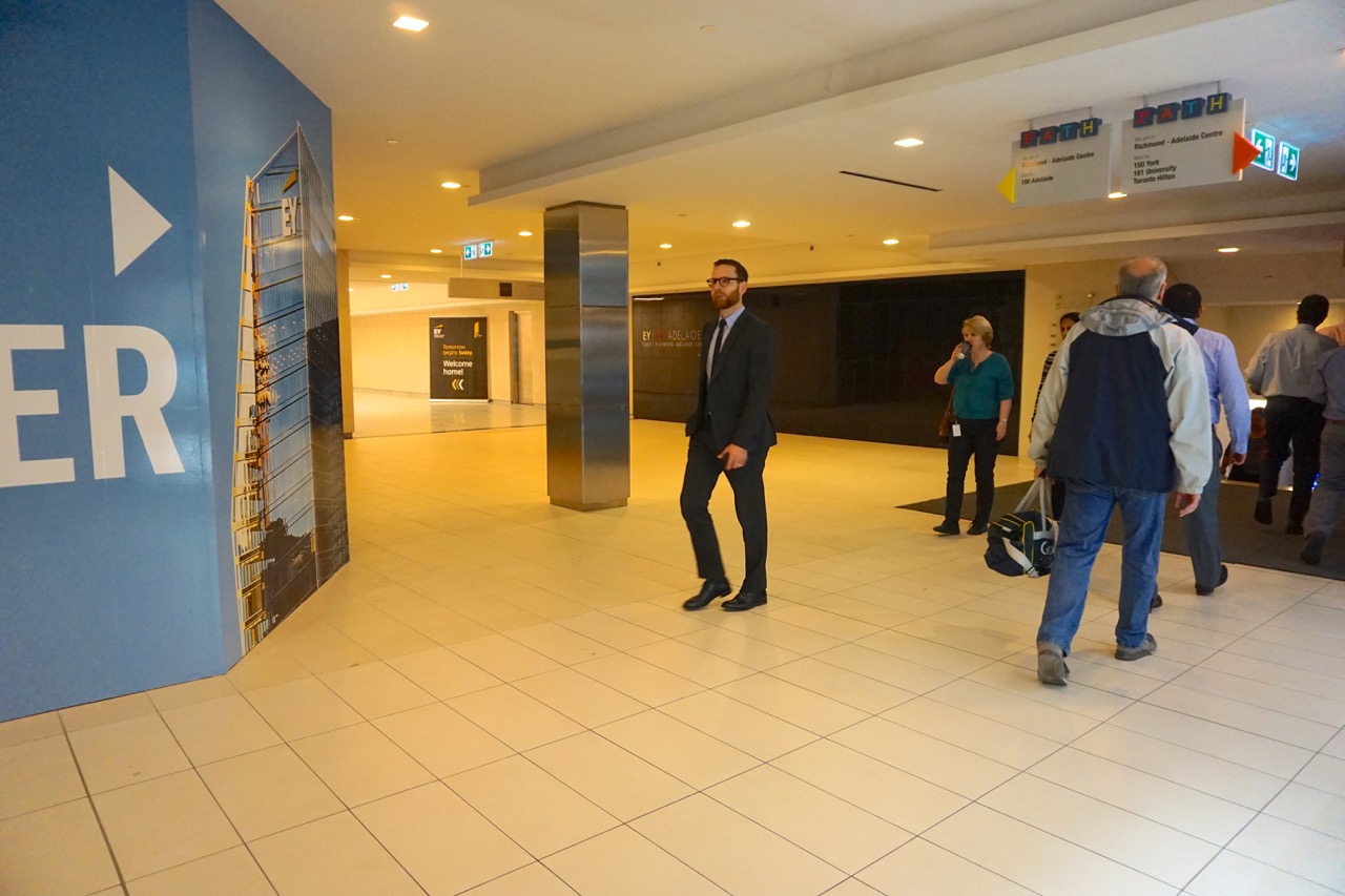
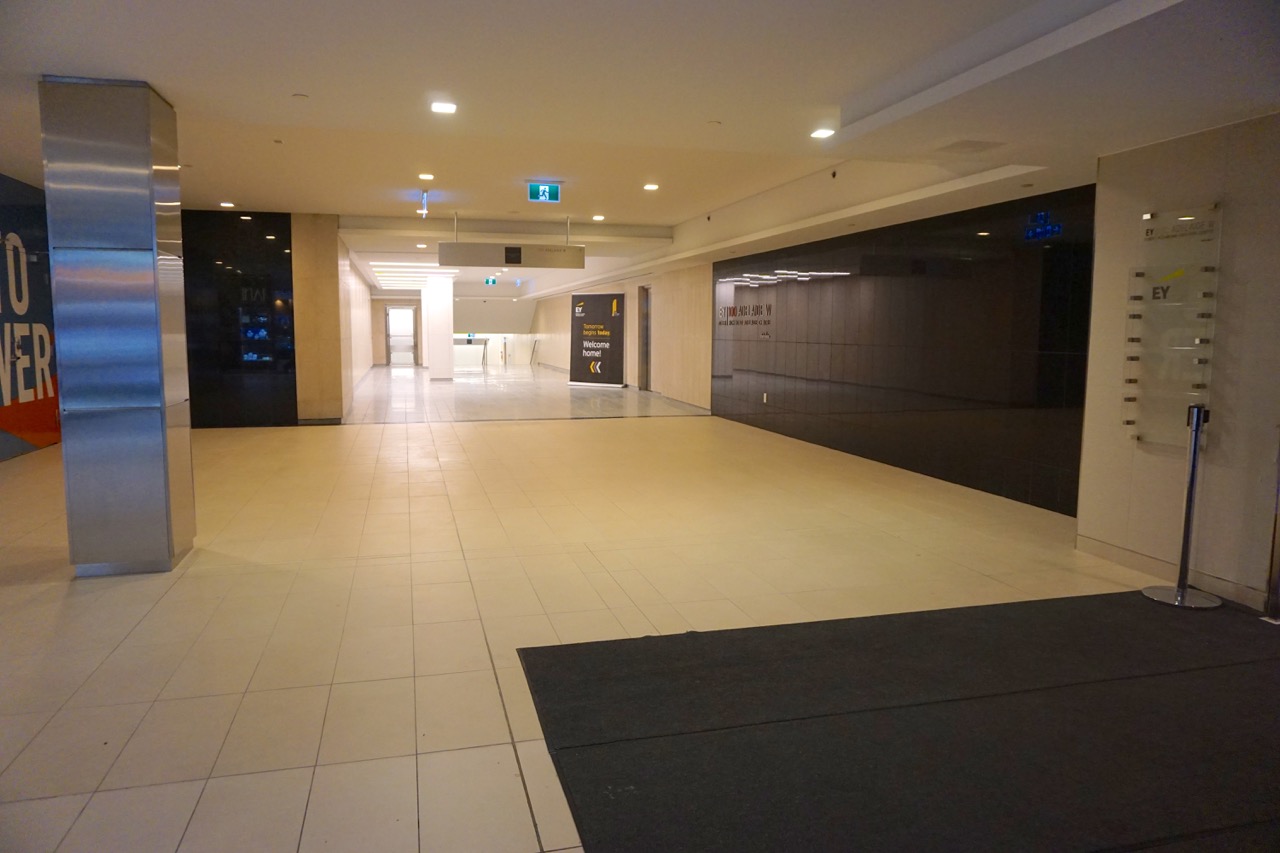
As you can see above, it adds no new shops to the PATH. As you can see below, it adds a regrettable grade change…
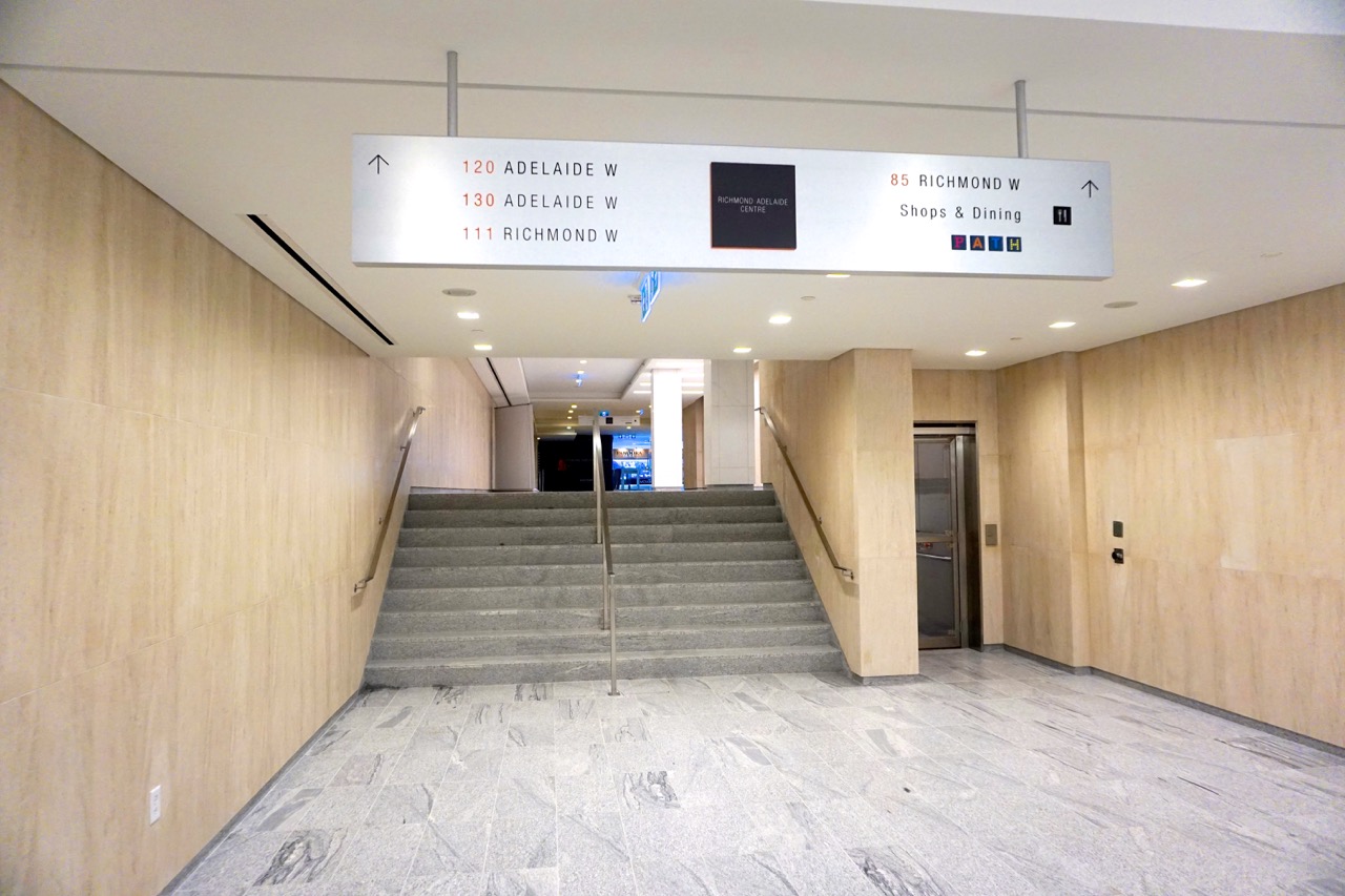
…but as the PATH wasn't designed into the earlier towers before they were built, whatchagonna do?
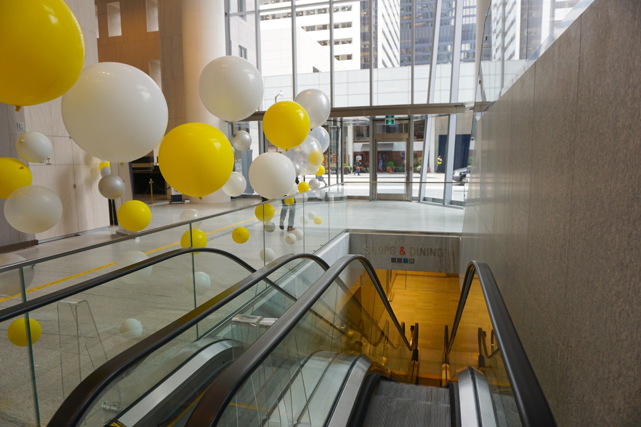
Above and below are how it surfaces in the new tower.
42
Here's how it connects to the older west-side north-south lane, just to the south of Rexall, and opposite a hall coming in from the Hilton and DBRS Tower to the west.
As you can see above, it adds no new shops to the PATH. As you can see below, it adds a regrettable grade change…
…but as the PATH wasn't designed into the earlier towers before they were built, whatchagonna do?
Above and below are how it surfaces in the new tower.
42
Attachments
LNahid2000
Senior Member
Does the PATH now also connect to INDX condos?
Midtown Urbanist
Superstar
Well, at least it has a connection!
