Electrify
Senior Member
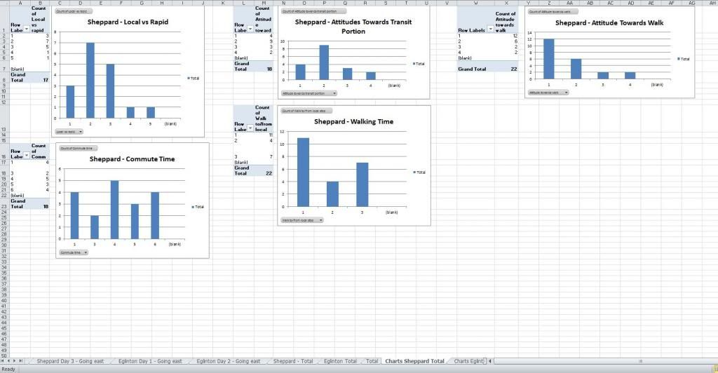
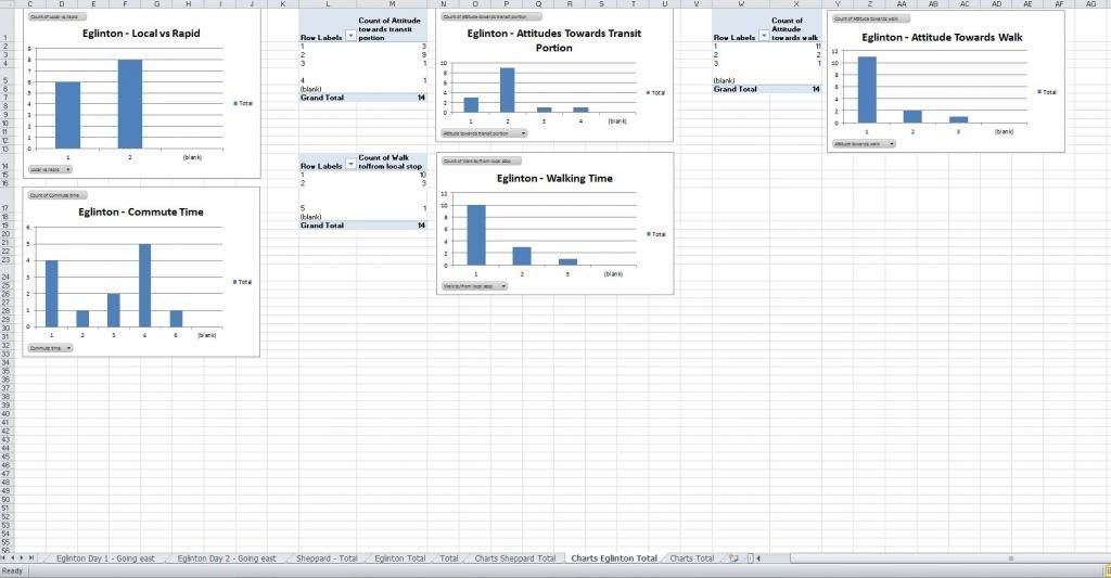
Anyways, back on topic, I have developed some charts of my results. For the record, in cases where no one selected an option, it does not have its own column. So when you see columns labelled "1-3-4-5" I am not trying to throw anyone off, it is just that no one selected option 2. There is probably a way to make it show, but it took me long enough to figure out how to create these graphs in the first place.
EDIT: Click through to get the full images.
Sheppard Total
Eglinton Total
Overall Total
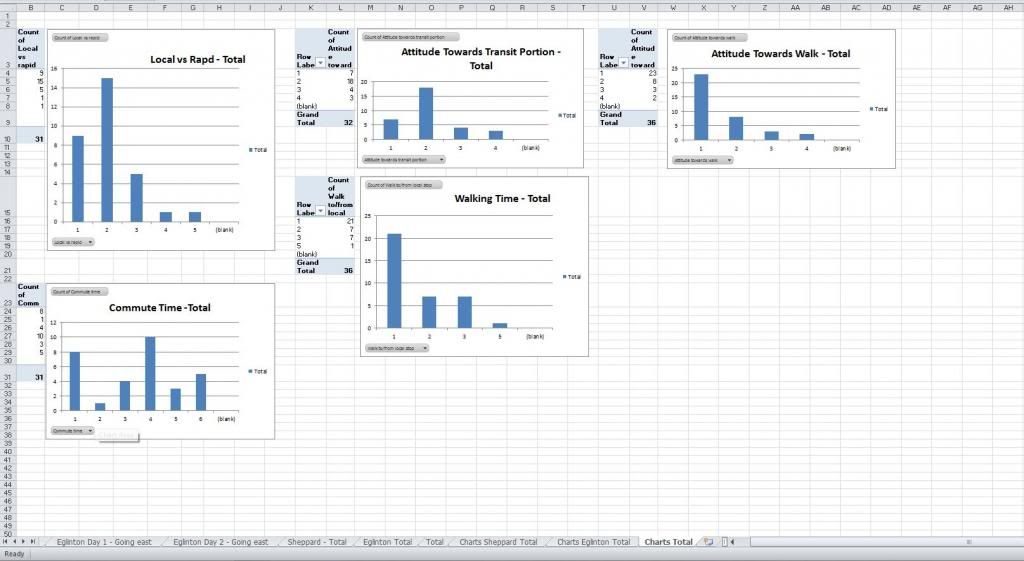
One thing I noticed by doing this is just how diverse the commute times actually are! Going back to my last post, it goes to show that multiple modes of focus on key and high use corridors are in fact a very good option to explore.
EDIT: Click through to get the full images.
Sheppard Total

Eglinton Total

Overall Total

One thing I noticed by doing this is just how diverse the commute times actually are! Going back to my last post, it goes to show that multiple modes of focus on key and high use corridors are in fact a very good option to explore.


