Long time lurker here…
Urbantoronto has been one of my ‘go to’ sites for two years, and I have learned a vast amount about the city from it. It is a very successful enterprise, and you should be commended for the work you are doing, and for taking it to the point that it is now at! Congratulations! Bearing that in mind, please forgive the intrusion I am about to make.
If you’ll permit me I’d like to comment on the changes you have recently enacted on the site. I am coming at this not through the portal of architecture, and I will leave discussions as to the functionality of the site to others. I am not an architect, but rather a designer and artist, and I am speaking strictly from a design perspective.
Firstly, the palette you have selected is certainly not for everybody, as many people find rust colors to be somewhat unpleasant. That aside, I think the main issue here is that the palette of deep oranges, reds and blacks does not evoke any associations with the city itself. It just doesn’t say “Toronto” to me.
I know that the vBulletin blue is dull and you were right to change it. Unfortunately, orange-based colours spark an unusually strong positive or negative reaction in people. People tend to really love them or really hate them, so you are likely to be alienating at least some of your potential audience with this choice. Also the use of the gradient is very generic and dated looking.
Also, the phrase ‘Welcome to our planet’ is just a head-scratcher, and while
I think I know what it means, I am not sure. Suffice to say that this confusion is not a good thing, when it comes to the art of branding! Either way, the phrase is distracting, and on bad days I find it annoying. At best: it doesn’t add anything to the site, and it takes up a vast amount of mental space.
The banner in general has
‘a lot going on’ to put it mildly, but unfortunately none of it underscores the strength and meaning of the site. In other words for all its busyness, there is not one thing on the banner that says “Toronto”, other than the name of the site itself, and a very artificially coloured and generic skyline shot that is no better than the worst kind of postcards found at tourist destinations (which is in any case buried under a mountain of photoshop filters).
The planet image on the left is extremely low def looking, and the smeared city lights across the surface seem meaningless and are just adding to the clutter. There's a random sunrise effect on top left, even although the entire surface edge of the earth is already illuminated! And then there's a lonely little line drawing of a crane sort of jammed into the end of the URL. At the most basic level, everything on the banner is just kind of just kind of fighting with everything else.
Anyway, something iconicly Toronto would be far stronger than the present mish mash. Please forgive the comparison but Torontoist’s use of landmarks like OCAD and yes, ‘The Tower’ seems smart, simple and memorable in comparison. Its no masterpiece but it immediately conveys what the site is all about.
Also: Button mayhem and the problem of “chartjunk”.
From the Wiki:
“Markings and visual elements can be called chartjunk if they are not part of the minimum set of visuals necessary to communicate the information understandably. Examples of unnecessary elements which might be called chartjunk include heavy or dark grid lines, unnecessary text or inappropriately complex fontfaces, ornamented chart axes and display frames, pictures or icons within data graphs, ornamental shading and unnecessary dimensions.”
http://en.wikipedia.org/wiki/Chartjunk
The doodads reach a kind of apotheosis in the ‘City Photos’ area. What
are all those things? You’ve got 6 or 7 things happening in a miniscule little area. Each with its own colour, and each with its own drop shadow and shading! Yikes!
My overall point here is that I am left feeling that the present busyness of the site is actually undermining its very purpose, and the values that it upholds: the promotion of intelligent and inspired design and architecture and the embrace of very high standards. For me, the site is all about giving voice to a community that believes in the importance of these things.
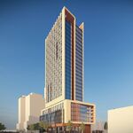
I would suggest to you that at present the redo has actually muddied the water in this regard. To put it in architectural context: the present busyness of the site evokes the fussiness and over reaching of this:
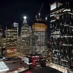
More than the simplicity, elegance and quality represented by this.
Anyway, just my two cents. Rip it to shreds if you like, but I just wanted to put it out there.


