|
|
|


You are using an out of date browser. It may not display this or other websites correctly.
You should upgrade or use an alternative browser.
You should upgrade or use an alternative browser.
Evocative Images of Lost Toronto
- Thread starter LowPolygon
- Start date


EVCco
Senior Member
This was, of course, the coat of arms for the pre-amalgamation City of Toronto. Perhaps its rather pallid replacement is symbolic of the state we find ourselves today;
As someone with a life-long interest in heraldry and vexillology, I`ve always found both the current coat of arms and the current city flag to be beyond insipid - but, I guess, at least you don`t see the coat of arms around too much.
I think there was a thread on here from a few years ago about wanting to change the flag (one can always dream...)
Etobicoke had a great flag from 1977-1995, then they messed up:
http://flagspot.net/flags/ca-on-et.html
There`s still a few heraldic remnants that can still be found around old metro if one looks hard enough, though:


...interesting to compare the last one with the arms of the Republic of Kiribati:

Last edited:
thecharioteer
Senior Member
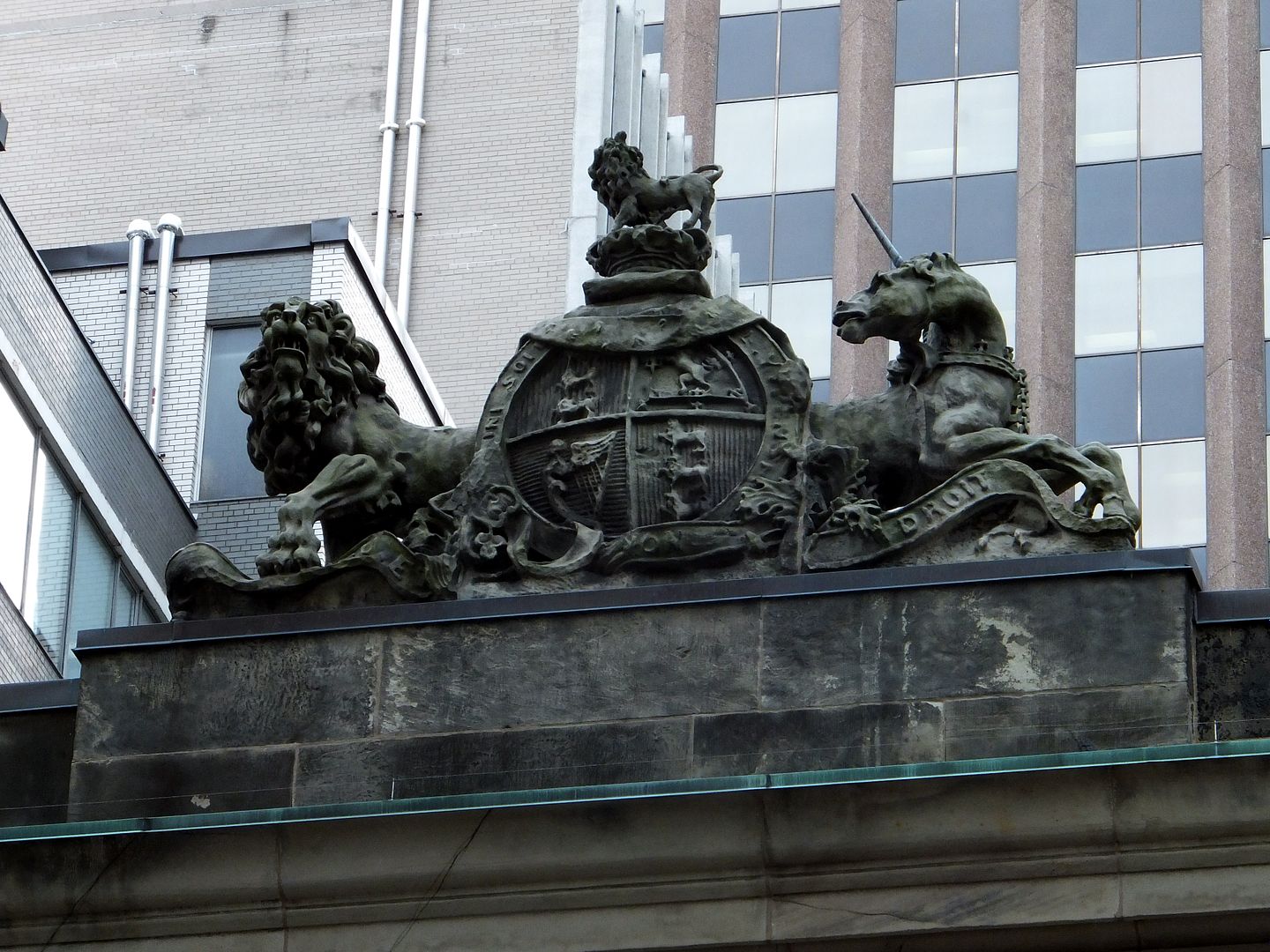
There are also some wonderful examples of the Canada coat of arms throughout the city.
The Metropolitan Church:
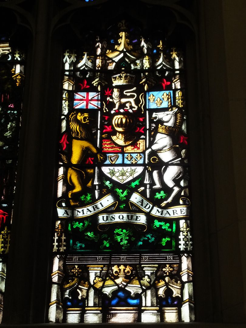
http://www.flickr.com/photos/-jm/8593271667/lightbox/
Fort York Armouries:
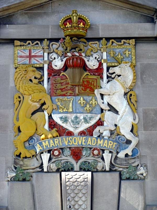
http://www.flickriver.com/photos/sarge_schultz/sets/72157621160378667/
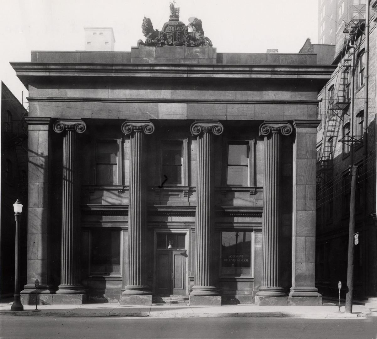
10 Toronto Street (the Seventh Post Office):
The Metropolitan Church:

http://www.flickr.com/photos/-jm/8593271667/lightbox/
Fort York Armouries:

http://www.flickriver.com/photos/sarge_schultz/sets/72157621160378667/
10 Toronto Street (the Seventh Post Office):


Last edited:
nostalgic
Active Member
I don't know what planet I was on when the new Toronto coat of arms was adopted, but when thecharioteer posted the image I couldn't remember having seen it before and thought it was a joke. Pallid and insipid, yes, but also unintelligible (to me, at least). I shouldn't have had to do research to find out what the elements mean... what I took to be a crown with big jewels is a city wall, and that's not America's symbolic bald eagle as I thought.
junctionist
Senior Member
We need to do something about the city's logo. The stylized image of city hall looks dated and done on the cheap. The old coat of arms would make a fine replacement.
thecharioteer
Senior Member
The old coat of arms at least contained images that communicated to the citizens of the city, (and in some ways were quite radical), namely, that the original native inhabitants were given equal weight (not kneeling) with Britannia, the symbol of colonial forebears. The message itself was in its own way inspiring. Here was a city that valued integrity, intelligence and industry (in the sense of hard work, not factories).
When one looks at the Canada coat of arms, the animal imagery is stylized and mythic with the lion and the unicorn. The symbolism is all legible: the Ensign and the Fleur-de-lis, the maple leaf, etc.
The current Toronto coat of arms: animals drawn by Nelvana (a Care Bears city?); an eagle? a bear? One needs a glossary to see how this committtee-designed product was an attempt to meld various images from the various pre-amalgamation cities so that nobody felt left out.
From the City's website:
The Coat of Arms was created after the 1997 amalgamation of the former cities of Etobicoke, York, North York, Scarborough, Toronto, the Borough of East York and the Metro level of government.
How it was created
-Members of the public were asked which symbols they would like to have included in the City of Toronto's new Coat of Arms
-The questionnaire was distributed at the City's Civic Centres, to Members of Council, libraries, community centres and posted on the City website during the month of July 1998
-More than 1,100 responses were received
-The design was created by the Chief Herald of Canada and granted by His Excellency Romeo LeBlanc, Governor General of Canada
-Council approved the new design on October 30, 1998
http://www.toronto.ca/protocol/coatofarms.htm
thecharioteer
Senior Member

Anna
Active Member
The current Toronto coat of arms: animals drawn by Nelvana (a Care Bears city?); an eagle? a bear? One needs a glossary to see how this committtee-designed product was an attempt to meld various images from the various pre-amalgamation cities so that nobody felt left out.
Should have a raccoon on it.
Hogtown Arms
http://spacing.ca/toronto/2009/03/09/spacing-presents-the-toronto-town-buttons/
Anna
Active Member
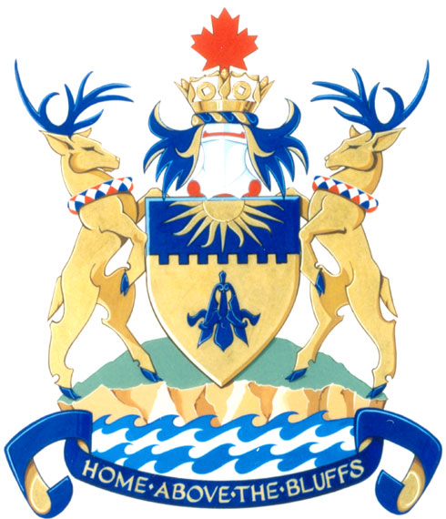
There`s still a few heraldic remnants that can still be found around old metro if one looks hard enough, though:
Leaside
EVCco
Senior Member
^Good find!
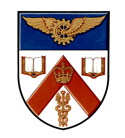
Just to round out the boroughs, here's Scarborough, with description:
http://reg.gg.ca/heraldry/pub-reg/project-pic.asp?lang=e&ProjectID=606&ProjectElementID=2131
Not sure if York or East York were ever granted official arms, unless you count this:

And here's a clearer version of the old Metro arms that I posted above:
http://reg.gg.ca/heraldry/pub-reg/project-pic.asp?lang=e&ProjectID=1527&ProjectElementID=5122
A little busy, but still quite preferable to the newer one.
Just to round out the boroughs, here's Scarborough, with description:
http://reg.gg.ca/heraldry/pub-reg/project-pic.asp?lang=e&ProjectID=606&ProjectElementID=2131
Not sure if York or East York were ever granted official arms, unless you count this:
And here's a clearer version of the old Metro arms that I posted above:
http://reg.gg.ca/heraldry/pub-reg/project-pic.asp?lang=e&ProjectID=1527&ProjectElementID=5122
A little busy, but still quite preferable to the newer one.
Anna
Active Member
^Good find!
Just to round out the boroughs, here's Scarborough, with description:
http://reg.gg.ca/heraldry/pub-reg/project-pic.asp?lang=e&ProjectID=606&ProjectElementID=2131
...
This blurry one is the one I remember

EVCco
Senior Member
Hmm...
In this instance I think I might prefer the newer one
In this instance I think I might prefer the newer one
thecharioteer
Senior Member
And here's a clearer version of the old Metro arms that I posted above:
http://reg.gg.ca/heraldry/pub-reg/project-pic.asp?lang=e&ProjectID=1527&ProjectElementID=5122
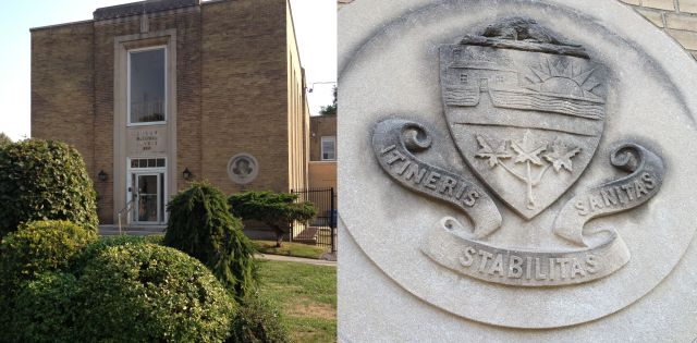
Interesting the inclusion of the caduceus in the old Metro coat of arms. Not to be confused with the symbol for medicine, the staff of Mercury with the twin snakes became the symbol for commerce, but also for deception, liars and thieves (http://en.wikipedia.org/wiki/Caduceus).
It was an integral part of the Canadian Bank of Commerce logo early in the 20th century:
197 Yonge:
Attachments

adma
Superstar
Here's what the Fords should adopt as a coat of arms

the lemur
Senior Member
I find that one interesting for two reasons: the phrase 'Compliments of the season' (in other words, 'Season's Greetings') as a general reference to Christmas and the New Year and not, as some modern critics would have it, a more recent PC invention, and the grammatical error: since it is 'to their friends', the annual greeting is that of the Toronto P.O. employees, plural, hence it should be employees', not employee's.