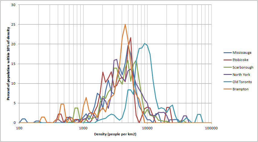
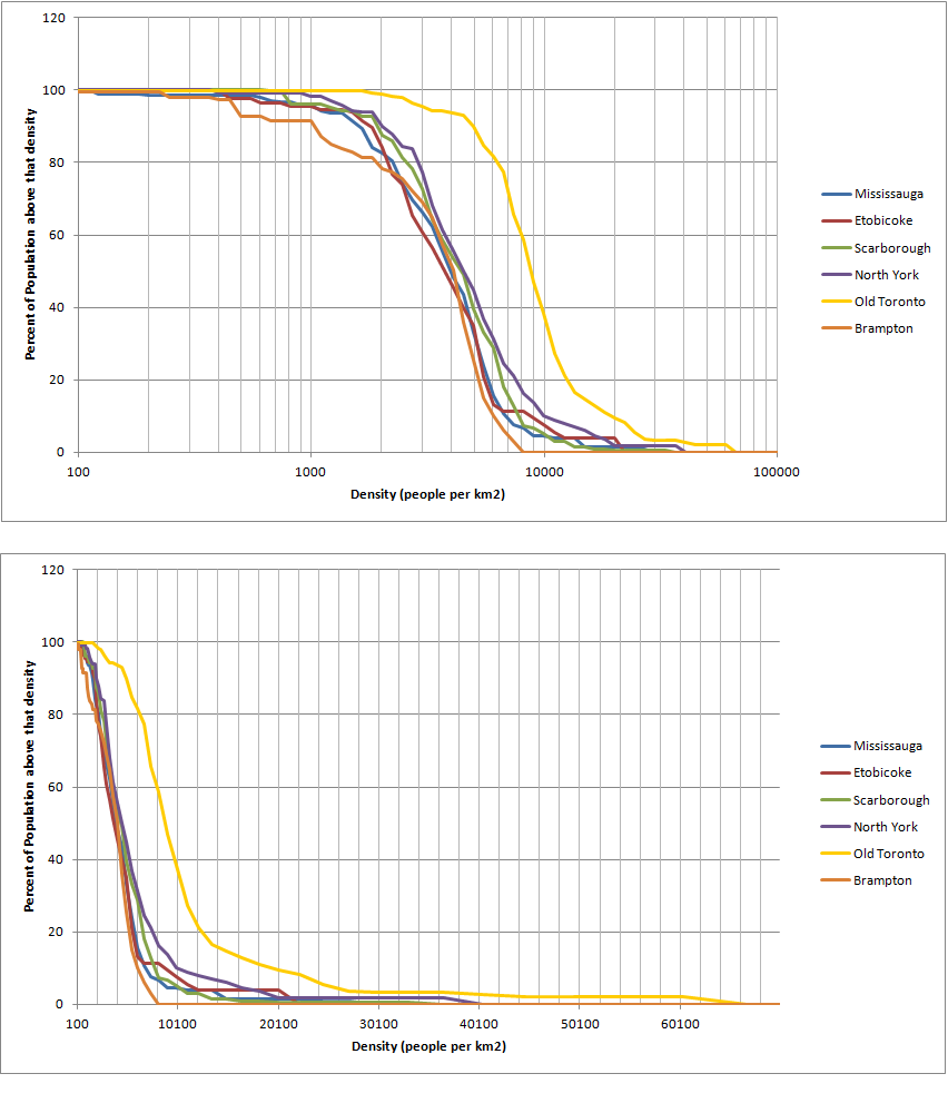
I had to look very closely before I realized why the old city looked so similar to the old suburbs. If the point was to show how similar they were, it's very misleading visually.
The old city doesn't look very similar to the old suburbs... if you look at the graph you'll see that the bulk of the old city lives at 5000-15000people per km2 while the bulk of the suburbs (new and old) live at densities of 2000-8000 people per km2. Meanwhile the old city has hardly anyone living at densities below 4000/km2, which is still a common density in the suburbs (even 2000/km2 is relatively common in the suburbs). The point was to show that the old city is a fair bit denser than the old suburbs, and that the old and new suburbs are pretty similar. Also, if the graph wasn't logarithmic, you'd either have to hide everything above 20,000 people per km2, or squash the bulk of the population into the left side of the graph so that the suburbs are even less distinguishable from each other.
@Glen, I most definitely do agree that employment density is important, and I agree that there is not enough focus on that. However, I'm not sure what makes you say New York and Los Angeles have similar population densities... New York has way more dense housing than Los Angeles, assuming the threshold for high density is set quite high (Los Angeles might come out ahead in the 10,000-15,000ppsm range, but I don't consider that particularly dense). Also, downtown Toronto is quite well served by transit, I'm not sure how many people commute to the CBD, but once the portion of people commuting into downtown by car reaches a low enough level, it's not really worth making improvements.
Meanwhile, there are something like 2million jobs outside downtown where most people drive, so there's a lot of room for improvement there. The improvement doesn't have to be made only through transit investments of course, a lot could probably be done by adding employment around subway stations and maybe GO stations, bus terminals, etc. Not all the transit investments would have to be subways either, you could have BRTs or GO improvements too. Finally, it's still worth considering the potential for future development, as the land around existing transit lines gets intensified, new rapid transit lines can be considered in areas with more moderate densities that have land that can easily be intensified.