News   Nov 18, 2024
 1.2K     1 
News   Nov 18, 2024
 544     0 
News   Nov 18, 2024
 1.5K     1 

Cdn Arch/JBM on Four Seasons Centre

I don't think the issue is what's being pointed out, but rather how it's being pointed out.

Exactly; the "it's for its users, not for you" hubris. How is that different from libertrollian alibis on behalf of monster homes, etc? (And moreover, how is that *urban*?)

At least JBM arrives at his measured criticism from an opera-sympathetic perspective...
 
Re: Cdn. Arch/JBM on Four Seasons Centre

We're all users, or we can be if we want. The free concerts, talks, and performances in the City Room began a couple of weeks ago; rush seats, and seats in the back of the Orchestra with obscured views of the surtitles, are dirt cheap. People who use the money thing as an excuse to claim outsider status no longer have legs to stand on.
The people just walking by who have no desire to see opera should be able to enjoy the building too. Personally I like it, but those who don't shouldn't be dismissed just because they don't see the interior or experience a performance. Critics of First Canadian Place aren't dismissed just because they don't work in the building.

The onus ( or in adma's case, anus ) is on those who disagree, to show us what a better designed loading dock than the one on York Street is supposed to look like and what a better back-of-house for Richmond Street is supposed to look like. Which, so far none, have.
The back-of-house is offices, right? There are lots of office and residential uses that meet the street without retail in a way that's inviting for pedestrians. From the pictures I've seen (I haven't seen the Richmond side in person, I'll admit), the FSC doesn't do that.

This doesn't look very inviting, with the long horizontal windows and huge expanses of blank, flat wall.
172225-121294.jpg


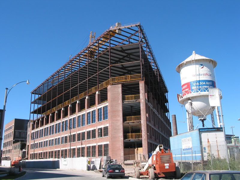
This looks better: more windows, vertical emphasis, the facade is broken up.
02_ToyFactory3.jpg


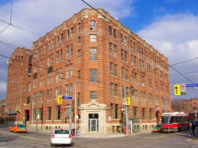
This building uses a similar approach. So does the Whitney Block, except with plants where the building meets the sidewalk.
King-ParliamentcitycentreSSP.jpg


That kind of approach is taken on a lot of buildings, especially old institutional buildings...like opera houses. Obviously copying old warehouse architecture wouldn't be approprate for the FSC but some minor changes to the south side windows or trim or recesses in the wall could have made a big difference.

Is there a reason the Richmond facade has hardly any windows?
 
Re: Cdn. Arch/JBM on Four Seasons Centre

The people just walking by who have no desire to see opera should be able to enjoy the building too. Personally I like it, but those who don't shouldn't be dismissed just because they don't see the interior or experience a performance. Critics of First Canadian Place aren't dismissed just because they don't work in the building.

And to spin things around; who says there's a consensus among those who *do* use the 4SC? I'm sure that there are those among its "regulars" who'd be prone to agree w/JBM about the exterior--and *not* from some kind of Tom Wolfean modern-is-bad standpoint.

It's fine to praise the venue; but from AP/BB circles, it verges on super-slanted "opera dittohead" hysteria, i.e. it's absolutely perfect, it can't do no wrong, etc. Makes me wonder if there's some ill-disguised conflict of interest here...
 
Re: Cdn. Arch/JBM on Four Seasons Centre

I went to Gotterdamerung, was seated half-way up Ring 5, just off centre. I could close my eyes and hear where the singers were on the stage. 4 1/2 hours later my bum wasn't asleep. So kudos to Jack and his team for that. The stair is wonderful from below, a changing leopard pattern of foot prints. The City Room is very beautiful.

I have to agree with JBM about the outside though. There are places where it is very nicely detailed, but there are also places where it is a bit klutzy and it is hard to see why. The street edge is one big lost opportunity.

In so many ways it is a typical Toronto building, not suprising, better than OK. I have to disagree with Jack. If there is ever a case for some drama, this was it. But for what he did for the budget he is a champion.
 
Re: Cdn. Arch/JBM on Four Seasons Centre

And to spin things around; who says there's a consensus among those who *do* use the 4SC? I'm sure that there are those among its "regulars" who'd be prone to agree w/JBM about the exterior--and *not* from some kind of Tom Wolfean modern-is-bad standpoint.

I've been to a couple of opera performances at the Hummingbird Centre and I'll definitely be a user at the Four Seasons - and I agree with JBH.
 
Re: Cdn. Arch/JBM on Four Seasons Centre

Brighter Hell: anyone "just walking by" can enjoy the opera house: the first photograph you post shows a magnificent fly tower, a stage door, the entrance to the loading docks and the slitty vertical windows punctuating - and playing off - the long horizontal stretch of the Richmond Street facade in an interestingly irregular pattern. The image nicely captures the ever-changing light effect on the grey brickwork. What's not to like? Anyone with an aesthetic sense, and an open mind, ought to be able to get something out of that. The exterior of the building reflects the interior functions of the building at all points, not just with the City Room. Why should a staff entrance and stage door on Richmond Street "meet the street" with any less honesty?

4Pook: Welcome! I agree about the sound half way up Ring 5 - I sat there at the Gala in June and was in awe.

adma: I've pointed out several things I dislike about the house in the past - the dented vertical strips of cladding on the outside of the building that delineate the horseshoe shaped auditorium, for instance, and the mean little lounge on Ring 4.
 
Re: Cdn. Arch/JBM on Four Seasons Centre

It's fine to praise the venue; but from AP/BB circles, it verges on super-slanted "opera dittohead" hysteria, i.e. it's absolutely perfect, it can't do no wrong, etc. Makes me wonder if there's some ill-disguised conflict of interest here...

I didn't find any evidence of hysteria in the postings of AP or BB. Nor do I recall any suggestions of perfection with respect to this building, either. Even if there was, it would be an opinion, wouldn't it? Why would that opinion bother you so much? As for conflicts of interest, maybe you would want to provide some evidence, or even an explanation of what type of conflict of interest you are alluding to.
 
Might as well use this thread to post the pics of the Centre from Doors Open. The COC did an amazing job with the guided tours. I got to appreciate the place more, even if the outside (particularly the Queen side) is less than stellar. The inside certainly is, and was amazed by how quiet it is in there - acoustics are amazing. The COC also had periodic free performances in the City Room with operatic excerpts, and that was a very nice touch.

FS1.jpg


FS2.jpg


FS4.jpg


Royal Box.

FS5.jpg


Jackman Lounge.

FS6.jpg


FS7.jpg


FS8.jpg
 
Nice pics. I particularly like the glass staircase and wood finishings inthe lobby. The sweeping wall that rises the height of the atrium is terrific and the small amphitheatre overlooking University ave. is a unique feature as well.

Unfortunately the south exterior of the building in particular does the opposite of the lobby facade- it turns its back on everything. Not sure how diamond would justify this side of the buidling other than financial.
 
That's because the south side of the building serves a different purpose from the "lobby facade". It is not about spectacle, it is about offices and a stage door.
 
I dropped by this year (again) just to see my reaction after all the initial excitement had died down....and I was disappointedly underwhelmed. I remember really liking the main theatre space much more the first time I saw it but on this third viewing (and after about half a year) I was struck by how...well...bland it was. A little too much plaster maybe? (I really dislike the bare walls by the elevators in the main atrium. They give the appearance of a office building atrium, not an opera house or place of theatre).

I just came from the Gardiner Museum and maybe that tainted my perspective. I found that version of neo-modernism, and the detailing, to be much richer, layered and textured. I particularly liked the use of different materials and stone throughout the building.

This is all very subjective but I probably shouldn't leave such an important theatre thinking "eh' about the architecture. Maybe we are just becoming spoiled.
 
Not spoiled, just experiencing the space as an observer rather than as a participant. The plaster is for acoustical reasons. Full of people, waiting for the lights to go down, chatting to your friends in the next seats, with the pretty little lights on the balcony fronts, and experienced as an opera house, the hall is magical.
 
Thats true. I was only judging on an aesthetic level (which is only part of the story).
 
Having just finished my first season's worth of operas at the new house, my companion and I were noting this weekend how much more we think people are dressing up for the new house. Not that everyone is resplendently costumed now, but more people are. The new house has brought that out in people; there is much more see-and-be-seen as people feel more on-display in the auditorium's multiple balconies before the show, or on all the walkways in the wonderful City Room, or even sitting in the aerial amphitheatre during the Opera Talks before it all gets going. The spare, clean, and handsome lines of the building seem to be begging the audience to be the decoration, and they are rising to the occasion.

42
 

Back
Top