You are using an out of date browser. It may not display this or other websites correctly.
You should upgrade or use an alternative browser.
You should upgrade or use an alternative browser.
casaguy
Senior Member
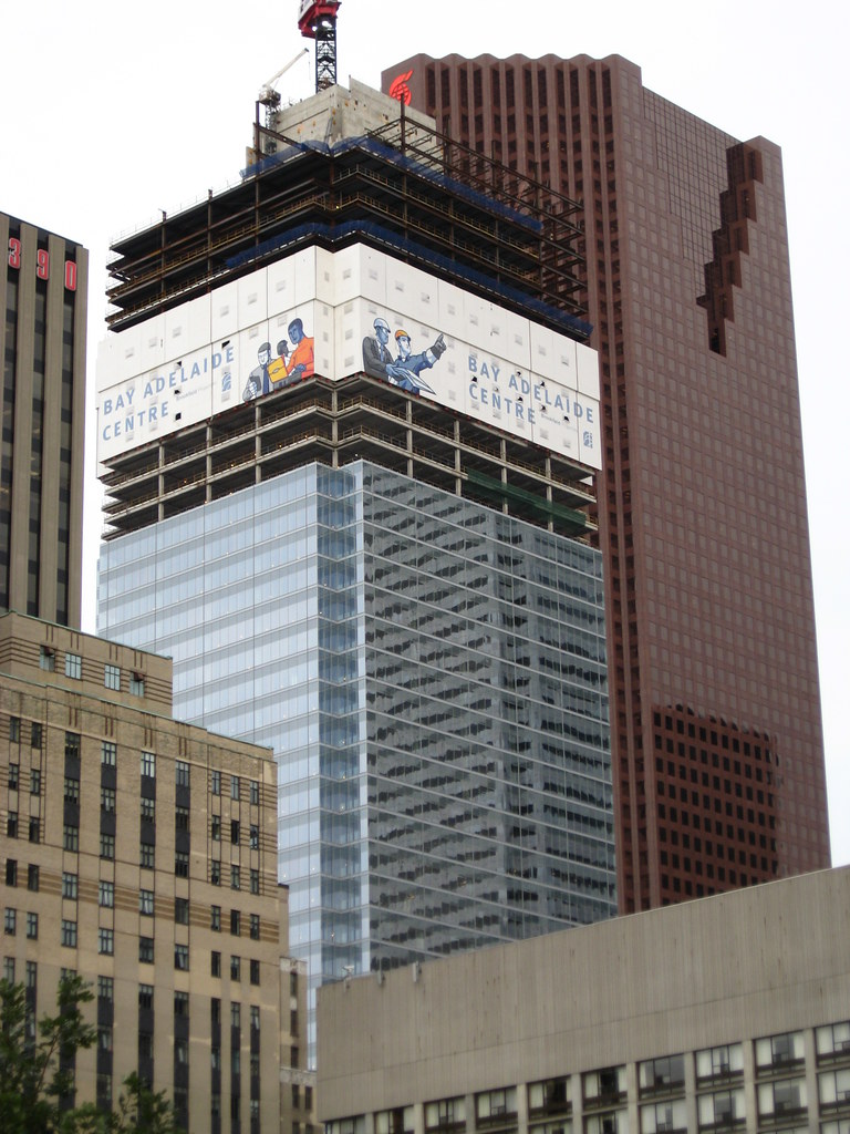
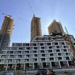
So it's bland on its own. But not bland when others surround it.
Gotcha.
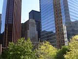
Yes... this particular angle and reflection made it catch my eye compared to what I've seen so far in pictures and in person. The diagonal lines from the BMO reflection create the most interesting reflection I've seen... prompting me to take a closer look at the building as a whole.
I think there's nothing wrong with "bland" in this cluster of downtown towers. It doesn't need to say "wow look at me". In fact it's probably a perfect companion to the other towers. In this case being a bit on the bland side is just fine... especially if it will never look the same way twice depending on where you're looking at it from.
And Jarrek... yes buildings can certainly be bland on their own but not when others surround it... much like people.
(Sorry for some bad punctuation but my comma key isn't working for some reason...)
Redroom Studios
Senior Member
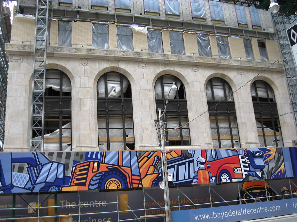
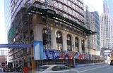
amazing comparison shots on the facade portion! They've done a great job and it looks even better than the original with the black window frames on the first few floors. I just wish that the cut stone continued the full height instead of switching over to that cream coloured brick. Crazy to realize that theyve torn down that facade, topped out the elevator core and almost rebuilt the entire facade in 2 years.
Spoonman
Active Member
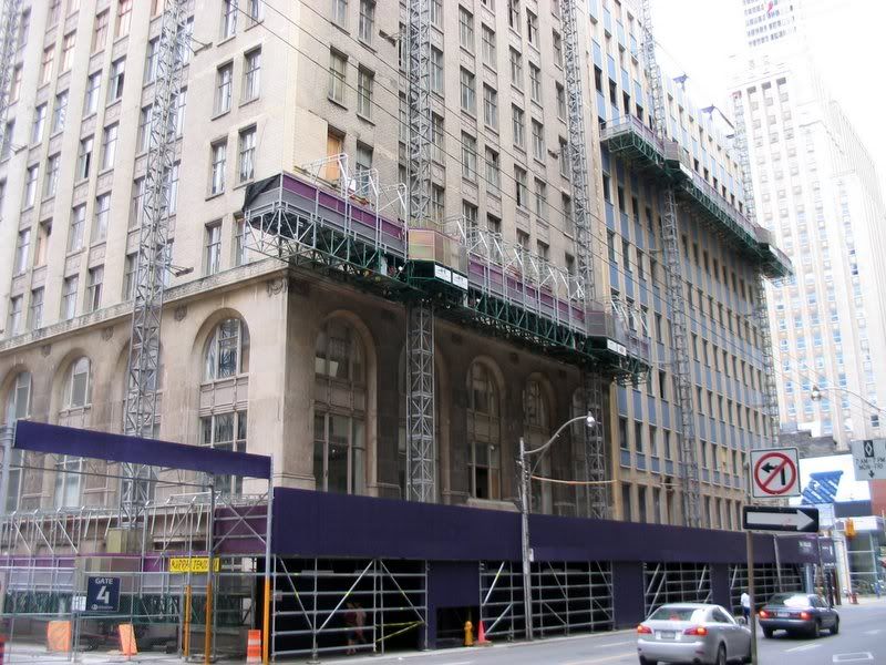
It's probably been mentioned before, but it's a shame they didn't keep the facade of the adjacent building with the blue panels. It would have continued the street wall quite nicely and made the facadectomy less apparent at street level.
yin_yang
Active Member
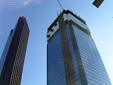
yeah...it's nice and all, but looks like a stump of a tower.
Spoonman
Active Member
Is it perchance because there is a stump (i.e. un-encased core) still protruding from the apex?
khris
Senior Member
It's probably been mentioned before, but it's a shame they didn't keep the facade of the adjacent building with the blue panels. It would have continued the street wall quite nicely and made the facadectomy less apparent at street level.
No thanks! I'm glad they didn't keep that crap.
dt_toronto_geek
Superstar
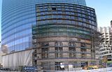
Last picture is Temperance. Love how the building has started to curve 
Peepers
Banned
Last picture is Temperance. Love how the building has started to curve
I need to rethink my criticism of this building...I'm really starting to love the curves on the north elevation ...lol
dt_toronto_geek
Superstar
Ok, hahaha... I tried my best taking six photographs and stitching them together to try and capture the restored Temperance Street side. If you think this is amusing, you should have seen the curvy mess with 12 shots that I stitched together from base to top!
khris
Senior Member
Ok, hahaha... I tried my best taking six photographs and stitching them together to try and capture the restored Temperance Street side. If you think this is amusing, you should have seen the curvy mess with 12 shots I stitched together from base to top!
Try this out:
http://www.photosynth.net/
It auto stitches everything together.
OR try this:
http://get.live.com/photogallery/overview
It has an autostitch and you can save the new image. It does an amazing job as well.
dt_toronto_geek
Superstar
Try this out:
http://www.photosynth.net/
It auto stitches everything together.
OR try this:
http://get.live.com/photogallery/overview
It has an autostitch and you can save the new image. It does an amazing job as well.
I saw that you used photosynth in another post and it looks good. Thanks for the tip bud, I'll give them a shot!
Tewder
Senior Member
So it's bland on its own. But not bland when others surround it.
Gotcha.
Why does that sound so absurd to you? The building benefits from an interplay with its surrounding context. Would like to see more of this Toronto.
digitalis
Active Member
BA from Queen
Pictures taken yesterday from Queen St.


Pictures taken yesterday from Queen St.


