|
|
|


Search results
-
T
Toronto 550 Wellington West and 1 Hotel | ?m | 15s | Freed | a—A
14 is even worst -
T
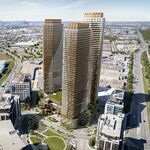
Toronto Vü Condos | 83.51m | 24s | Aspen Ridge | Hariri Pontarini
Nice tour. I always liked this building too. -_-' It's always good to lead by example...... j/k -
T
Toronto First Canadian Place Rejuvenation | 298.08m | 72s | Brookfield | MdeAS Architects
Imagine if the whole building was scaffolding. It'll look like a giant heatsink. -
T
Toronto Living Shangri-La Toronto | 214.57m | 66s | Westbank | James Cheng
You live in a condo? I remember you saying you were scared of heights.......or that could've been another poster. -
T
Toronto X The Condominium | ?m | 44s | Great Gulf | a—A
Don't forget the PDI, so we should get pics in a couple weeks. Now if only the buyers on the lower floors start posting here. :mad: -
T
Ubisoft coming to Toronto
New article http://www.gamasutra.com/view/feature/5229/building_on_conviction_inside_.php The office is located at Bloor/Lansdowne and their first game is going to be Splinter Cell.- tissot
- Post #36
- Forum: Politics (Toronto Issues)
-
T
Toronto Aura at College Park | 271.87m | 78s | Canderel | Graziani + Corazza
Taken with my cell a few hours ago. Last two was taken from the loading ramp. -
T
TFC Training Facility
Looks like MLSE is looking for a developer to build a training facility. Where do you guys think would be the best location? I would think MLSE would want it close to BMO field. Video could be found here http://torontofc.neulion.com/tfc/console.jsp PDF here...- tissot
- Thread
- Replies: 19
- Forum: Politics (Toronto Issues)
-
T
Toronto X The Condominium | ?m | 44s | Great Gulf | a—A
From yesterday I'm surprised there is no interior pics for this building. Any one catching my drift ? :p -
T
Four Season Gardens (Hwy 7+404, Catalia Dev, 14+13+10+9s, Northgrave)
Won't most of the buyers be Chinese since it's located in Richmond Hill? -
T
X - The Condominium (Great Gulf Homes) - Real Estate -
There’s a video of Breuer on the website. http://www.xcondos.com/x_preview.htm- tissot
- Post #362
- Forum: Real Estate - Individual Project Threads
-
T
Toronto Ïce Condominiums at York Centre | 234.07m | 67s | Lanterra | a—A
hahahaa..I like how there's no door to the washroom. -
T
Post a good floorplan!
Charlie. The unit itself is 684sqft and the terrace is a whopping 713sqft. It's viewing south too.- tissot
- Post #80
- Forum: Rate This Design/Floorplan
-
T
Toronto X The Condominium | ?m | 44s | Great Gulf | a—A
http://www.blogto.com/city/2010/01/brilliant_lights_from_torontos_dizzying_heights/#comments -
T
Toronto Casa | 147.52m | 46s | Cresford | a—A
http://www.blogto.com/city/2010/01/brilliant_lights_from_torontos_dizzying_heights/#comments -
T
Post a good floorplan!
I really like this foorplan. I don't mind the linear kitchen +Not a lot of wasted space +Walk-in-closet +A lot of windows +Columns on the outside +Powder room -Bedroom a little narrow -Steps to terrace- tissot
- Post #78
- Forum: Rate This Design/Floorplan
-
T
Forum Issues Since Relaunch (Jan 20, 2010)
I hope I don't hurt any feels for saying this. The banner is very tacky and amateurish, it feels like I’m viewing a webpage back in the 90's. I think everything would look better if kept simple. Lose the picture and "welcome to our planet". Keep the red and white "urban Toronto" and the slogan...- tissot
- Post #5
- Forum: Forum Issues
-
T
Toronto Casa | 147.52m | 46s | Cresford | a—A
I don't know how many times I have to post this, but Bells Entertainment Service is so much better than anything Rogers has to offer. http://entertainment.bell.ca/en/package.html -
T
Toronto Casa | 147.52m | 46s | Cresford | a—A
Yea, I have no idea why anyone would want satellite or even cable when they can get BES. How long did it take to install?