|
|
|


Recent content by Redroom Studios
-

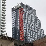
Toronto Concord Canada House | 231.97m | 74s | Concord Adex | Arcadis
exactly... at least the tops are not just going to be left as a dog's breakfast like so many others have been. other than that they are a crime against architecture.- Redroom Studios
- Post #2,755
- Forum: Buildings
-
Toronto Pinnacle One Yonge South Block | 296m | 85s | Pinnacle | Hariri Pontarini
agreed! and I would even take that exact same reddish colour to help break up the sea of blue and white on the waterfront.- Redroom Studios
- Post #128
- Forum: Buildings
-
Toronto EQ Bank Tower | 105.18m | 23s | First Gulf | Sweeny &Co
enough with the all glass buildings. the only look good when contrasted against masonry or concrete buildings nearby. when you have nothing but glass buildings it becomes completely soulless.- Redroom Studios
- Post #392
- Forum: Buildings
-
Toronto Concord Canada House | 231.97m | 74s | Concord Adex | Arcadis
the entire venture is about minimizing costs and maximizing profit with zero regard for architecture or what this gives back to the city. you know, pretty much standard Toronto development practice 95% of the time.- Redroom Studios
- Post #2,719
- Forum: Buildings
-
Toronto Quayside Building 1A | 193.9m | 57s | Dream | Alison Brooks
what a bizarre design. looks like somebody was trying way too hard. this is like a modern version of baroque.- Redroom Studios
- Post #11
- Forum: Buildings
-
Toronto 55 Mercer | 155.5m | 47s | CentreCourt | Arcadis
how many blocks to the nearest tree?- Redroom Studios
- Post #502
- Forum: Buildings
-
Toronto River City Condos Phases 1 & 2 | ?m | 16s | Urban Capital | ZAS Architects
just found this video, although it is from 2 years ago. sorry if it was posted before, but perhaps some newer members wouldnt have seen it.- Redroom Studios
- Post #801
- Forum: Buildings
-
Toronto Waterworks Building Redevelopment | 47.55m | 13s | MOD Developments | Diamond Schmitt
I'd love to see the stats you are referring to there... Toronto lovers enjoy skewing stats to make themselves feel more important that they actually are. just for comparison I found this: https://en.wikipedia.org/wiki/List_of_United_States_cities_by_population_density for the US. And we havent...- Redroom Studios
- Post #783
- Forum: Buildings
-
Toronto Aqualuna at Bayside | 61.87m | 18s | Tridel | 3XN
this is looking cool... I wish they would build a lot more of these uniquely shaped buildings on the waterfront. I understand the concept of the angles and balcony layouts to maximize views for every unit. however, in reality for the people living there, they have zero privacy on their...- Redroom Studios
- Post #600
- Forum: Buildings
-
Toronto 55C: 55 Charles Condos | 167m | 50s | MOD Developments | a—A
how many times can they build the same building in a 4 block radius??? what passes for architecture here is a joke. and the fact that people eat them up and get excited over it is tragic comedy.- Redroom Studios
- Post #593
- Forum: Buildings
-
Toronto skyline
- Redroom Studios
- Post #2,634
- Forum: Photos and Videos
-
Toronto Concord Canada House | 231.97m | 74s | Concord Adex | Arcadis
they had to do something to break up the otherwise boxy monotony! it's unfortunate they couldnt have given this thing some different colour from the other dozens of neighbouring buildings as well.- Redroom Studios
- Post #2,682
- Forum: Buildings
-
Toronto Crosstown Community: Generations (Block 5A) | 92m | 27s | Aspen Ridge | a—A
amazing... this utilitarian shlock that gets passed off as architecture in Canada / Toronto. just imagine how great this development could be with real vision and real design!- Redroom Studios
- Post #55
- Forum: Buildings
-
Toronto Sugar Wharf Condominiums (Phase 2) | 283.6m | 85s | Menkes | a—A
so we are going to have a forest of these bland, repetitive and rather tall buildings blocking out the entire waterfront / views from the water now? Menkes needs to be stopped because they are an absolute blight on the cityscape.- Redroom Studios
- Post #526
- Forum: Buildings