News   Dec 12, 2025
 681     0 
News   Dec 12, 2025
 1.6K     6 
News   Dec 12, 2025
 757     0 

Toronto Eglinton Line 5 | ?m | ?s | Metrolinx | Arcadis

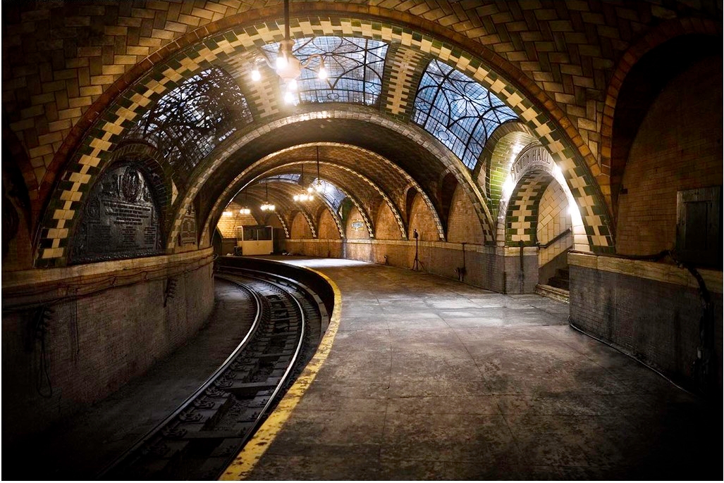
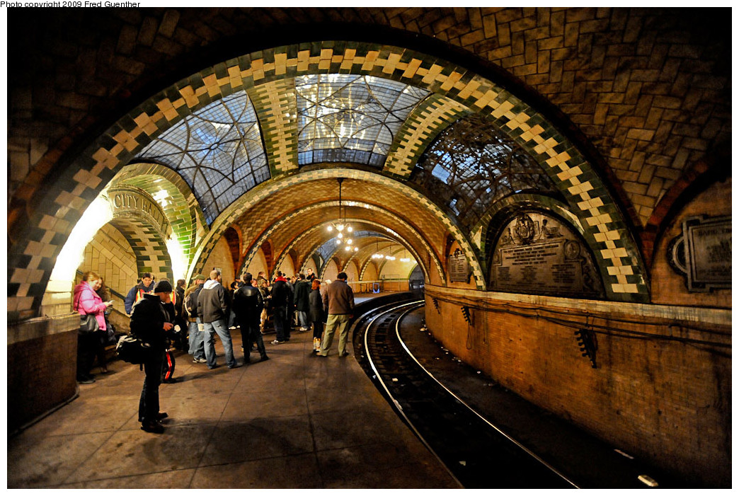
Dupont is public art done right. It's actually integrated into the station, and the art carries itself through the entire station. This isn't something that has to be expensive.

The Crosstown design tacks on public art to one or two spots in a handful of stations, leaving the rest of the station bare and undecorated.
Very well put!

Gotta love the artist claiming how her work "confronts" passengers. I claim visual assault in today's PC world. #stopvisualassault

I'm only half joking. The term is "sensory overload" and most of us are affected by it, some more than others, especially hyperkinetics like myself as a result of Thyroid Cancer. (This has a silver lining to the cloud. I'm now pushing 70 with the energy of a 30 year old, damage besides) It's not art, it's a distraction. And for that second less intrusive scheme, I can see how it would cue Schizophrenics. Their ability to discern shadow from direct image is compromised enough as it is, why play with people's heads like that? Many of the disorders mentioned aren't 'all or nothing'. They affect the population by degree, and perhaps half the population is affected to some extent.

What's wrong with just making a 'public place' *welcoming* and not "confront" anyone?
 
Last edited:
Very well put!
Gotta love the artist claiming how her work "confronts" passengers. I claim visual assault in today's PC world. #stopvisualassault

Gack. I'm controlling my sarcasm and at the same time trying not to sound like Hank Hill.

There is a legitimate level of discussion of art that goes above what the average person says or thinks, but beyond that is a level that is pure self-absorption.

When we are talking about public art and aesthetics of a subway station, the average Joe's "I like it" is as good as it need get.

So yeah, we want spaces that are attractive and pleasing. But I hope Crosstown leaves the highbrow stuff down at the OCA. Which says that we don't need top-end artists and their expensive commissions, nor do we need international competitions.

IKEA kitchen pretty is good enough.

- Paul


Hold it right there, Paul! I was completely with you til the last line.

When did IKEA start making pretty kitchens?

:p
 
As well as unneeded expense and poor choice of what adds to most riders' experiences, there's the very real issue of *disorientation* for some (and this includes myself at times, years of cancer treatment have taken a toll on some receptor processes) and from the descriptions given, I would avoid dwelling on both of these while trying to navigate my way to a destination. I'm only mildly affected, aging eyesight and compromised depth perception add to the proclivity to convolute visual planes, but for some, both of these would be an absolute nightmare:

eglinton_station.jpg.size.custom.crop.1086x747.jpg
science_centre_station.jpg.size.custom.crop.850x478.jpg


Someone, a few, are *really* not thinking on this one. I'd suggest they consult some experts on this before going ahead with these at the locations stated.

How bad is this for someone with compromised perceptual abilities? Almost as bad as physical barriers for wheelchair users.

Note where the 'crystalline corruption of depth and distance' is aimed right at people on *escalators* for God's sakes. In my case, the problem is overly-acute processing of the image, to the point of affecting balance and sense of position. I'd immediately grab the moving handrail and look away. For some, that reaction wouldn't be reflexive, they'd just lose their balance on the escalator.

Read the artist's own description, and then think about how this will affect some:
.
Ya know, I don't blame the artist so much as the morons in charge of bureaucratic dispensation of saccharide disorientation. By all means *please* the eyes. But challenging the safety of a sizable minority of riders is just plain @#%&*) stupid.

Next week:
Infinity Mirrors presents a surprise display at Yonge and Bloor station! Dazzle people! Take them to a new world where what they see isn't real! See them trip and fall in delight, and bleed the meaning of life from within.

I am reminded of a possibly apocryphal anecdote about James Turrell’s early work. Some of his installations were supposedly so immersive, and so effective in altering visitors’ perceptions of light and shadow, that people would try to lean on beams of light, thinking they were a wall or something, and fall flat on their rear ends. A couple of lawsuits later, and he had to dial things back a little.
 
It's ironic that GO and the TTC ban music outside of headphones, and yet insist on your participating in visual "confrontations" as you step on an escalator.

What next?
TTC backtracks on $500,000 station art installation
Hold it right there, Paul! I was completely with you til the last line.
When did IKEA start making pretty kitchens?
Gack! (Again). lol...I wondered how the IKEA thing would go down, so perhaps "milquetoast" might be more apt?
I am reminded of a possibly apocryphal anecdote about James Turrell’s early work. Some of his installations were supposedly so immersive, and so effective in altering visitors’ perceptions of light and shadow, that people would try to lean on beams of light, thinking they were a wall or something, and fall flat on their rear ends. A couple of lawsuits later, and he had to dial things back a little.
Exactly! Except on an escalator or platform edge, you don't just fall on your touche.


There's a good reason why highway signs are regulated for being fatally distracting or not.
 
Metrolinx to unveil winning public art designs for Eglinton Crosstown Stations

TORONTO: January 15, 2017 – Join Leslie Woo, Chief Planning Officer with Metrolinx, who will officially announce the successful artists and unveil their beautiful concepts for the future Eglinton Crosstown stations.

Date: Tuesday, January 16

Time: 10:00 a.m.

Location: Ontario Science Centre, Great Hall

770 Don Mills Road, North York

(southwest corner of Eglinton Avenue East and Don Mills Road)


Parking: Free parking is available on site.
 
I don't know about that - the designs we have seen so far is clearly guided by certain design principles. I find the overall effect to be far more coherent than the TYSSE approach.

AoD

Exactly. Coherent, cost-effective, but with art included. This is the right approach imo. But since I haven't seen a doc on these installations, and reading the article where it's noted that only a small percentage of the Crosstown stations/stops will have art, I'm wondering if we could do a bit more. Maybe not "art", but what about tilework? Will each of the stations have a different pattern and colour scheme? Even if just done simple like Line 2 with an alternating solid and stripe colour pattern is a lot better than continuous grey or white. Then what about the surface stops of which there's many. Surely we could do something like St Clair with bits of unique artistic flair. The cost of tiles or small glass panels are a drop in the bucket.
 
Exactly. Coherent, cost-effective, but with art included. This is the right approach imo. But since I haven't seen a doc on these installations, and reading the article where it's noted that only a small percentage of the Crosstown stations/stops will have art, I'm wondering if we could do a bit more. Maybe not "art", but what about tilework? Will each of the stations have a different pattern and colour scheme? Even if just done simple like Line 2 with an alternating solid and stripe colour pattern is a lot better than continuous grey or white. Then what about the surface stops of which there's many. Surely we could do something like St Clair with bits of unique artistic flair. The cost of tiles or small glass panels are a drop in the bucket.

I have no problem with staying with the same colour scheme either - TBH I've always preferred something timeless like Bilbao or DC Metro. Other than where it truly mattered, the art should be the station itself.

AoD
 
I have no problem with staying with the same colour scheme either - TBH I've always preferred something timeless like Bilbao or DC Metro. Other than where it truly mattered, the art should be the station itself.

AoD

DC Metro is a whole different ballgame. Bare walls, but done so beautiful I dare not dream of us doing something similar. Specifically for their underground vaulted stations. And a lot of that is just a perfect combo of exceptional architecture, design, and lighting. I think it's safe to say Crosstown won't be Bilbao or DC. But do we have an answer about how the platforms will look with Crosstown - e.g tilework on one side, concrete on the opposite side, general colour scheme? Or is that still undecided?
 
I don't know about that - the designs we have seen so far is clearly guided by certain design principles. I find the overall effect to be far more coherent than the TYSSE approach.

AoD

Where you see coherent, I'm seeing an unwillingness to invest in better design for the individual stations. And whatever design principles that are shown here, appear to be driven by cheapness.

All of the stations on the Crosstown appear to feature bare concrete platforms, and bare white walls. It feels like a real stretch to suggest that this design was motiviated by anything but cheapness.

Admittedly, there is still a lot that is unknown about the design. Simple designs can look fantastic depending on what finishing materials are used. And it appears that the platform design is still a work in progress, hence the generic art and design on the platform walls.

Screen Shot 2018-01-16 at 9.12.21 AM.png
Screen Shot 2018-01-16 at 9.12.30 AM.png
Screen Shot 2018-01-16 at 9.12.40 AM.png
 

Attachments

  • Screen Shot 2018-01-16 at 9.12.21 AM.png
    Screen Shot 2018-01-16 at 9.12.21 AM.png
    1.2 MB · Views: 632
  • Screen Shot 2018-01-16 at 9.12.30 AM.png
    Screen Shot 2018-01-16 at 9.12.30 AM.png
    1.1 MB · Views: 658
  • Screen Shot 2018-01-16 at 9.12.40 AM.png
    Screen Shot 2018-01-16 at 9.12.40 AM.png
    1.1 MB · Views: 647
Art in Motion: Unveiling Public Art Projects at Crosstown Stations

TORONTO: January 16, 2018 – Six stations along the Eglinton Crosstown Light Rail Transit (LRT) line will feature public art by local and internationally renowned artists. Renderings of the eight public art projects were released today at a “pop-up art gallery” created by Metrolinx at the Ontario Science Centre, which will be home to one of the stations on the new Crosstown line when it is opens in 2021.

These eight art projects represent the first investment under Metrolinx’s new Integrated Art program, a professionally designed initiative to improve the transit experience for riders across the Metrolinx regional transit network. These art projects—as well as future public art programs that will be part of Metrolinx building projects—are an investment in new and improved public space for the communities Metrolinx serves.

“Public art in transit stations is an excellent way to improve the customer experience. Metrolinx knows that outstanding design, including integrated art for the public to enjoy, helps build ridership and community pride in their transit system.”

- Phil Verster, President and CEO, Metrolinx

“Integrating world-class art into projects like the Eglinton Crosstown shows the commitment Metrolinx has made to design excellence, enhancing the quality of public space, and improving the customer experience.”

- Leslie Woo, Chief Planning Officer, Metrolinx

The stations and artists from today’s announcement are:

Stations = Artists

Mount Dennis station = Hadley + Maxwell

Mount Dennis station = [emerging artist] – Sara Cwynar

Caledonia station = Janice Kerbel

Cedarvale station = Douglas Coupland

Eglinton station = Rodney LaTourelle with Louise Witthöft

Science Centre station = Sarah Morris

Kennedy station = Joseph Kosuth

Kennedy station = [emerging artist] – Dagmara Genda

The selected artists include world-renowned sculptors, photographers, video artists, painters and printmakers based in the GTHA, Canada, and around the world.

The 19-kilometre Eglinton Crosstown LRT, opening in 2021, will connect Mount Dennis Station in the west with Kennedy Station in the east, and includes a 10-kilometre underground portion between Keele Street and Laird Drive. The line will include 25 stations and stops that will link to bus routes, three subway stations, three GO Transit lines, and the Union Pearson Express. The Eglinton Crosstown is a $5.3 billion capital investment by the Government of Ontario to expand transit in Toronto.


For more information and renderings of the art concepts please visit: http://www.thecrosstown.ca/IntegratedArt
 
Last edited:

Back
Top