News   Nov 18, 2024
 529     0 
News   Nov 18, 2024
 338     0 
News   Nov 18, 2024
 1.1K     1 

Tired of the Toronto box?

ganjavih

Senior Member
Member Bio
Joined
Apr 23, 2007
Messages
2,028
Reaction score
4
Anyone else getting tired of the Toronto box? I mean, they're nice and all, and recent boxes such as Spire and Murano are quite attractive. But can't we try something different? The positive aspect of the sale of the 1BE site is that a new more interesting design is now possible. What do you think? Is it time to think outside the box?

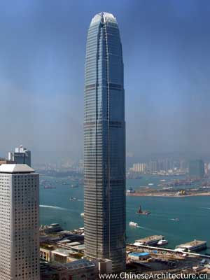
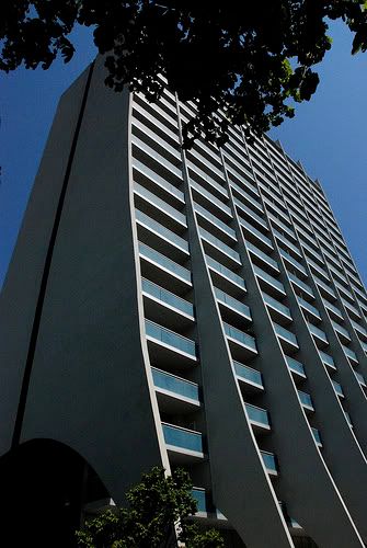
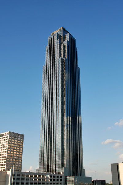
Here are some non-boxes that I think would look good in TO. Post a pic of your favourite non-box.
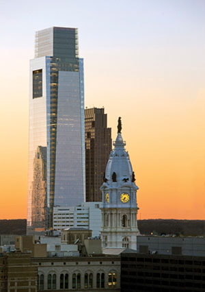
transco1.jpg


thumb.jpg


Bank%20of%20America.jpg


Twoifc-001.jpg
 
As far as shapes go, I like cuboids. Who needs more than 6 faces? I'm less concerned by the shape than the glut of lame podiums, greenish blue glass and skinny point towers which don't make any visual impact during the day.

Not that there aren't nice non-cubes either.
 
So it's back to '80s postmodernism, judging by photos 1 and 3. Boring...

There hasn't exactly been a shortage of alternatives to the "box" like RoCP, Quantum, West Harbour City, the Met, and currently under construction, Absolute and Trump.
 
Last edited:
Here are some non-boxes that I think would look good in TO.

I'll arrange to have them shipped over straight away.

They're boxes with bits chopped off the edges. There's a young native man who carves bars of white soap and sells on the street that look quite similar.
 
They're boxes with bits chopped off the edges.

I was about to point out the same thing. And not that there is anything wrong with the approach, but for every person who dislikes what is referred to as a box, there will be another who hates the box with the corners knocked out.
 
Tired of the Toronto box?

Take a trip to a typical East Asian, Latin American or ex-communist city full of boring skyscraper designs and superblocks/commie blocks (outside of the familiar skyline with landmark buildings) and perhaps you might come back with a better appreciation of skyscraper architecture in Toronto.
 
I still don't understand what on earth is wrong with a building made up of 90-degree corners and edges.

1) It's not a "box". Saying this shows that you have little appreciation for the components of a piece of architecture. Experience a building before you go around calling it a "box".

2) These "box" buildings are usually the most space efficient. Therefore their architecture makes sense.

3) Boxier buildings are easier to retrofit and tend to stay more timeless.
 
Ahh I hate to say this, but I actually love those monolithic 3-pronged apartment blocks that dot the edge of the Don Valley. I know I'm crazy, but the way they seem to hug the ground and all the different faces just makes me want just a couple more of them.
 
if we are going to get a square building (box) i would like it to have at least some setbacks i personaly love setbacks on a building. imo they are way better than just a plain box aka bay adelaide.

(spire i dont know what to call them other that box................. square buliding, 90 degrees buildings lol i dont know)
 
Last edited:
I agree that the glass minimalist box has been done to death in Toronto, not necessarily a terrible thing but often somewhat boring and uninspired nonetheless. In a perfect world I'd like to see more set-backs on condos and towers in the downtown core where this approach to design makes sense. I'd also like to see some bolder design that takes a chance on offering something different, with the understanding that this will always carry a little more risk. Thank you Alsop, Gehry and Libeskind for your efforts in this regard.... oh of course, and less precast/concrete/glass curtain wall everywhere.
 
Ahh I hate to say this, but I actually love those monolithic 3-pronged apartment blocks that dot the edge of the Don Valley. I know I'm crazy, but the way they seem to hug the ground and all the different faces just makes me want just a couple more of them.

I actually like them as well. They seem practical in that they allow a lot of surface area for a given volume which is important for condos because it means more windows and balconies. For an onlooker, the prongs give the impression of volume and mass that is sadly lacking in modern point towers. Some of them are a bit unfortunate in that they were built with depressing materials, but I would definitely like to see a 21st century reiteration of the concept.

The scourge of high rises is the elipse. I guess they are meant to improve exposure to a given view (i.e. lake) but they just look ridiculous. And who the hell has furniture that matches the particular eccentricity of these curves? You are basically forced to make a right angle mental wall from the vertex of the curve to the nearest flat walls.
 

Back
Top