unimaginative2
Senior Member
Concrete's liberating allure

AARON LYNETT/TORONTO STAR
The Rosedale Valley Bridge. Architect: John B. Parkin Associates, with Delcan Cater & Co. Completed: 1966.
Inexpensive, permanent and freighted with meaning, concrete allowed architects in the `50s and `60s to express Toronto's huge civic optimism – setting it apart from U.S. cities
Oct 21, 2007 04:30 AM
Murray Whyte
staff reporter
Brutalism. Sounds friendly, no?
No. And that, no doubt, is part of the problem. As an unfortunate – and incorrect – label for much of the late-Modern concrete architecture built largely through the late '50s to the early '70s, the term is about as cuddly as a cactus.
And fairly or unfairly, most of the buildings it has come to describe – in blanket form – suffer the same fate.
"There's still this sense that people have a very strong negative opinion about some of these buildings," says Michael McClelland, who means to change that. Or if not change it, exactly, then at least do something we haven't in a long time: talk about it.
What's lost in that dismissiveness, McClelland says, is the tremendous positive surge that these kinds of buildings embodied here: Of a city coming into its own, building big – the biggest, at least back then, in the case of the CN Tower – dreaming big, and using the most modern of technologies to render a thoroughly contemporary city as many of its American counterparts suffered the indignities of suburban flight.
To help remind us, McClelland and co-editor Graeme Stewart have assembled Concrete Toronto, a tome of writing, interviews and photographs about concrete architecture here, with a mind to reclaiming its good name – or, at least, start that conversation,
"We're interested in why people appreciate certain buildings, and look at others and say `Oh, I hate that,'" says McClelland, a principal at ERA Architects, who specialize in historic restorations.
"We found that if they like it, it's because they understand it. And if they don't, it's because of a prejudice."
It would be hard to find a more maligned urban form than massive slabs of concrete. And what's easy to forget, or ignore, is the spirit it once embodied.
In the late modern rush for democratic structures and space, concrete was not oppressive, but liberating – an inexpensive form so malleable as to lend almost sculptural possibility to the built environment. It was solid, permanent and ideal-embodying – a material that allowed an architect to believe he or she was building something that would last forever.
It was also the catalyst for a nationwide building boom, and a technological revolution in the field that wouldn't be seen again for decades, until advanced computer rendering made such things as Frank Gehry's titanium-sheathed Bilbao Guggenheim possible in 1995.
"There was this huge optimism at the time," McClelland says. "It was an extremely democratic material – inexpensive, and you could do almost anything with it. These architects thought they were doing some really interesting stuff."
By international standards – and it was international; important architects like Le Corbusier and Louis Kahn were using concrete the world over – many of them were:
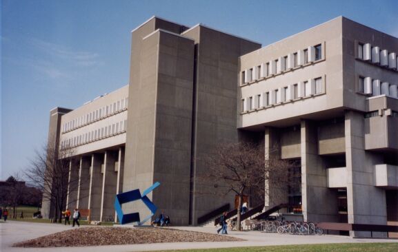
The ornate concrete simplicity of Peter Goering's landmark Medical Sciences building at the University of Toronto in 1969.
The stark beauty of Irving Grossman's Beth David Synagogue in 1959.
John Andrews' imposing stepped volumes of Scarborough College in 1964.
A host of robust, swooping apartment structures by Uno Prii.
Viljo Revell's new city hall, probably the city's best-loved building.
But we hate concrete these days – don't we? There's that prejudice again. McClelland points out that the same design team that conceived new city hall also hatched the Sheraton Centre across the street – a much-maligned structure that looms close to Queen St. and University Ave.
"With these kinds of buildings, most people will say that they hate them, but they can't say why," McClelland shrugs.
It might come as a shock to some that concrete can be not only imposing, but delicate and warm. Taivo Kapsi's 1968 house on Ardwold Gate, for example, a perfectly-proportioned assemblage of volumes rendered in ridged grey, hunkers in harmony with the lush grasses and trees that grow around, over and through it.
Ron Thom and Arthur Erickson, two of Canada's most celebrated architects, harnessed the material's creative force and made some of their most memorable work with it – Thom's campus at Trent University in Peterborough and Erickson, who did Roy Thomson Hall here, better known for such concrete masterpieces as the Museum of Anthropology or the MacMillan Bloedel Building in Vancouver.
Out west, it was a little easier. Not so much saddled by history, perhaps, an architectural aesthetic based on material and proportion could more readily take hold.
Less so here, where the much-loved ornateness of Victorian or Georgian structures cast their more recent concrete brethren as being not yet being historically valuable, but merely out of fashion – so much so that two icons of the era, John Parkin's twin masterpieces in Don Mills, the Bata headquarters and the Imperial Oil building, were recently demolished.
Encouragingly, perhaps, they met their end amid a row over architectural heritage and significance. For concrete buildings, this is progress. What's easy to forget, of course, is that the Victorians were once loathed for the same reasons they're now coveted – too fussy, too narrow, too twee, too old. McClelland says that, for concrete, that day will come, too.
"It's almost a missing chapter in the history of our city," he says. "Not all of these concrete buildings are great. But what we don't have right now is the conversation to determine that. And that's what we're trying to start."


