|
|
|


Search results
-
S
YRT/Viva Construction Thread (Rapidways, Terminals)
Does anyone else not like the new white-on-blue street signs they are using along rapidways? The green York Region ones are much more aesthetically pleasing and larger, the blue ones are tiny and harder to see. I have a feeling the design was chosen as an attempt to mimic Toronto.- Starflyer
- Post #771
- Forum: Transportation and Infrastructure
-
S
Woodbine Centre
I believe it is https://www.google.ca/?gws_rd=ssl#q=ontario+largest+indoor+amusement+park -
S
Woodbine Centre
Ah, makes more sense. Glad to see that it looks like Fantasy Fair is staying put, lots of childhood memories at that place. -
S
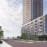
Toronto Bloor & Dufferin | 122.35m | 37s | Hazelview | Turner Fleischer
I was at Dufferin Mall recently for the first time in a long time and the place was hopping, even mid-day on a weekday. Lots of new stores, some of them higher-end. I don't think it's going anywhere. -
S
Woodbine Centre
Heh, well we will just have to see how this ends up in the long run. The poster that @PMT posted describes the building in the red circle as just an "entertainment complex". Doesn't mention anything about Fantasy Fair, but Marino Real Estate... -
S
Woodbine Centre
Does anyone know what their plans are for Fantasy Fair? I am having trouble figuring it out just by the renderings.