Search results
-
A
Toronto The Well | 174.03m | 46s | RioCan | Hariri Pontarini
There is an argument in my piece (which is deeply rooted in an understanding of, and love for, the city) that I hope will earn some discussion. 1970s Reform thinking was focused on protecting house neighbourhoods - assembled sites and “blockbusting” were the enemy. That attitude continues to...- AlexBozikovic
- Post #6,290
- Forum: Buildings
-
A
Toronto The Well | 174.03m | 46s | RioCan | Hariri Pontarini
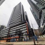
My take on The Well is up now: https://www.theglobeandmail.com/gift/5208e122e460c436e748f8b9681c5f871eaf70ef2d7f6d32c0338e8e95eff563/JMFBZCOMURAKPKKCV242GDWYME/- AlexBozikovic
- Post #6,279
- Forum: Buildings
-
A
Toronto Ontario Line 3 | ?m | ?s | Metrolinx
This is a peer-reviewed paper in an engineering journal.- AlexBozikovic
- Post #22,508
- Forum: Transportation and Infrastructure
-
A
Toronto Ontario Line 3 | ?m | ?s | Metrolinx
For what it’s worth: https://www.theglobeandmail.com/canada/toronto/article-doug-fords-transit-plans-billions-in-waste-bad-for-the-planet/ The paper: https://iopscience.iop.org/article/10.1088/1748-9326/ab442f- AlexBozikovic
- Post #22,504
- Forum: Transportation and Infrastructure
-
A
Vaughan VMC South Block B4 | 102.75m | 20s | SmartCentres | 3XN
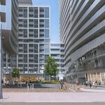
Wonderful. A car-free, block-long courtyard with some animation. Why is this possible in Vaughan and not in Toronto?- AlexBozikovic
- Post #10
- Forum: Buildings
-
A
Toronto The Jasper | 23.25m | 7s | 211 Gerrard East Inc | COMN Architects
"Science" is when planners decide that a shadow moving over a park will make it uncomfortable in September, apparently.- AlexBozikovic
- Post #32
- Forum: Buildings
-
A
Toronto 666 Spadina Avenue | 41m | 11s | Cromwell | Arcadis
Architecturally this is almost okay. The problem is the combination of black, white and brick tile in the cladding: too many materials, and the transitions between them are poorly detailed. It’s really striking IRL. Clearly the architects did not spend a lot of time, if any, looking at the...- AlexBozikovic
- Post #178
- Forum: Buildings
-
A
Toronto Ontario Line: Queen-Spadina Station | ?m | 1s | Metrolinx | HDR
Great find, @thecharioteer. This branch was Chadwick & Beckett, 1902. Same year and architects as the King/Bathurst Bank of Toronto which is also being gutted right now.- AlexBozikovic
- Post #90
- Forum: Buildings
-
A
Toronto 888 Dupont | 61.7m | 18s | TAS | SA
There has to be a cheap way to convert garages into work only studio space.- AlexBozikovic
- Post #129
- Forum: Buildings
-
A
Toronto KING Toronto | 57.6m | 16s | Westbank | Bjarke Ingels Group
This is amusing, but no, I was not!- AlexBozikovic
- Post #1,540
- Forum: Buildings
-
A
Toronto KING Toronto | 57.6m | 16s | Westbank | Bjarke Ingels Group
From The Well:- AlexBozikovic
- Post #1,537
- Forum: Buildings
-
A
Zoning Reform Ideas
Thanks for sharing, @Northern Light. But to be clear, I’m calling for as of right apartment buildings everywhere. The “major streets” policy that’s now being considered is not that. It’s perhaps 1/1000 of that. This is the problem..- AlexBozikovic
- Post #1,048
- Forum: Design and Architectural Style
-
A
Toronto Ontario Place | ?m | ?s | Infrastructure ON
Thanks, @just east of the creek. Here is that column of mine: https://www.theglobeandmail.com/arts/art-and-architecture/article-for-doug-ford-an-audit-of-ontario-place-could-be-trouble/- AlexBozikovic
- Post #3,199
- Forum: Buildings
-
A
Toronto 100 Borough | 163.5m | 50s | The Rosdev Group | Arcadis
Dire.- AlexBozikovic
- Post #5
- Forum: Buildings
-
A
Toronto Billy Bishop Toronto City Airport | ?m | ?s | Ports Toronto | Arup
It’s a small thing, but the analogy between Billy Bishop and London City Airport as “centre city” airports is bogus. LCY is 11 km from London Bridge. On a Toronto map, that’s equivalent to a location past High Park. And it does not border one of London’s most important and beloved parks.- AlexBozikovic
- Post #5,136
- Forum: Transportation and Infrastructure
-
A
Toronto 141 Roehampton | 186.3m | 58s | Lifetime | Wallman Architects
Tearing down 70 units to build 800, in the one pocket of North Toronto where all the buildings are going, while the surrounding ocean of houses continues to see zero population growth. Just another day in Toronto..- AlexBozikovic
- Post #29
- Forum: Buildings
-
A
Toronto Mirvish Village (Honest Ed's Redevelopment) | 85.04m | 26s | Westbank | Henriquez Partners
Leaving everything else aside… yes: that’s right. These neighbourhoods are being occupied by fewer, richer people every year, and that will continue to be the case until apartment buildings are allowed- AlexBozikovic
- Post #1,801
- Forum: Buildings
-
A
Toronto Mirvish Village (Honest Ed's Redevelopment) | 85.04m | 26s | Westbank | Henriquez Partners
The population in this area is absolutely lower than it was in 1971 and continues to shrink. It’s a consistent pattern across Toronto’s house neighborhoods, especially the wealthier ones. During the time that Mirvish Village has been under construction, four neighbourhoods around it – Annex...- AlexBozikovic
- Post #1,798
- Forum: Buildings


