|
|
|


Search results
-
4
Southcore Financial Ctr: PricewaterhouseCoopers Tower (18 York St, bcIMC, 26s, KPMB)
I think with some dense foliage surrounding the base/podium and a good street-front treatment, this thing will turn out alright. -
4
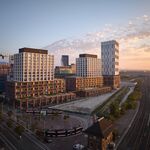
Bay Adelaide Centre West Tower (Brookfield, 50s, WZMH)
^Spaced, yeah, I saw the preview tonight on TV. -
4
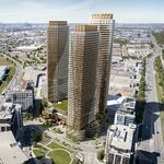
Toronto St Regis Toronto Hotel and Residences | 281.93m | 58s | JFC Capital | Zeidler
Won't Trump block the southern KPMG sign? -
4
Toronto Residences at the RCMI Condos | 134.72m | 42s | Tribute | Zeidler
I'm going to make a time capsule. I'm going to put in a copy of Eye Weekly and a nickel from 1993. -
4
Toronto Aria | ?m | 19s | Fernbrook Homes | Rafael + Bigauskas
I know there's a lot of hate, but I think it looks good driving up Leslie and East on Sheppard and the 401. -
4
Toronto Maple Leaf Square | 185.92m | 54s | Lanterra | KPMB
I don't see any cell towers? -
4
Toronto The Uptown Residences | ?m | 48s | Pemberton | Burka
Casa, X, CrystalBlu, Uptown... they're all new. -
4
Toronto St Regis Toronto Hotel and Residences | 281.93m | 58s | JFC Capital | Zeidler
^Most likely Steveve, as it acts as a temporary weather wall for the workers. -
4
Toronto St Regis Toronto Hotel and Residences | 281.93m | 58s | JFC Capital | Zeidler
thedeepend I do like that art deco building you posted; very much so. That subtle green is fine with me. What makes me quiver is that green paneling that is above and below each window. I mean, what the hell is that? You know, that goddam green slab of glass with some exotic 'greeness'... -
4
Toronto St Regis Toronto Hotel and Residences | 281.93m | 58s | JFC Capital | Zeidler
The entire tower is ugly if you ask me. From the turquoise/teal hue to the cringeworthy post-modern pastiche of cheap materials, I just don't like this thing. Is it me, or is the use of teal/turquoise/green just getting a little too ubiquitous in the downtown core? Are developers really this... -
4
Bay Adelaide Centre West Tower (Brookfield, 50s, WZMH)
How are they installing those? Pulling them up from the street and then what? Are there workers dangling in harnesses; installing the sign? -
4
Toronto Maple Leaf Square | 185.92m | 54s | Lanterra | KPMB
Yeah, no, that aqua green doesn't do it for me... not one bit. I can only imagine how dated and suburban that colour will seem in a decade. -
4
Toronto Bloor Street Neighbourhood Condos | ?m | 32s | Cresford | Northgrave
Those plastic potted plants aren't cheap. The smaller bushes retail for like $200+.... if they are lower middle class, they just went in to debt. -
4
Toronto CrystalBlu Condos | ?m | 36s | Bazis | Burka
I can only hope he's harnessed in Steveve... it looks like he is. -
4
Toronto Residences at The Ritz-Carlton, Toronto | 207.86m | 53s | Graywood | Kohn Pedersen Fox
Is it just me or do the mullions make this building look worse than it should? What's with the ubiquity of these mullions on nearly every building. They just cheapen the look in my opinion. -
4
Toronto Festival Tower and tiff Bell Lightbox | 156.96m | 42s | Daniels | KPMB
^Perhaps your sights were set on the other lofty aspects of the dining establishment. -
4
Toronto Residences at The Ritz-Carlton, Toronto | 207.86m | 53s | Graywood | Kohn Pedersen Fox
I was under the impression that the Ritz hotel portion was going to be ready for the G20 summit. Was I wrong? -
4
Toronto The Uptown Residences | ?m | 48s | Pemberton | Burka
How many people will be moving in to Uptown and Crystal Blu when all is said and done? 2000?